Abstract
Two methods are presented that allow for identification of mixed cases in the extraction of general factors. Simulated data is used to illustrate them.
Introduction
General factors can be extracted from datasets where all or nearly so the variables are correlated. At the case-level, such general factors are decreased in size if there are mixed cases present. A mixed case is an ‘inconsistent’ case according to the factor structure of the data.
A simple way of illustrating what I’m talking about is using the matrixplot() function from the VIM package to R (Templ, Alfons, Kowarik, & Prantner, 2015) with some simulated data.
For simulated dataset 1, start by imaging that we are measuring a general factor and that all our indicator variables have a positive loading on this general factor, but that this loading varies in strength. Furthermore, there is no error of measurement and there is only one factor in the data (no group factors, i.e. no hierarchical or bi-factor structure, (Jensen & Weng, 1994)). I have used datasets with 50 cases and 25 variables to avoid the excessive sampling error of small samples and to keep a realistic number of cases compared to the datasets examined in S factor studies (e.g. Kirkegaard, 2015). The matrix plot is shown in Figure 1.

Figure 1: Matrix plot of dataset 1
No real data looks like this, but it is important to understand what to look for. Every indicator is on the x-axis and the cases are on the y-axis. The cases are colored by their relative values, where darker means higher values. So in this dataset we see that any case that does well on any particular indicator does just as well on every other indicator. All the indicators have the same factor loading of 1, and the proportion of variance explained is also 1 (100%), so there is little point in showing the loadings plot.
To move towards realism, we need to complicate this simulation in some way. The first way is to introduce some measurement error. The amount of error introduced determines the factor loadings and hence the size of the general factor. In dataset 2, the error amount is .5, and the signal multiplier varies from .05 to .95 all of which are equally likely (uniform distribution). The matrix and the loadings plots are shown in Figures 2 and 3.

Figure 2: Matrix plot for dataset 2

Figure 3: Loadings plot for dataset 2
By looking at the matrix plot we can still see a fairly simple structure. Some cases are generally darker (whiter) than others, but there is also a lot of noise which is of course the error we introduced. The loadings show quite a bit of variation. The size of this general factor is .45.
The next complication is to introduce the possibility of negative loadings (these are consistent with a general factor, as long as they load in the right direction, (Kirkegaard, 2014)). We go back to the simplified case of no measurement error for simplicity. Figures 4 and 5 show the matrix and loadings plots.
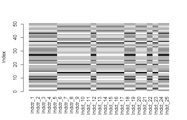
Figure 4: Matrix plot for dataset 3

Figure 5: Loadings plot for dataset 3
The matrix plot looks odd, until we realize that some of the indicators are simply reversed. The loadings plot shows this reversal. One could easily get back to a matrix plot like that in Figure 1 by reversing all indicators with a negative loading (i.e. multiplying by -1). However, the possibility of negative loadings does increase the complexity of the matrix plots.
For the 4th dataset, we make a begin with dataset 2 and create a mixed case. This we do by setting its value on every indicator to be 2, a strong positive value (98 centile given a standard normal distribution). Figure 6 shows the matrix plot. I won’t bother with the loadings plot because it is not strongly affected by a single mixed case.

Figure 6: Matrix plot for dataset 4
Can you guess which case it is? Perhaps not. It is #50 (top line). One might expect it to be the same hue all the way. This however ignores the fact that the values in the different indicators vary due to sampling error. So a value of 2 is not necessarily at the same centile or equally far from the mean in standard units in every indicator, but it is fairly close which is why the color is very dark across all indicators.
For datasets with general factors, the highest value of a case tends to be on the most strongly loaded indicator (Kirkegaard, 2014b), but this information is not easy to use in an eye-balling of the dataset. Thus, it is not so easy to identify the mixed case.
Now we complicate things further by adding the possibility of negative loadings. This gets us data roughly similar to that found in S factor analysis (there are still no true group factors in the data). Figure 7 shows the matrix plot.

Figure 7: Matrix plot for dataset 5
Just looking at the dataset, it is fairly difficult to detect the general factor, but in fact the variance explained is .38. The mixed case is easy to spot now (#50) since it is the only case that is consistently dark across indicators, which is odd given that some of them have negative loadings. It ‘shouldn’t’ happen. The situation is however somewhat extreme in the mixedness of the case.
Automatic detection
Eye-balling figures and data is a powerful tool for quick analysis, but it cannot give precise numerical values used for comparison between cases. To get around this I developed two methods for automatic identification of mixed cases.
Method 1
A general factor only exists when multidimensional data can be usefully compressed, informationally speaking, to 1-dimensional data (factor scores on the general factor). I encourage readers to consult the very well-made visualization of principal component analysis (almost the same as factor analysis) at this website. In this framework, mixed cases are those that are not well described or predicted by a single score.
Thus, it seems to me that that we can use this information as a measure of the mixedness of a case. The method is:
- Extract the general factor.
- Extract the case-level scores.
- For each indicator, regress it unto the factor scores. Save the residuals.
- Calculate a suitable summary metric, such as the mean absolute residual and rank the cases.
Using this method on dataset 5 in fact does identify case 50 as the most mixed one. Mixedness varies between cases due to sampling error. Figure 8 shows the histogram.

Figure 8: Histogram of absolute mean residuals from dataset 5
The outlier on the right is case #50.
How extreme does a mixed case need to be for this method to find it? We can try reducing its mixedness by assigning it less extreme values. Table 1 shows the effects of doing this.
|
Mixedness values |
Mean absolute residual |
|
2 |
1.91 |
|
1.5 |
1.45 |
|
1 |
0.98 |
Table 1: Mean absolute residual and mixedness
So we see that when it is 2 and 1.5, it is clearly distinguishable from the rest of the cases, but 1 is about the limit of this since the second-highest value is .80. Below this, the other cases are similarly mixed, just due to the randomness introduced by measurement error.
Method 2
Since mixed cases are poorly described by a single score, they don’t fit well with the factor structure in the data. Generally, this should result in the proportion of variance increasing when they are removed. Thus the method is:
- Extract the general factor from the complete dataset.
- For every case, create a subset of the dataset where this case is removed.
- Extract the general factors from each subset.
- For each analysis, extract the proportion of variance explained and calculate the difference to that using the full dataset.
Using this method on the dataset also used above correctly identifies the mixed case. The histogram of results is shown in Figure 9.

Figure 9: Histogram of differences in proportion of variance to the full analysis
Like we method 1, we then redo this analysis for other levels of mixedness. Results are shown in Table 2.
|
Mixedness values |
Improvement in proportion of variance |
|
2 |
1.91 |
|
1.5 |
1.05 |
|
1 |
0.50 |
Table 2: Improvement in proportion of variance and mixedness
We see the same as before, in that both 2 and 1.5 are clearly identifiable as being an outlier in mixedness, while 1 is not since the next-highest value is .45.
Large scale simulation with the above methods could be used to establish distributions to generate confidence intervals from.
It should be noted that the improvement in proportion of variance is not independent of number of cases (more cases means that a single case is less import, and non-linearly so), so the value cannot simply be used to compare across cases without correcting for this problem. Correcting it is however beyond the scope of this article.
Comparison of methods
The results from both methods should have some positive relationship. The scatter plot is shown in

Figure 10: Scatter plot of method 1 and 2
We see that the true mixedness case is a strong outlier with both methods — which is good because it really is a strong outlier. The correlation is strongly inflated because of this, to r=.70 with, but only .26 without. The relative lack of a positive relationship without the true outlier in mixedness is perhaps due to range restriction in mixedness in the dataset, which is true because the only amount of mixedness besides case 50 is due to measurement error. Whatever the exact interpretation, I suspect it doesn’t matter since the goal is to find the true outliers in mixedness, not to agree on the relative ranks of the cases with relatively little mixedness.1
Implementation
I have implemented both above methods in R. They can be found in my unofficial psych2 collection of useful functions located here.
Supplementary material
Source code and figures are available at the Open Science Framework repository.
References
Jensen, A. R., & Weng, L.-J. (1994). What is a good g? Intelligence, 18(3), 231–258. http://doi.org/10.1016/0160-2896(94)90029-9
Kirkegaard, E. O. W. (2014a). The international general socioeconomic factor: Factor analyzing international rankings. Open Differential Psychology. Retrieved from http://openpsych.net/ODP/2014/09/the-international-general-socioeconomic-factor-factor-analyzing-international-rankings/
Kirkegaard, E. O. W. (2014b). The personal Jensen coefficient does not predict grades beyond its association with g. Open Differential Psychology. Retrieved from http://openpsych.net/ODP/2014/10/the-personal-jensen-coefficient-does-not-predict-grades-beyond-its-association-with-g/
Kirkegaard, E. O. W. (2015). Examining the S factor in US states. The Winnower. Retrieved from https://thewinnower.com/papers/examining-the-s-factor-in-us-states
Templ, M., Alfons, A., Kowarik, A., & Prantner, B. (2015, February 19). VIM: Visualization and Imputation of Missing Values. CRAN. Retrieved from http://cran.r-project.org/web/packages/VIM/index.html
Footnotes
1 Concerning the agreement about rank-order, it is about .4 both with and without case 50. But this is based on a single simulation and I’ve seen some different values when re-running it. A large scale simulation is necessary.