We all know that universities differ in quality. But what exactly do we mean by that? How do we determine which are the top universities? There are a number of international ranking databases, 3 of which currently produce these top rankings:
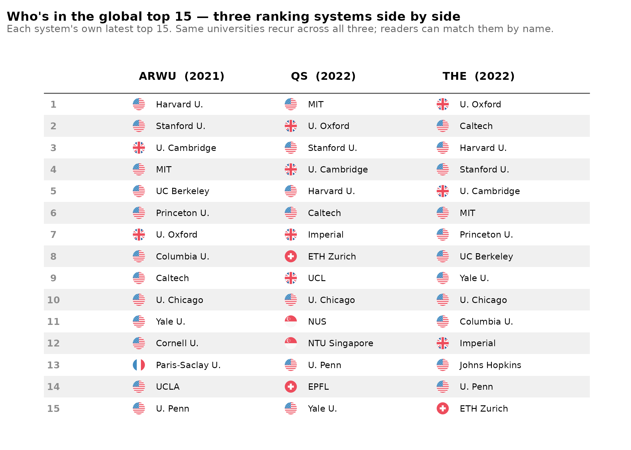
Yes, I could have included more databases, but AI tells me these are the most commonly used, and for the approach I develop below, it would not matter much to include more. The next step is to count the number of top universities by country. If we arbitrarily pick top 200, then we get the following top countries:
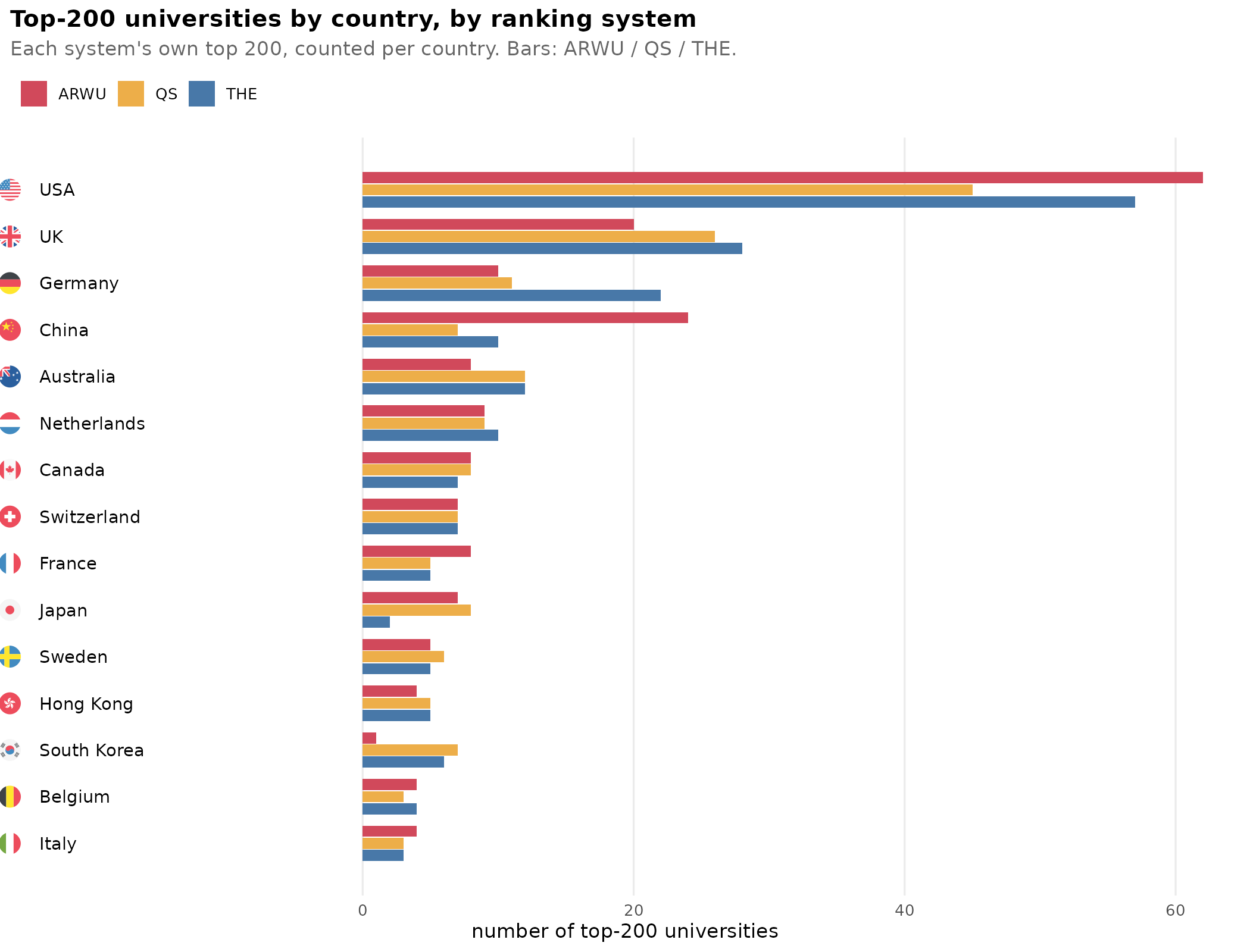
The results are reasonably, but not perfectly, correlated. USA has the most top universities in each database, but is the number 45 or 62? Asian countries show extreme divergence, South Korea has between 1 and 7 depending on the system. Which numbers are more sensible? It’s not obvious. Either China has already overtaken the UK (ARWU) or it is still far behind (QS and THE). Thus the main problem with the above findings is that we have 3 different databases of university rankings, so how are these best combined? Rank-order data is limited because we can’t say how much better rank X is than X+1 or X-1. We need interval data. Fortunately, it turns out the methods for computing these rankings are public and so are the underlying quantitative indicators. Thus, we can treat this as an ordinary factor analysis problem. We simply pool the available indicators and see what their correlations look like:
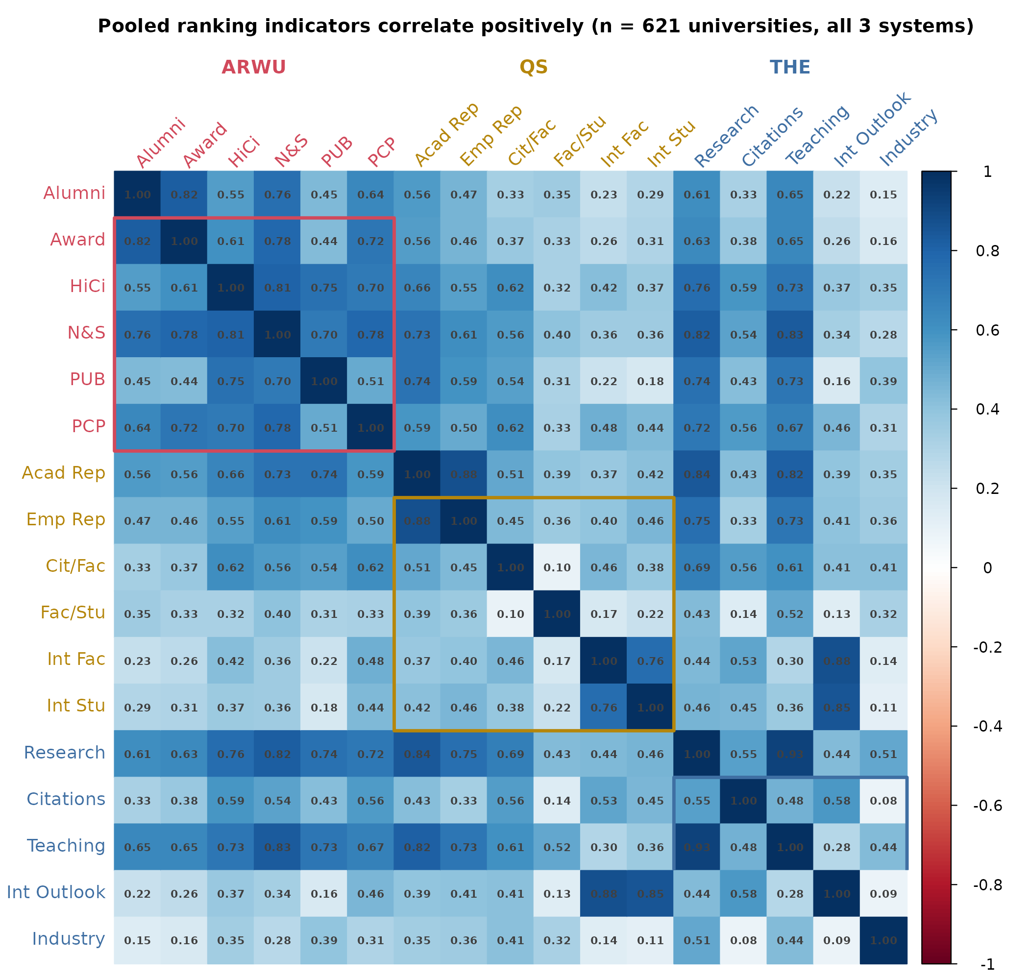
We unsurprisingly find a positive manifold, every quality indicator relates positively to every other indicator. The pattern is not that great though, there are a number of very weak indicators with correlation down to 0.08. This does not appear to be a bug, it’s just a bad measure, at least insofar as any general quality is concerned. Given the positive manifold, we can at least pragmatically treat the data as being explained (reflective) or well-summarized by (formative) a general factor or index, and then score every university on this university-g scale. Technically, the g here only refers to it being the general factor of these indicators of university quality, but you could also think of it as a proxy for the average human g — general intelligence — at the universities, or just think about it as university goodness. We also notice in the correlation matrix that some variables are near duplicates, which will inflate the variance related to that specific aspect of university quality. For instance, there are 3 closely related variables across 2 databases of internationalization, students/faculty/outlook, the latter which includes the former as well as international collaborations (joint authorships). Decent to half-decent arguments can also be made against each of the indicators as potentially measuring something other than university quality (number in parens is their assigned weight):
- Alumni (10%) — “The total number of the alumni of an institution winning Nobel Prizes and Fields Medals.”
- Award (20%) — “The total number of the staff of an institution winning Nobel Prizes in Physics, Chemistry, Medicine and Economics and Fields Medal in Mathematics.”
- HiCi (20%) — “The number of Highly Cited Researchers selected by Clarivate.”
- N&S (20%) — “The number of papers published in Nature and Science between 2016 and 2020.”
- PUB (20%) — “Total number of papers indexed in Science Citation Index-Expanded and Social Science Citation Index in 2020.”
- PCP (10%) — “The weighted scores of the above five indicators divided by the number of full-time equivalent academic staff.”
- Teaching (30%) — the learning environment: a reputation survey plus staff-to-student ratio, doctorate-to-bachelor ratio, doctorates-awarded-to-academic-staff, and institutional income.
- Research (30%) — volume, income and reputation: a research-reputation survey, research income (scaled to staff), and research productivity (publications per staff).
- Citations (30%) — research influence: captures how often a university’s published work is cited by scholars globally.
- International Outlook (7.5%) — staff, students and research: the proportion of international students, the proportion of international staff, and the proportion of papers with at least one international co-author.
- Industry Income (2.5%) — knowledge transfer: research income an institution earns from industry, scaled against the number of academic staff.
- Academic Reputation (40%) — based on a global survey asking academics to name the institutions where the best work is being done in their field.
- Employer Reputation (10%) — based on a survey asking employers to identify the institutions producing the best, most competent graduates.
- Faculty/Student Ratio (20%) — the number of academic staff relative to students, used as a proxy for teaching capacity.
- Citations per Faculty (20%) — total citations to an institution’s papers over five years, divided by its number of faculty.
- International Faculty Ratio (5%) — the proportion of faculty members who are international.
- International Students Ratio (5%) — the proportion of students who are international.
You can make arguments against each of them. Alumni measures raw counts, so just having more students in general will make these numbers higher. A small, elite and focused university is beaten by one with more students. Award measures ability to hire expensive staff, so one can consider it a measure of wealth of the university. Citations per faculty punishes hiring teaching focused professors. The ideal university by this metric has 0 students and 3 top researchers. Internationalization metrics punish larger countries since they have an easier time collaborating within country (USA, China), and one submeasure rewards joining papers with 100+ authors. It can also be gamed by intentionally attracting foreign students, even if these are below average. This is a typical strategy for many UK universities I’ve been told. Generally, though, gaming all metrics at the same time is not so easy, so their joint effect is probably a fair estimate of the general factor.
There are various ways to deal with such overlapping or strong group factors. One common approach is to score the data using the bifactor model. In this case, we posit that a few underlying unobserved (latent) variables cause the pattern we see. One of them we posit is general, so it affects every indicator, whereas the others only affect some subset (the group factors). In our case, we can fit this model:
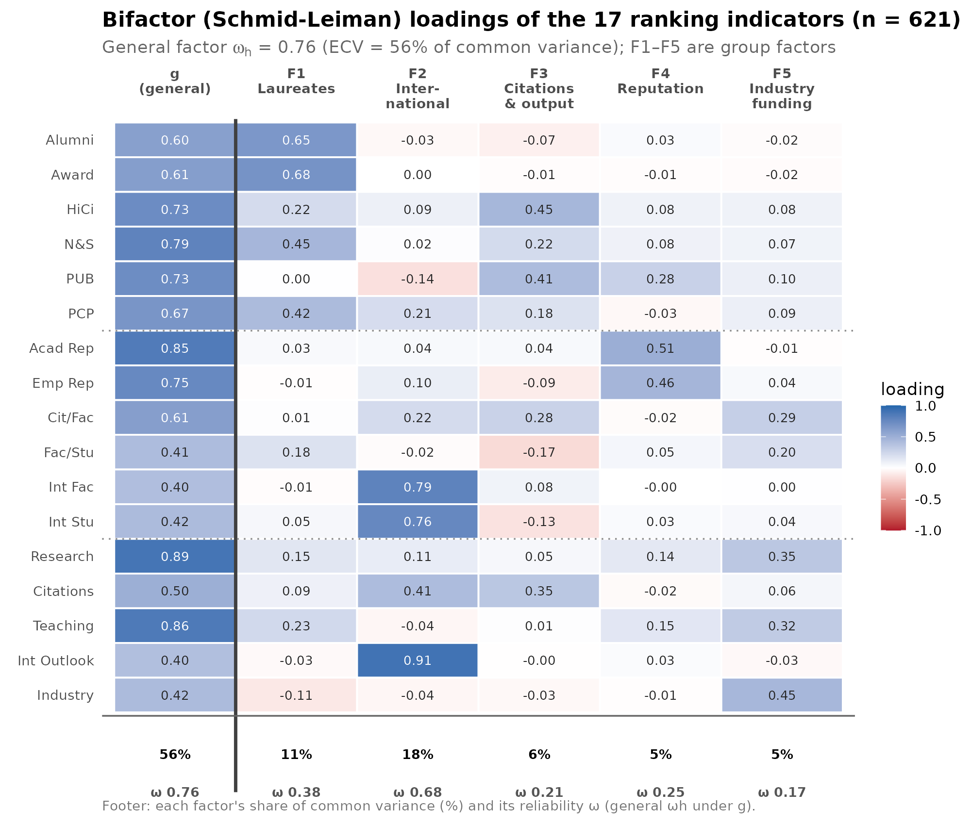
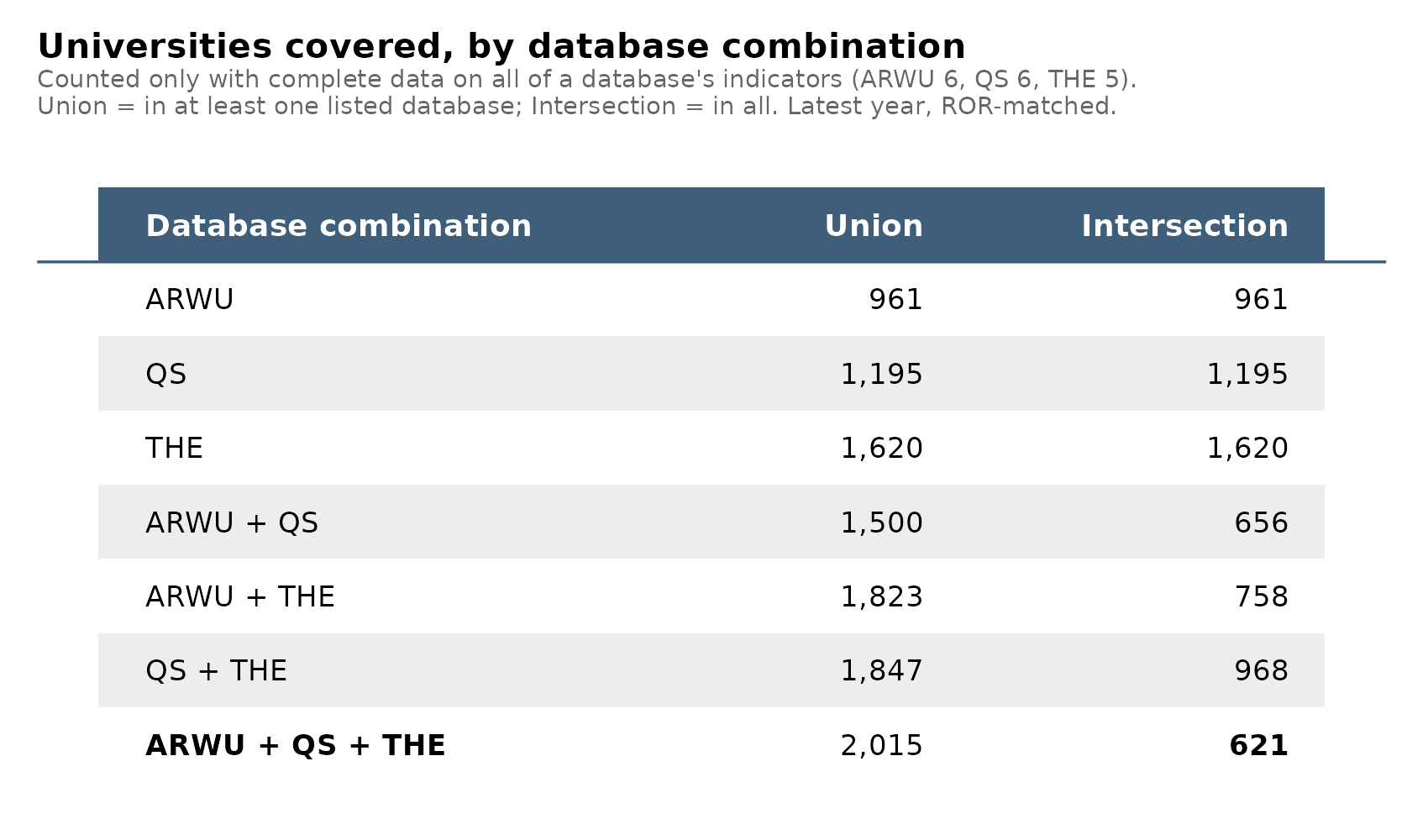
The uni-g has reasonably high omega h. But some of the other factors are not that great, especially not the last one which only has 1 indicator loading at 0.45. However, it doesn’t really matter much because alternative models produce essentially the same score estimates with correlations all above 0.99. Even just taking the mean z-score of variables (so called unit-weight factor analysis) correlates ~0.97 with the factor analytic scores. Thus this single score represents the quality fairly well as a single dimension and with that we have a single number for each university in this joint database, 621 universities that were included in each of these databases. However, there are many more universities in the world, and this is important as we shall see later. Here’s the sample sizes by database unions and intersections:
Above we used the full intersection to get the 621 universities with full data. However, given the strong correlations among the variables, we can also make reasonable estimates of uni-g for the union of all 3 databases using whichever variables are available. There are different approaches here, but a simple and principled approach is to fit the 1-factor EFA model using FIML which uses the available data and provides scores for every university. I tried alternative approaches such as building subset specific regression models, but the results were correlated 0.99 or so. Thus, we have obtained uni-g estimates for 2000+ universities.
Having integrated our estimates into a single best estimate we move to the next problem with the university counts by country: having more people in your country means you have more universities, and thus more chances to have top ones, even if there are no average quality differences between countries’ universities. Here are the correlations across different thresholds for “top” university:
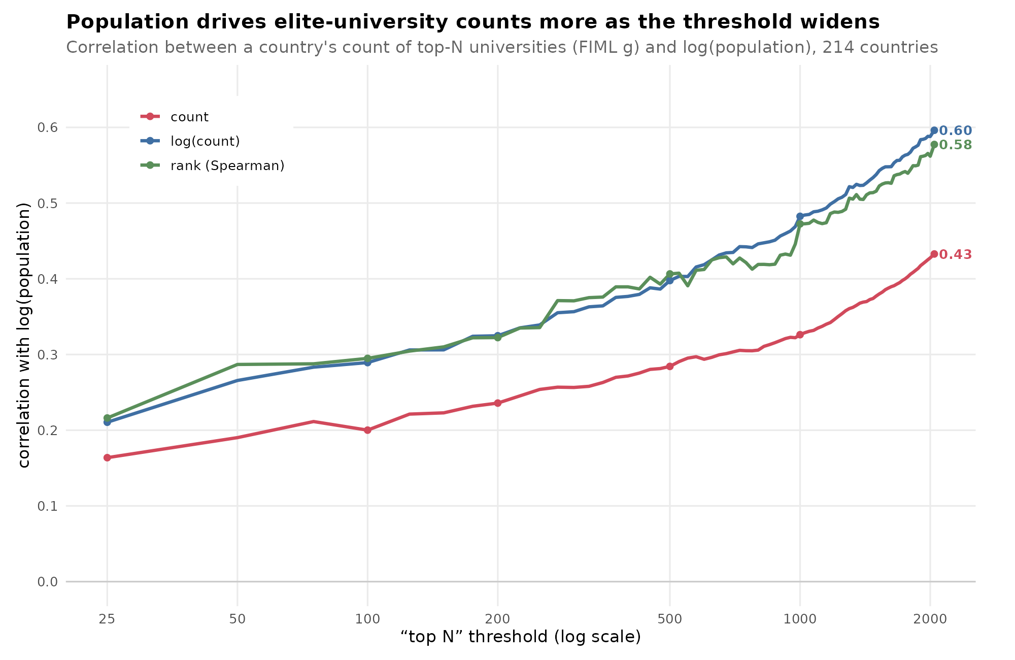
If the question is just who has more top universities, and thus where global research talent is concentrated, then it will tend to be whichever country has a large population, a good human talent average, as well as suitable political conditions. There are also historical lags, as new talent moves towards existing talent clusters, so even if some countries no longer have good political conditions (like the UK), then they can rely on the system’s self-reinforcing feature for some time. If the question is instead who is good at making top universities in relative terms, then we have to use some kind of the dreaded per capita analysis. Ignoring those other factors for now, here are the by country counts using the final model for the combined dataset and the per-million rankings for top 200:
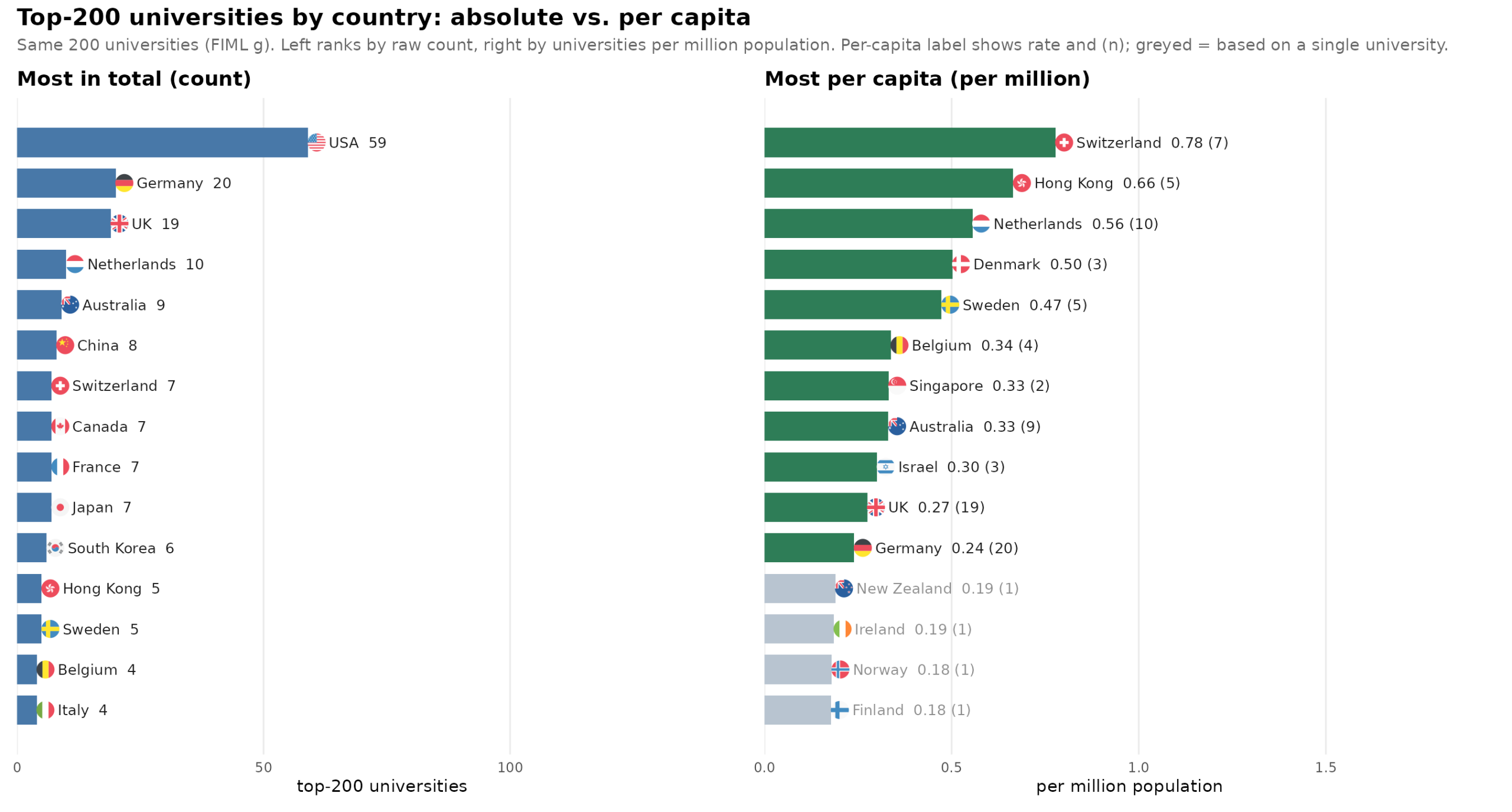
USA moves from global 1st to 16th. In other words, America doesn’t actually produce a lot of top universities taking their population into account using the naive approach.
The problem with per-person estimates for rare cases is that the estimates are very unstable. A small country like Iceland (400k population) might have a good university or might not, just like it might have a single Nobel Prize winner or not. A single positive observation would result in a very high per-person rate (2.5 top universities per million people) and 0 positive observations would result in the lowest rate of 0 per million. Hypothetically, if we were to magically scale every country’s population to 1 billion, we would learn the true rates without uncertainty, and this true rate would lie far from the observed rate. In other words, for rare cases/events, it is impossible to even arrive at a correct estimate as any observation would lead to a very wrong result compared to this counterfactual. The general solution to this issue is to use better models. There are two main approaches. First, we can adjust the observed per-person rate towards a plausible value, typically the global mean (weakly informative prior) using something like Empirical Bayes. Second, we can use count models to predict the expected count for each country as a joint effect of the variables we use for prediction + population size. This latter approach fixes the standard errors at the cost of interpretability of the model results. Yes, I know, some will object philosophically to this statistical approach. There is only 1 Iceland, and it only has the current number of top universities (0), so its observed rate is the true one. From this perspective, there is no possibility of estimating model uncertainty because we already observe all the data, it’s not a sample but the population. This means there is no point of doing any standard errors or inferential statistics at all. While perhaps philosophically defensible, no one actually follows this approach in practice. Everybody reports p values for regressions for US states, even though we also observe all 50 of them, and not a random sample of 50 states from a hypothetical infinite rerun of US history where they would be different numbers and kinds of states. But I digress. Anyway, in our list above, the 4 last entries on the per person list have exactly 1 university in top 200, their country’s top university.
Concerning the causal explanation of the worldwide distribution of universities and their quality levels, one could of course take many approaches. I posit that the most foundational approach consists of 2 root causes: national intelligence average (national IQ, or NIQ) and the population size in a distributional model. NIQ and population size are not closely causally connected. My causal model of the data is that given a sufficiently large population size (say, 1 billion), every country would have a distribution of universities with a mean uni-g of some value. The population size affects the number of universities but not mean uni-g. NIQ affects both the mean uni-g and the number of them. Thus, it moves the distribution towards the higher end of the university quality dimension and makes it larger. In theory, then, if we measured all universities in the world, then NIQ should be very highly correlated with mean uni-g for the country, since this is not affected by population size. However, the university databases do not measure all universities. There are about 20k accredited universities worldwide of which we observe data for about 2000 or 10%. The problem is that we are measuring them from the right tail, best first, so not a random sample. Thus, for countries with medium to low mean uni-g, we don’t observe the entire distribution of their universities so their mean uni-g will be inflated by sampling bias. For instance, Denmark has 7 broad universities, 3 are in top 200, 6 in top 500 and all 7 in top 1000. Adding more universities to the database would thus not expand this list and Denmark’s uni-g mean would remain unchanged. However, adding more universities to the database would add many more for India, Brazil, China etc., lowering their estimates of mean uni-g. From the perspective of statistical modeling, thus, I can think of 3 approaches:
- Count of top N — Per-person rate of top-N universities, where top N is a tuning parameter. Best modeled using count models. This avoids the selection bias from not observing the left tail at the cost of statistical uncertainty and model interpretability.
- Mean uni-g — Mean score of all observed universities from that country. Biased upwards for low human talent and large population size countries. Avoids the arbitrariness of the top N tuning parameter.
- Max uni-g — Single highest scoring university. Avoids both issues but has even more statistical uncertainty and may be affected by historical factors relating to concentration of talent inside countries. Many countries put almost all talent in capital region, others split it up more evenly, and the former is much better for this metric.
I don’t know which approach is best, so I tried all of them. The simplest is average uni-g by country vs. NIQ, we don’t need to adjust for population size, so it’s just a scatterplot:
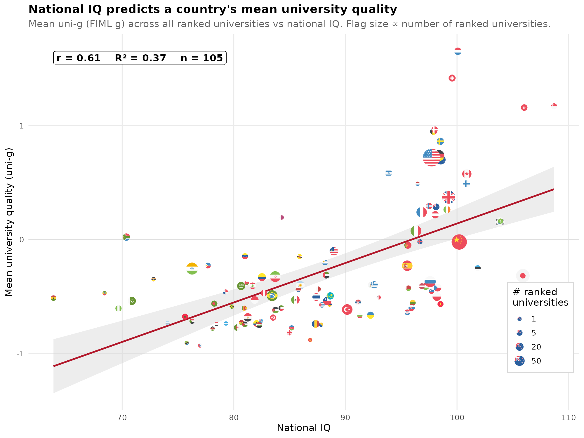
There is bias in that large countries are overestimated. E.g. USA has 1000s of unmeasured, low quality but accredited universities, all of which would substantially lower the mean uni-g if we had seen them. The same is true for low NIQ counties because we only observe their top universities. This general approach has issues with defining what is included as a university, and the data includes somewhere between 62% and 10% of American universities depending on these definitions.
The next idea is just to look at the single best scoring university by country (max uni-g) predicted from population size and NIQ. Population size makes the distribution larger, so there is greater chance of seeing a far right tail value, and NIQ moves the distribution towards the right and makes it larger, substantially increasing the max value seen. Since we have to control for population size, we can use the partial residuals for the plot: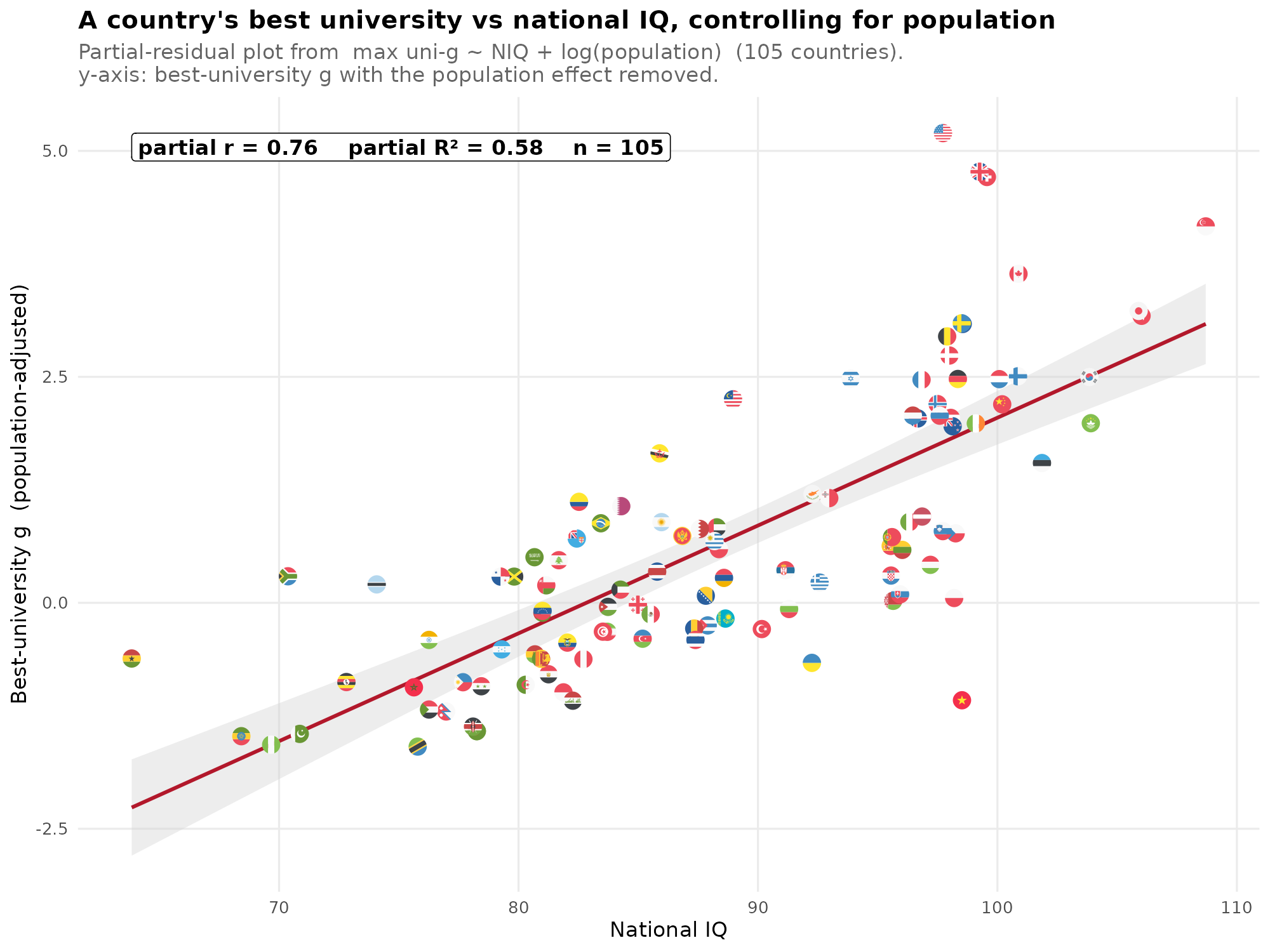
This gives a better model, with sensible signal also among the low to average NIQ countries. The top positive outliers with regards to NIQ are those that are 1) large, and or 2) attract top talent from other countries, USA, UK, Switzerland, Singapore, and Canada. 4 of 5 of these are Anglos, and we have issues with English-speaking world granting high prestige to internationally known universities. Everybody knows Harvard etc. because they are commonly featured in American movies. Alternatively, maybe the modeling of the effect of population size is not quite right. After all, no one really thinks that log (population size) is the exactly right mathematical specification for how population size affects the likely right tail value.
Finally, the count models. I’ve chosen to stick with the top 200 N threshold, though one can tune/hack this parameter to get slightly better fit. There is a choice of what count model to use, ranging from the classic Poisson to negative binomial to 2-step hurdle-like models. Fortunately, the data does not suggest excess number of 0’s, so we can stick with the negative binomial. The issue here for the blogpost is that it doesn’t really give us a nice plot to show the model, only 30 out of ~200 countries have any top 200 university, so almost all countries just have a 0 observed rate. The most visual approach I can think of is using the empirical Bayes adjusted rates per million, which since they are directly adjusted for population size, can be shown with a simple scatterplot:
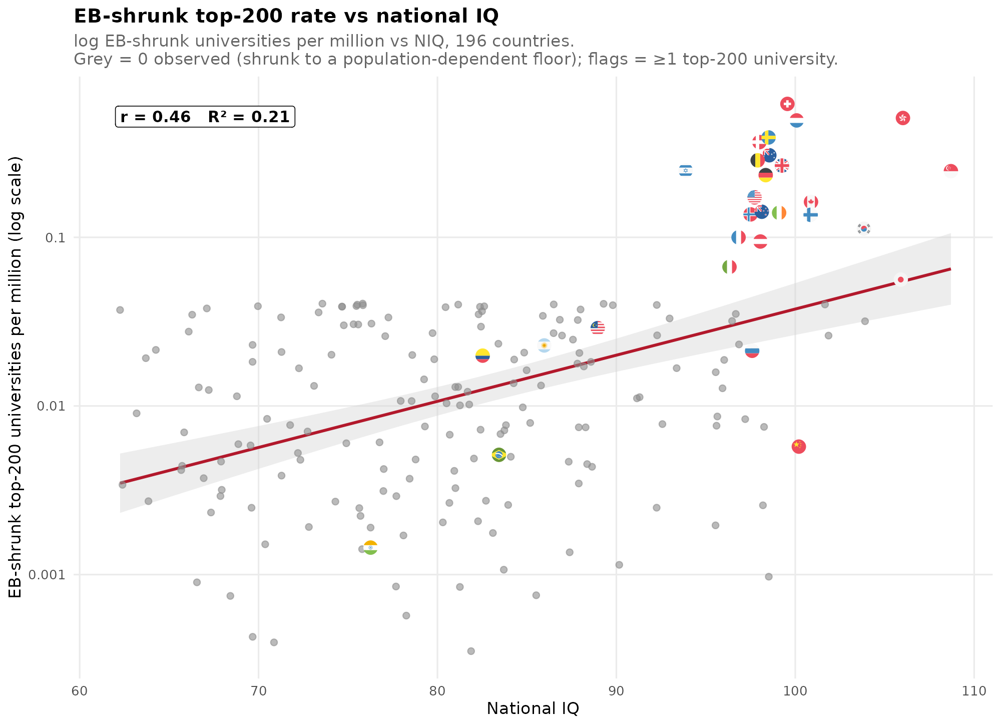
The grey values are the imputed values, that is, what the model expects the rate to be even though 0 was observed.
Overall, then, it is not entirely clear which approach is best for modeling this, but no matter the chosen approach, NIQs clearly predict university quality and quantity. One can go into models that control for confounders, spatial autocorrelation, or controlling for mediators like income/wealth, however, I am short on time, so this is it for today.