Many years ago I discovered that Brazil publishes the subject level data for many scale testing efforts. These also come with rich surveys concerning the children’s homes. The main tests are:
- ENEM, 1998-2024, ages 17-18 (secondary school), 3-5M/year, 4 subjects (~180 items)
- ENADE, 2017-2023, ages 22-24 (undergrads), various subjects (rotating)
- SAEB, 2017-2023, ages 10/14/17, math and language
- ANA, 2014, age 8 (3rd grade), math and language
- Prova Brasil, ages 10/14, math and language
- ENCCEJA, ages 15/18, various subjects
The sample sizes are in the millions, so one can estimate the subnational divisions quite well. Brazil has 5 regions, 27 states (including federal district like DC in USA), and 5500+ municipalities. Given the sample sizes, it is possible to fairly accurately estimate the means of the municipalities. First, it is useful to start with an understanding of how Brazilians classify themselves using the usual race color terms:
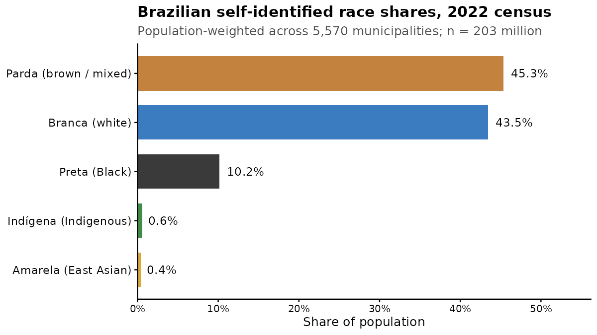
The numbers indicate a mixed country leaving towards European ancestry. This is true from genetic studies, but there is a lot of ancestry variation within those categories. Also interesting is the East Asian presence. Many people don’t know that Brazil hosts quite a lot of Japanese migrants. The maps of these groups look like this, the Whites:
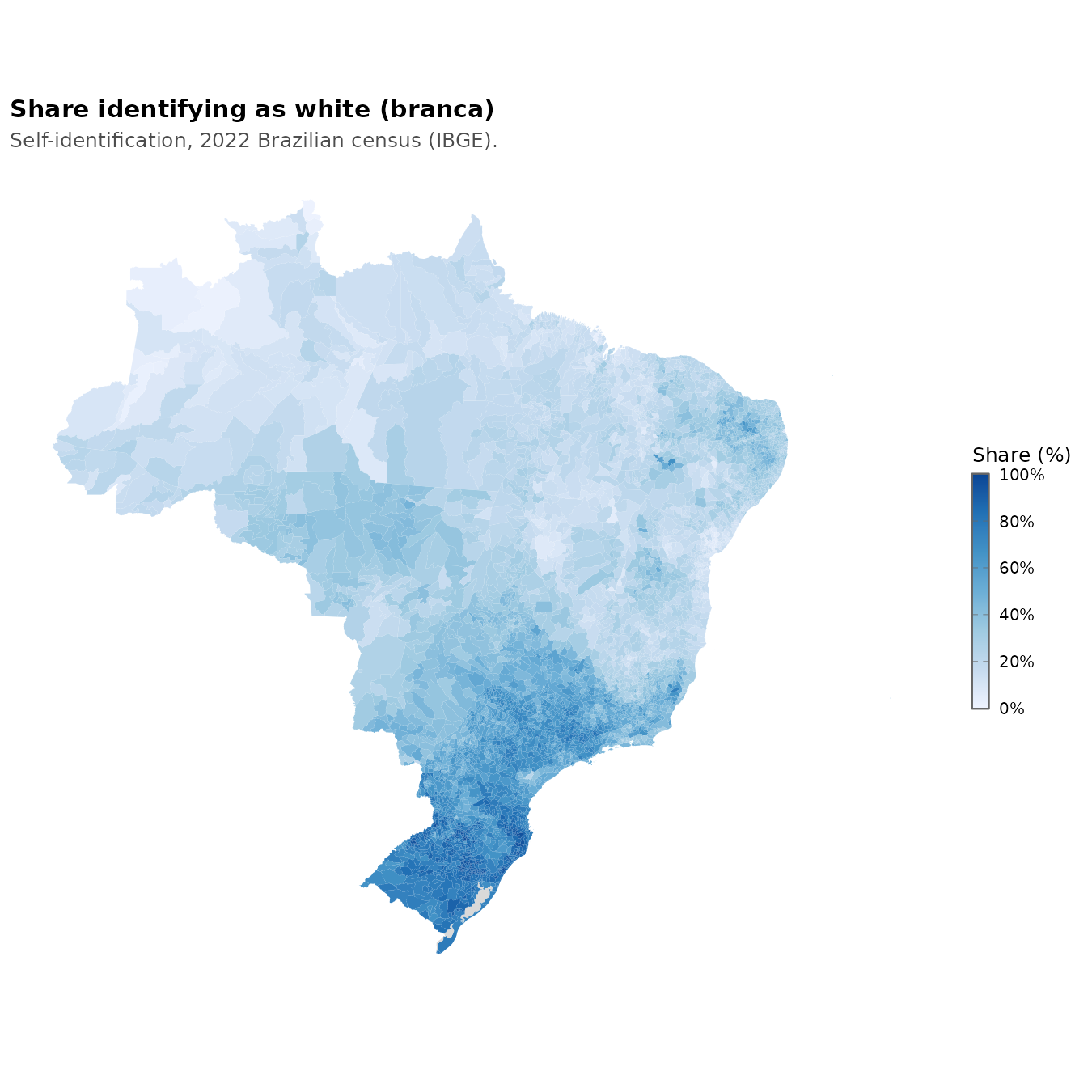
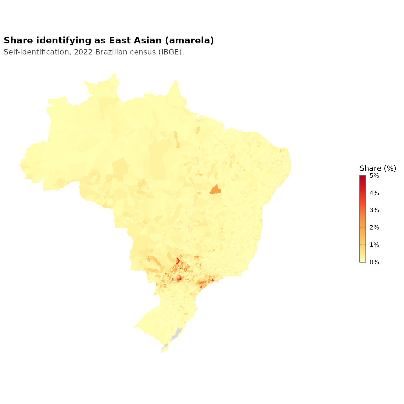
They live mainly in the southern part, part of the southern cone. They share this mostly with the Asians, the yellows:
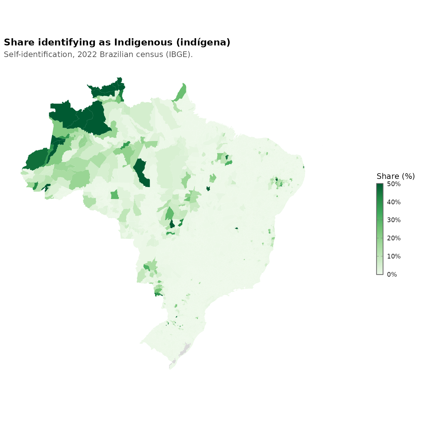
Given that this is the land of the Amerindians pre-Columbus, a lot of people have Amerindian ancestry, but those that identify that way as their primary ancestry mainly live in the far northwest rainforests:
The Blacks, the descendants of slaves, are to be found on the eastern coast, closest to Africa where they came from:
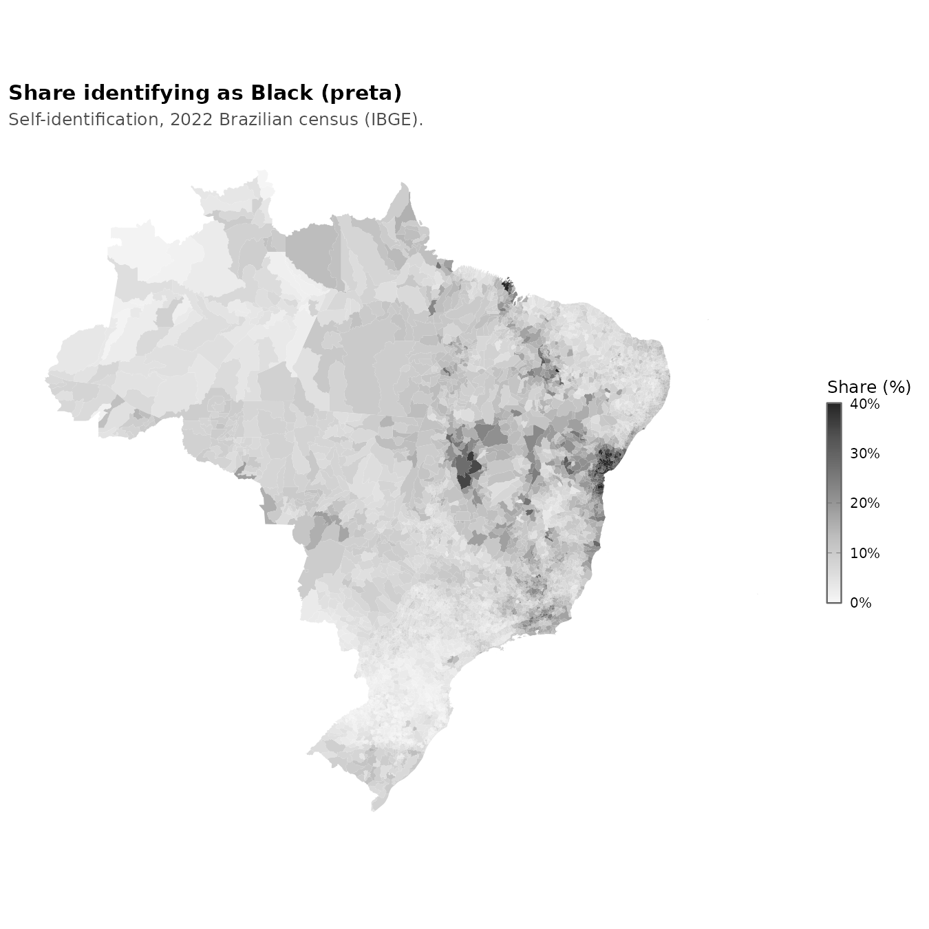
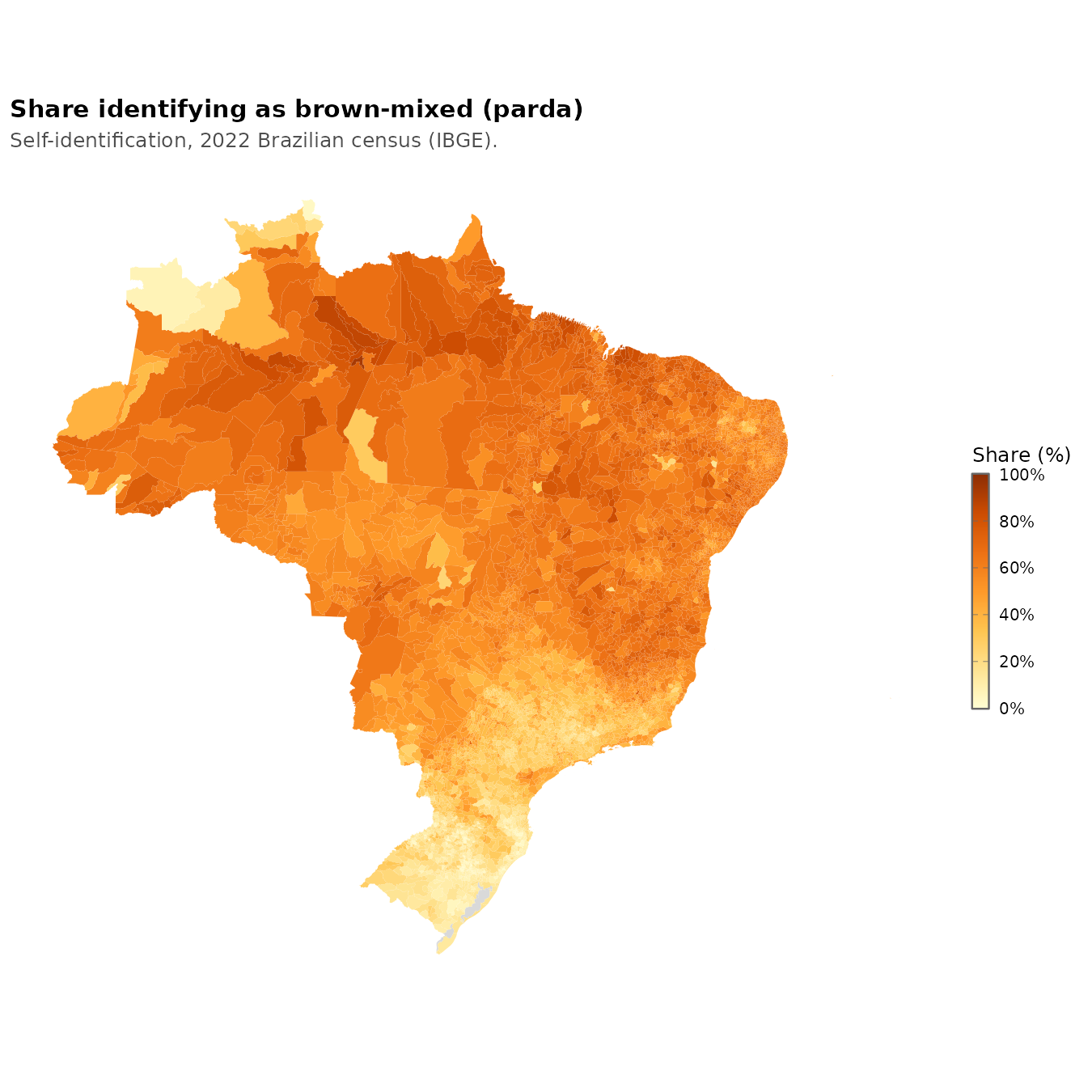
I was surprised there were not more of them in the northeastern tip. The remaining brown-mixed group is found everywhere but in smaller proportions where there are many Whites and Amerindians:
The Brazilian government supplies us with a Human Development Index-like score for each municipality:
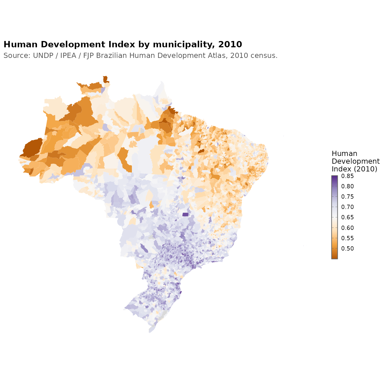
This is a bit dated because the 2020 cycle has not yet been released. We can however also estimate this socioeconomic status using the questionnaires given in the ENEM:
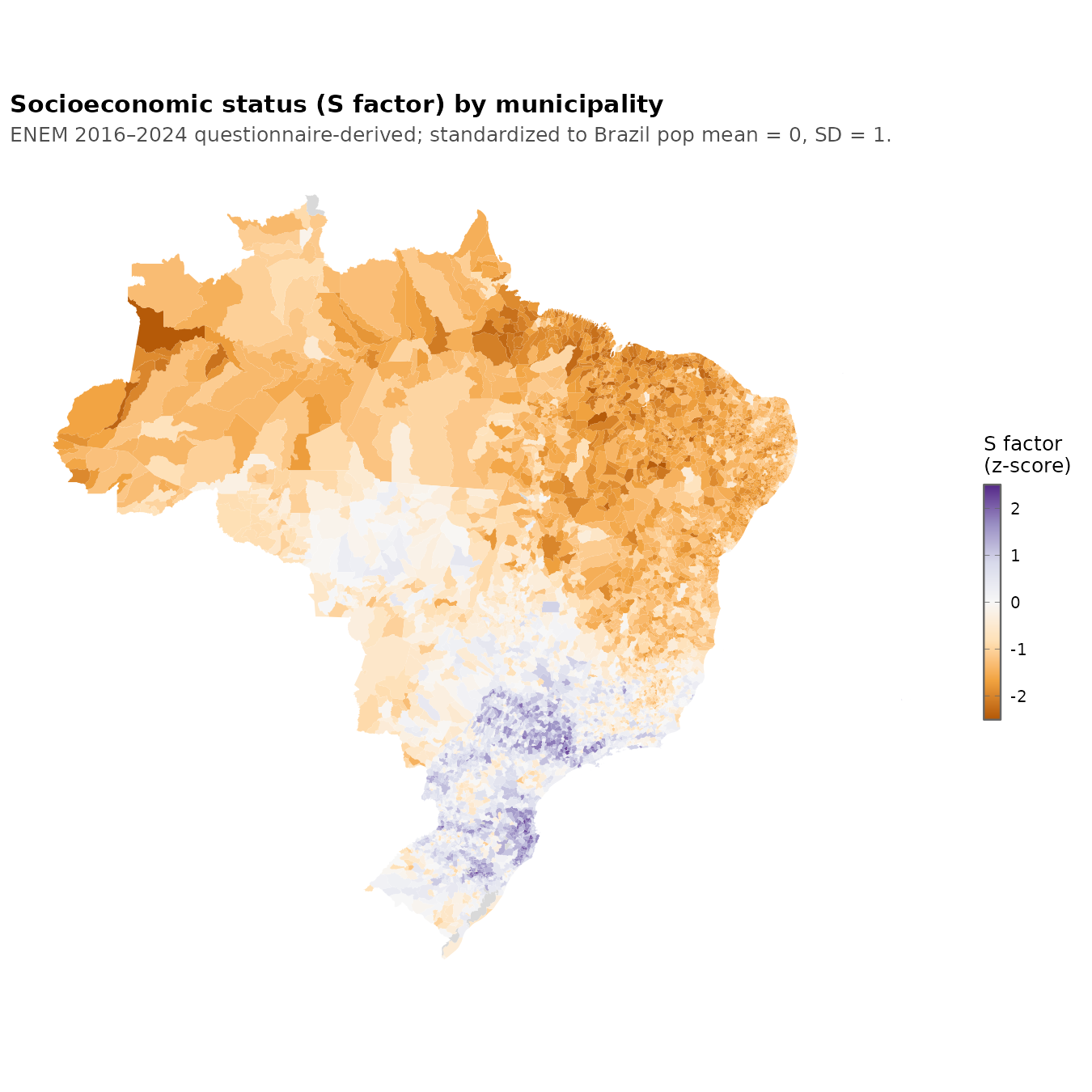
The maps look about the same, and the correlation is strong:
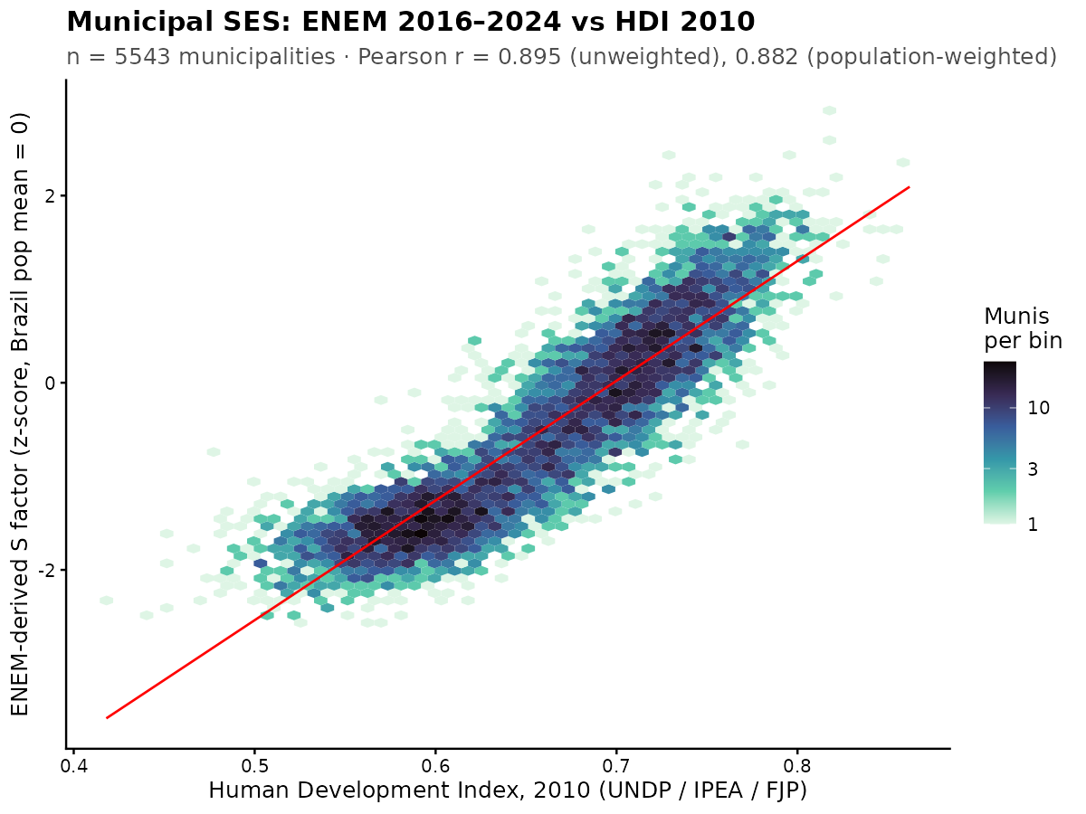
The nonlinearity arises because HDI itself is a suboptimal metric. It is not a true factor score based on 3 indicators (education, health, income) because it uses a non-standard kind of average, the geometric mean, and does nonlinear rescaling because they want to keep the metric on 0-1 scale for whatever reason. This aside, the correlation is about 0.9.
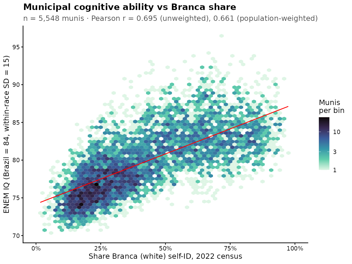
Regarding intelligence, or cognitive ability more broadly speaking, we can aggregate data from the various tests into municipalities. However, some of them are more fitting than others. The older ages are suboptimal because they involve selected students, who didn’t drop out of school, and sometimes moved from their hometown to pursue education. Here’s the IQ map of Brazil using the ENEM test: 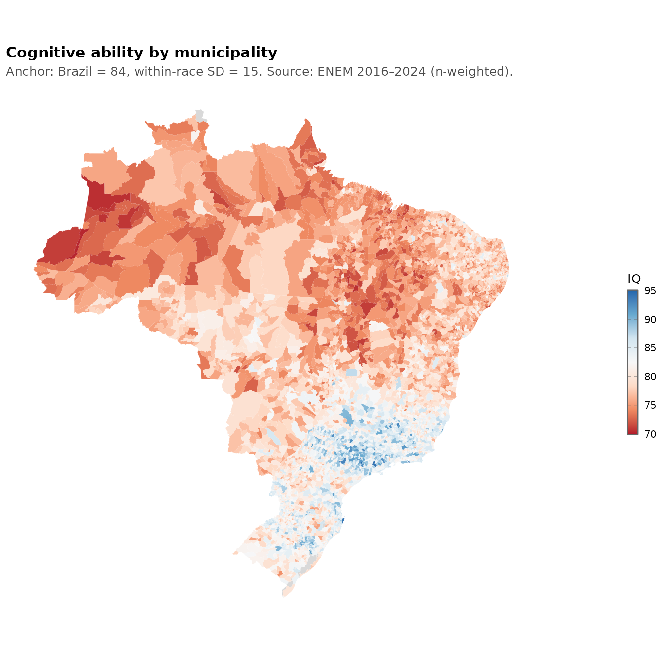
I’ve set the scores in tentative international IQ (British norms) using Brazil’s mean IQ and the Brazilian Whites assumed to have SD = 15. This scaling may be inaccurate, so buyer beware. The results suggest that southern parts of the Brazil should be fairly similar to parts of Spain, Portugal, Greece and so on in their level of development. Are they? Using the 2010 HDI values, yes, they are reasonably close. The highest IQ most White Brazilian municipalities are about 0.82 HDI, which was also true for southern Europe in 2010, e.g. the motherland Portugal was at 0.83. But this is only true when looking at the top tier municipalities, none of the states reach this level except for the capital (0.82).
The correlations between these variables are:
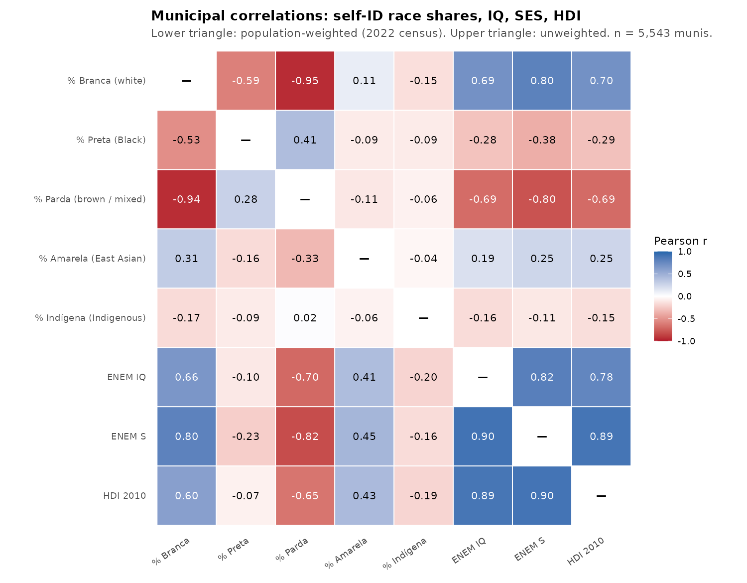
White and Asian (yellow) population %’s are correlated with positive outcomes, while mixed% is negatively correlated, and Black% only slightly negatively so. However, correlations reflect the variation in variables and their intercorrelations. Better is a regression model:
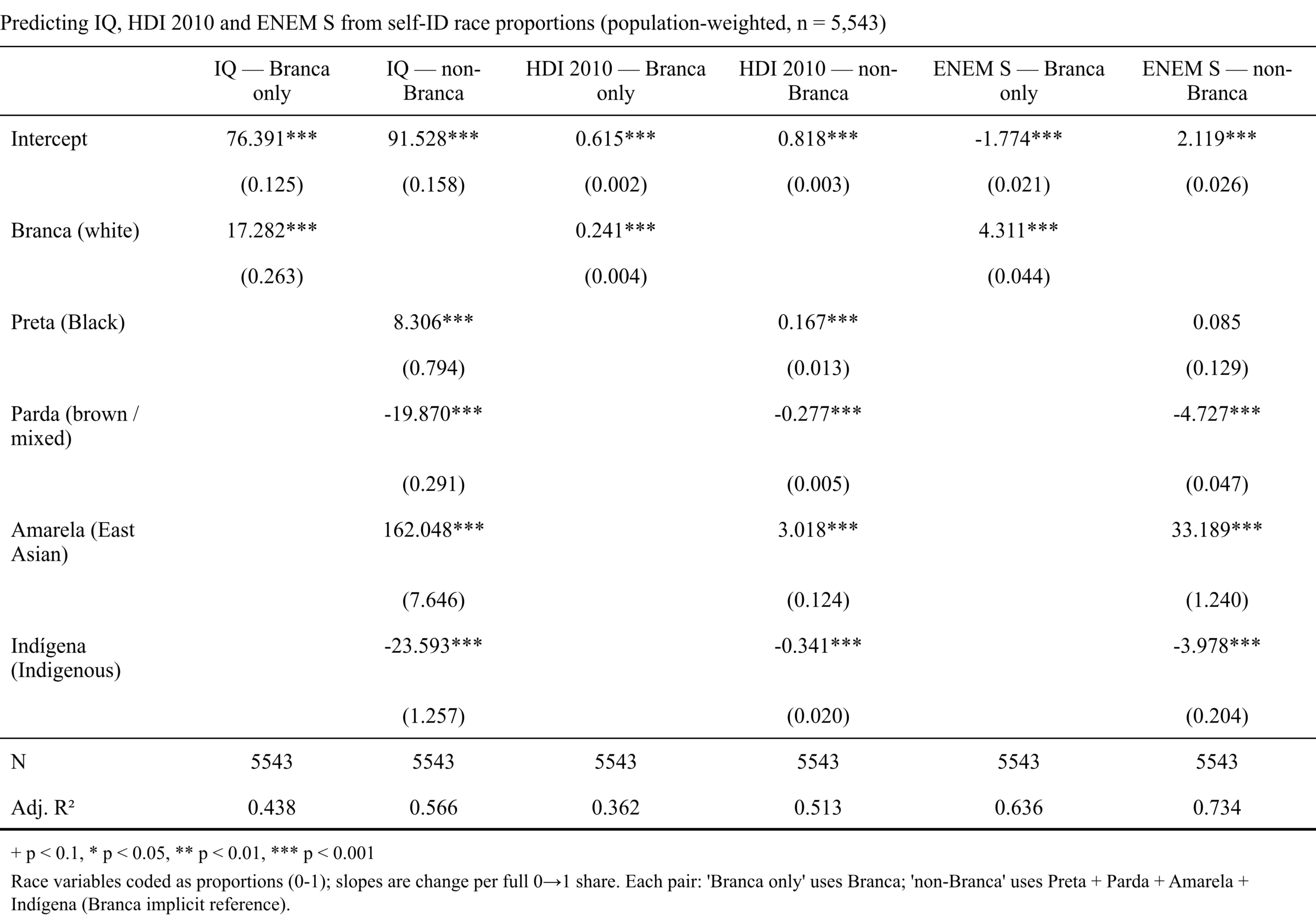
I left the variables in their natural units and used the unstandardized betas. The values for the slopes thus represent the effect of going from 0% to 100% for a given population. For instance, going from 0% to 100% East Asian (from 100% White) predicts a gain of … 162 IQ. Clearly, something is amiss with this kind of model. One could say maybe this is because it is extrapolating to 100% from a range of only 0 to 11%, but Black% also suggests +8 IQ, while mixed (with Black%) suggests -20 IQ.
OK, maybe spatial dependency issues is our problem. Here are the full models but using the spatial error model. This model allows neighboring areas to have correlated errors. What it really means is that if there are some unobserved causes of variation in these variables that is spatially autocorrelated (geographically clustered), we can indirectly control for them using the spatial data. Using this kind of model is usually a very good idea for such aggregate data which invariably shows spatial clustering. Results:
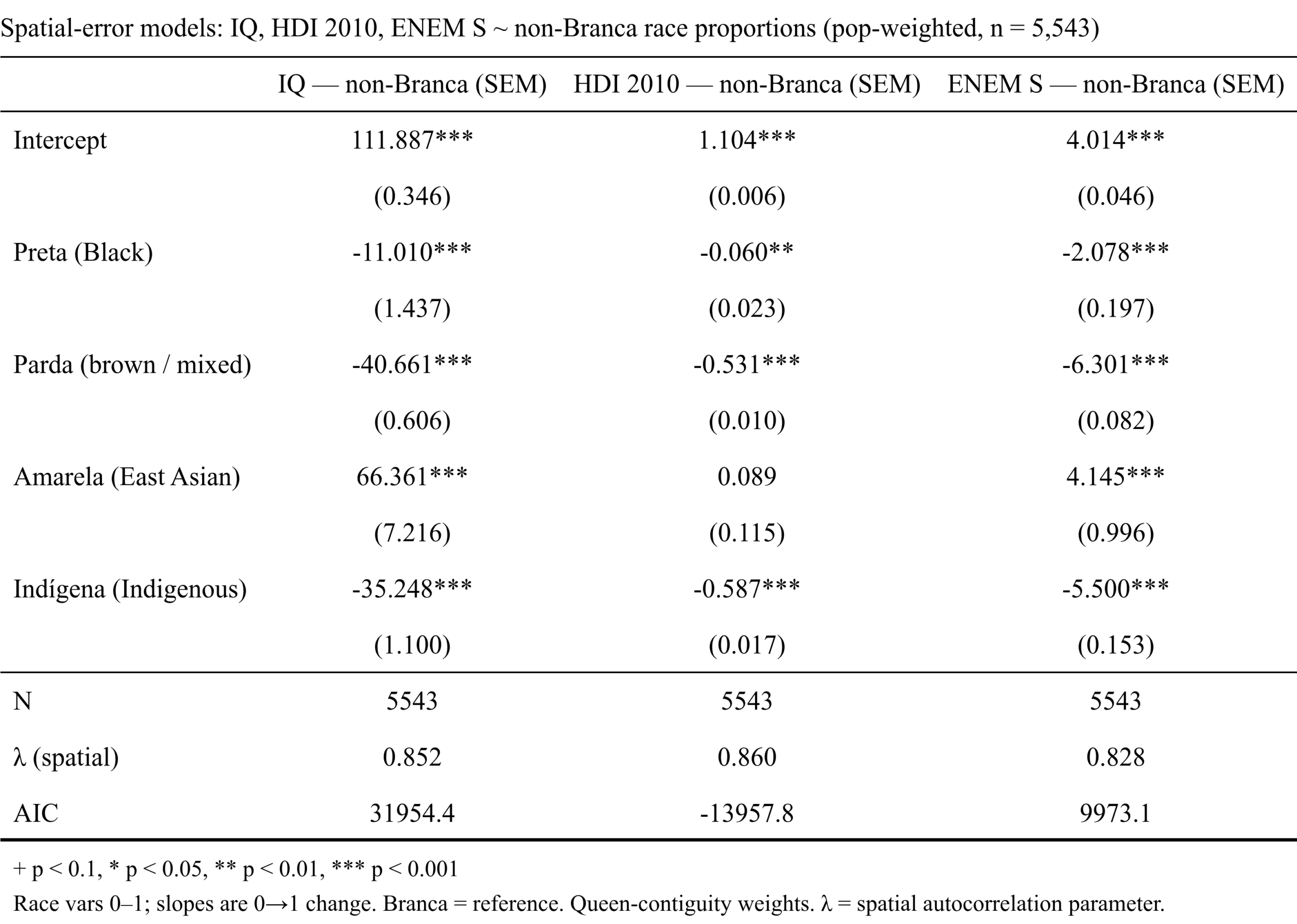
The results became more sensible, but not satisfactory. Hypothetically, going from 100% White to 100% East Asian now only predicts 66 IQ gain down from 162 IQ. On the other hand, the mixed% slope increased from -20 to -40 IQ. The Black% was also turned negative, as is expected. It was an improvement, but the results are not great.
Trying to figure out ethnic means using this way is fraught with issues, but we can also just use the direct approach since we have subject data. So here’s the ENEM means by self-id race and subject:
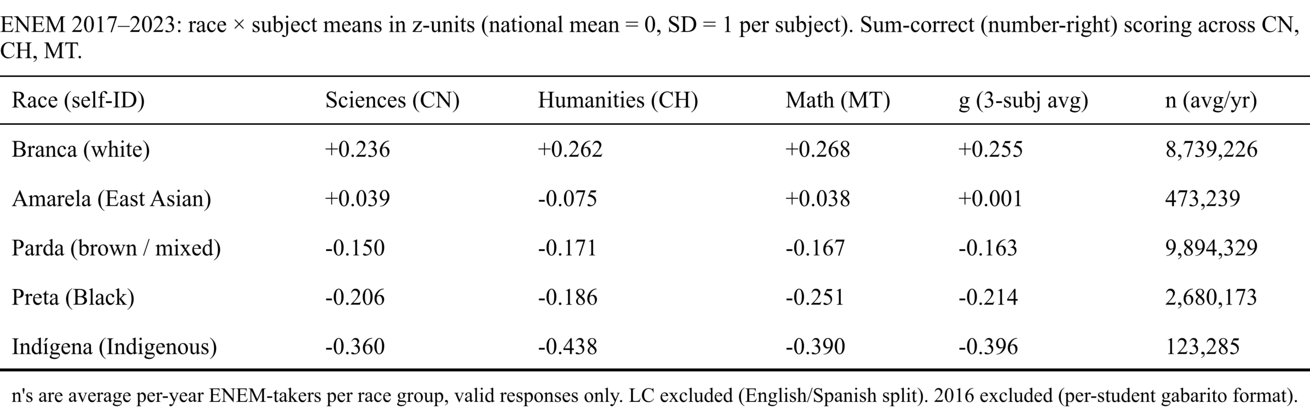
National mean set to 0, SD = 1. Thus we see the unexpected result that Asians perform below the Whites at the individual level by something like 0.25 national SD units. General gap sizes are not as large as those seen in other countries with nominally the same groups. One reason for this is that ENEM is for secondary school students who intend to go to university, so it is a selected sample. We can turn to the SAEB instead in which participation is mandatory and it is also given at younger ages:
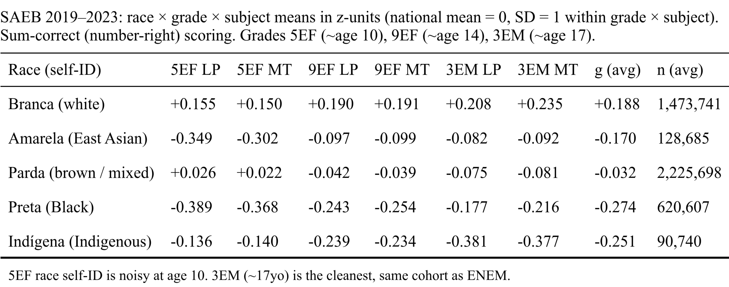
Curiously, the Asian disadvantage is larger here. It seems very mysterious. I mean, it is possible that Japanese Brazilians are very negatively selected to the point where they cannot even outperform the Brazilian Whites, but there is actually something else going on that’s more mundane. The problem is that very few people are actually East Asian and should press the “yellow” category. But humans make mistakes, and children more mistakes. Given how few Asians there are in Brazil, it is possible that the majority of “yellows” are actually not Asians at all, but errors. We can see this by looking at the distribution by age and test:
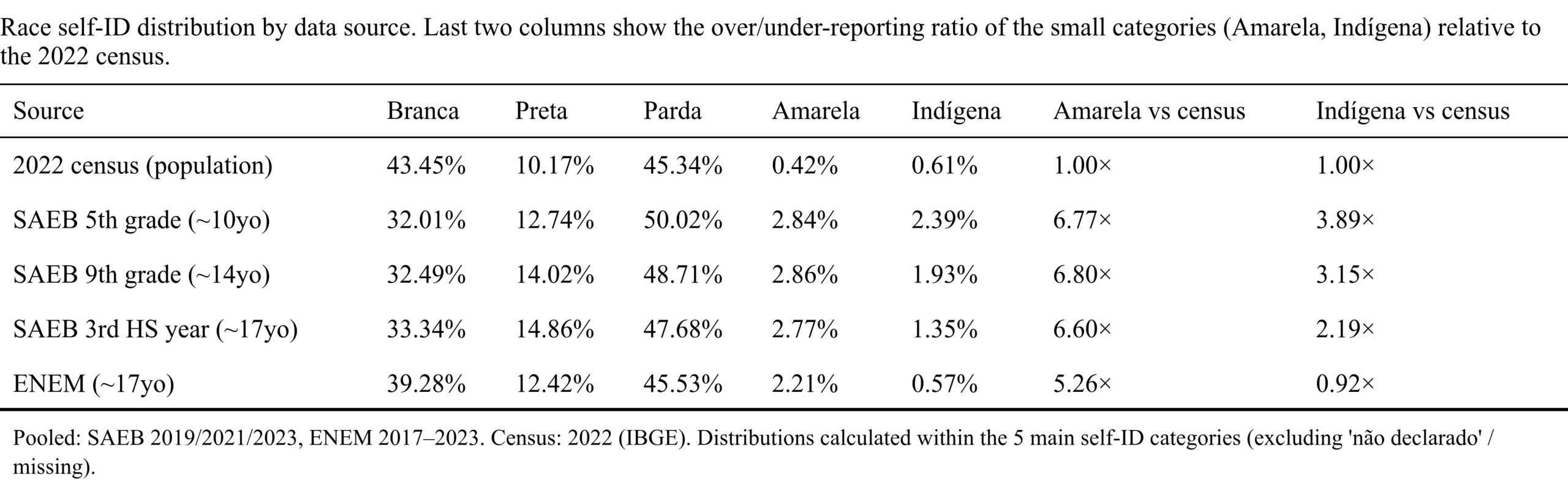
The census shows 0.4% Asians but these tests show 2.2-2.9% Asians. Unless there’s a large amount of new Asian migration to Brazil or Asians have a surprisingly high fertility rate, these numbers can’t be right and must instead reflect errors. In a simple model, if X % of students click at random adding to the Asian%, then assuming the census data are correct, we have to posit that about 10-15% of students click at random. That’s a quite high error rate, but this is Brazil after all.
There is a way to test this error model. We can look at Asian performance in the areas where there are many actual Asians (which we can confirm with other sources) meaning that those self-identified Asians are much more likely to be real Asians, compared to plausibly falsely reported Asians in other areas:
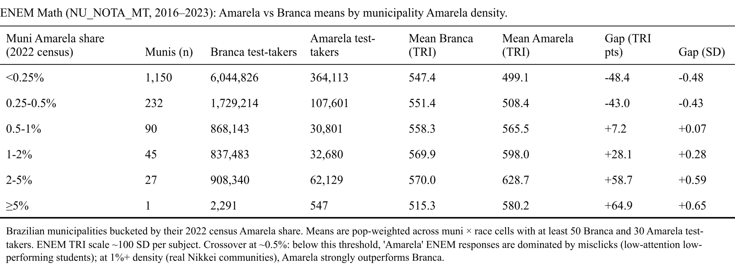
The table bears out the model well. Something like 80% of those who clicked yellow are from areas the census shows there are fewer than 0.25% Asians, and their mean score is about 0.5 SD below Whites in the same area. As we change to areas with more known Asians, the gap quickly narrows and becomes positive and substantial, at least 0.5 SD for the 2%+ Asian areas. Thus, the Asians aren’t underperforming at all, rather it’s a sneaky measurement issue! 8 years ago, I summarized some studies that used children’s names to investigate ancestry and cognitive performance in Brazil. These also showed Asian performance was above par:
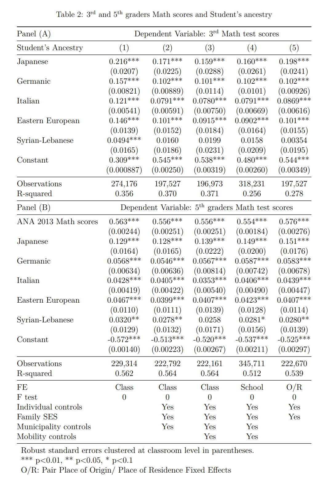
Not exactly obvious how to convert these coefficients to the values we obtained above, but at least we can be confident that more accurate measurement than our Asian% in the municipality proxy method also shows the Asian advantage, as well as for other groups. The reference is Iberian (Spanish/Portuguese) names, so their model suggests having Japanese surname predicted about 3.3 IQ higher score in math in grade 3, and 2.4 IQ for German last name. Suspiciously, they have left out any underperforming other groups, and in general the paper only talks about cultural effects, not genetics.
Anyway, this just about sums up the results. The aggregate regression results are somewhat messed up, possibly in part because of the incorrect race assignments of students. The spatial error model reduced the issues, but not entirely. The race gaps at the individual level were initially confusing for the Asians, but it was due to measurement issues. After that, things seem to work out about the same in Brazil as they do everywhere else.
Some leftover plots for those looking for things to post online. White% -> HDI:
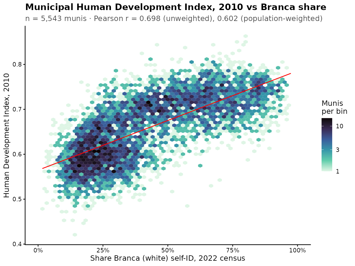
It shows the same nonlinear form as before. White% -> S factor from ENEM:

The nonlinearity is now smaller.
White% -> ENEM g:
One could also show the others but generally single variable scatterplots work best with the largest categories. Since Brazil has 2 categories of about even size (White and Mixed/Brown), there is little reason to duplicate them here. The smaller fractions will not show anything sensible (refer back to the correlation matrix).
