There are hundreds of values tests on the internet. Almost all of these are theory-based also known as made-up dimensions. These are dimensions that one could think of, make some questions for (that correlate positively), but they may not exist as factor variables in real data. Real life data are usually fairly boring, since the first dimension you find is always a left-right scale using whatever features that are currently culturally relevant at that time and place. A perhaps more sophisticated idea is to look at a large international dataset of such values, perhaps they can reveal something more worthwhile. That is the point of the World Values Survey, Hofstede’s cultural dimensions and the like. They like to present their results like this:
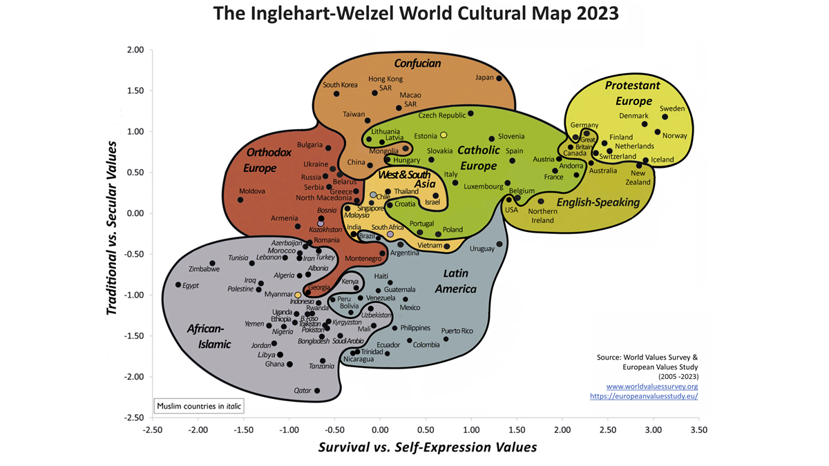
Despite being based on a large international dataset, the dimensions are in fact not ‘supported by’ the data as such (in the exploratory factor analysis sense). They are just arbitrarily defined as the 2 factors from a curated list of items. You can read about that on the website for WVS:
The two dimensions have been created by running factor analysis over a set of ten indicators. The ten indicators used (five to tap each dimension) were chosen for technical reasons: in order to be able to compare findings across time, we used indicators that had been included in all four waves of the Values Surveys. These ten indicators reflect only a handful of the many beliefs and values that these two dimensions tap, and they are not necessarily the most sensitive indicators of these dimensions. They do a good job of tapping two extremely important dimensions of cross-cultural variation, but we should bear in mind that these specific items are only indicators of much broader underlying dimensions of cross-cultural variation [Source: Chapter 2 from Inglehart, R & C. Welzel. 2005. Modernization, Cultural Change and Democracy: The Human Development Sequence. New York: Cambridge University Press].
Since these data are publicly available, I decided to download them and try again using a theory-neutral approach. The WVS data has to be merged with the European Values Sutdy (EVS) to obtain data from the list of countries above (some European countries did not participate in WVS). After filtering to the common pool of items, we are left with only 44 common value items (asked in every country). Some items of high relevance are unfortunately missing, those dealing with homosexuality, because a few Muslim countries don’t allow researchers to ask these in surveys (shame on Egypt, Tajikistan, Uzbekistan, Iran). Moving forward with the 44 items with complete coverage for 92 countries (156,658 people), we can plot our trusty parallel analysis to get an idea of how many factors we could maximally extract:
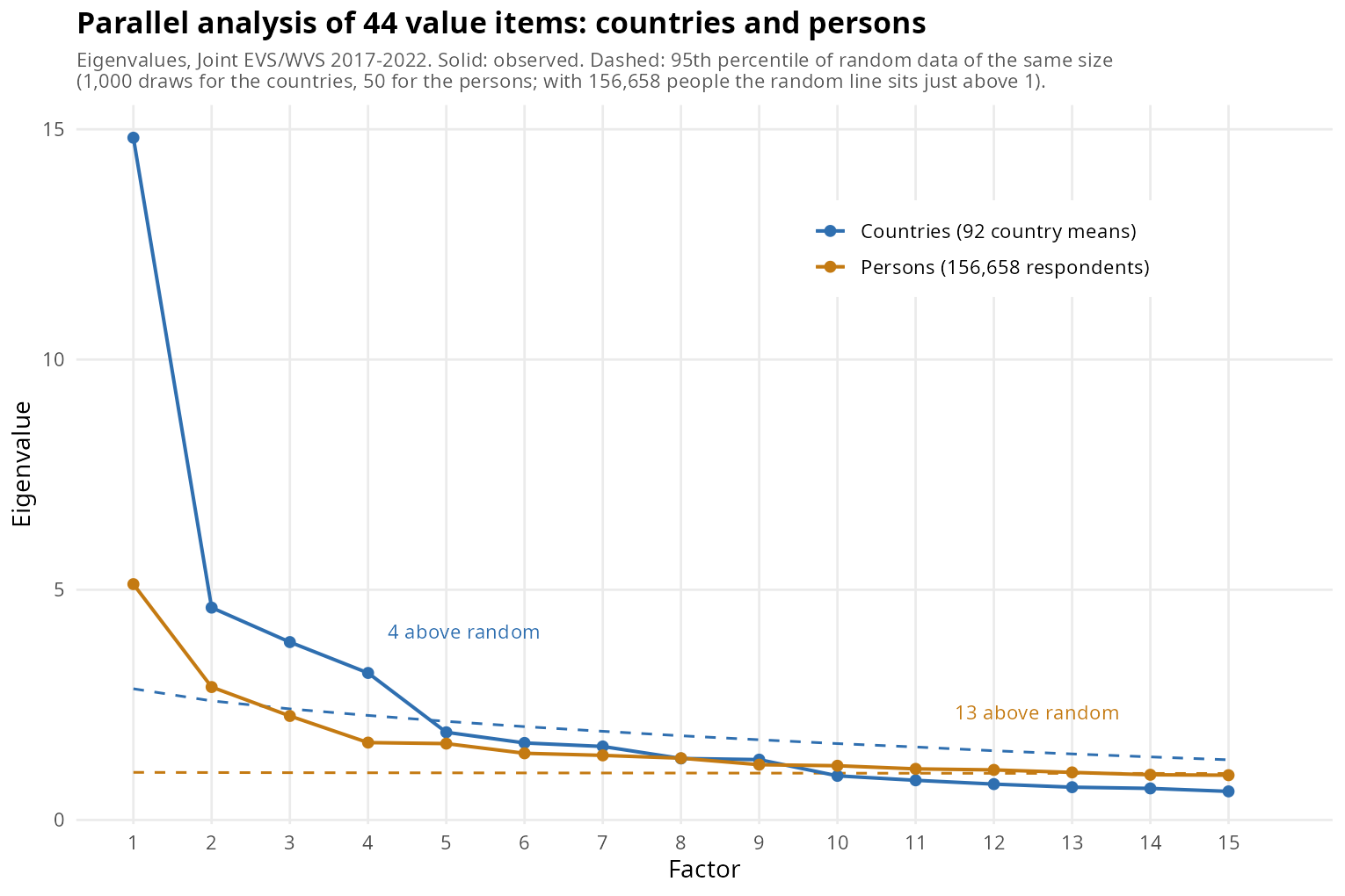
So depending on whether we analyze averages by country (so 92 units) or persons (100k+) we get either a maximum of 4 or 13 factors. Due to aggregation issues, there is no guarantee these dimensions are even the same. It is not so uncommon that directions of association differ between levels of analysis. For instance, within a country, obesity correlates slightly negatively with intelligence (presumably becoming weaker because of GLP-1 drugs), but between countries the correlation is very strongly positive, as economic development is caused by intelligence and also makes food cheap and abundant to the point where many become obese (East Asians aside). As such, if one wanted to score a kind of social status general factor, then fitting it on individuals within countries would find a slightly negative factor loading and between countries would find a very strong positive loading. In general, though, levels of analysis agree and usually the country-level correlations are stronger and in the same direction as the person-level.
With regards to the above, I used the person-level data for more reliable results and because I wanted to score persons, not just countries. So how many factors to extract? I decided to retain factors which would be scored with a reliability of at least 0.70. This is a low standard, and the last factor is based on only 2 items, which is not great either. Honestly, one could have gone with the 5-factor solution as well, but I decided to include the 6th factor out of interest. Again, deciding on what factors to retain is not exact science, but depends on the goals of the researcher. In this case, I wanted a multi-dimensional scale that would produce interesting and at least somewhat reliable results. Looking at the resulting 6-factor solution, the dimensions were:
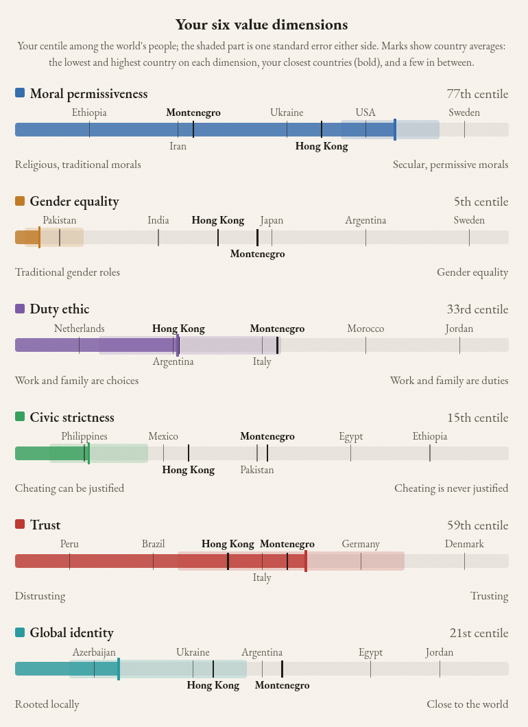
Amusingly, my own results suggest I am less sex egalitarian than the average Pakistani! Since I am not even religious let alone Muslim, it is hard to believe. The items that set me apart were:

I think the first one is fairly likely to be true given men’s extreme dominance under meritocratic hiring and even despite strong pro-female bias in the West. University is more important for boys mainly for the reason that women tend to study more useless stuff and for longer. Even female medical doctors commonly fail to make a return on investment on their medical degrees because “the median female physician simply doesn’t work enough hours to amortize her upfront investment in medical school”. American women fail to pay back their university tuition loans:
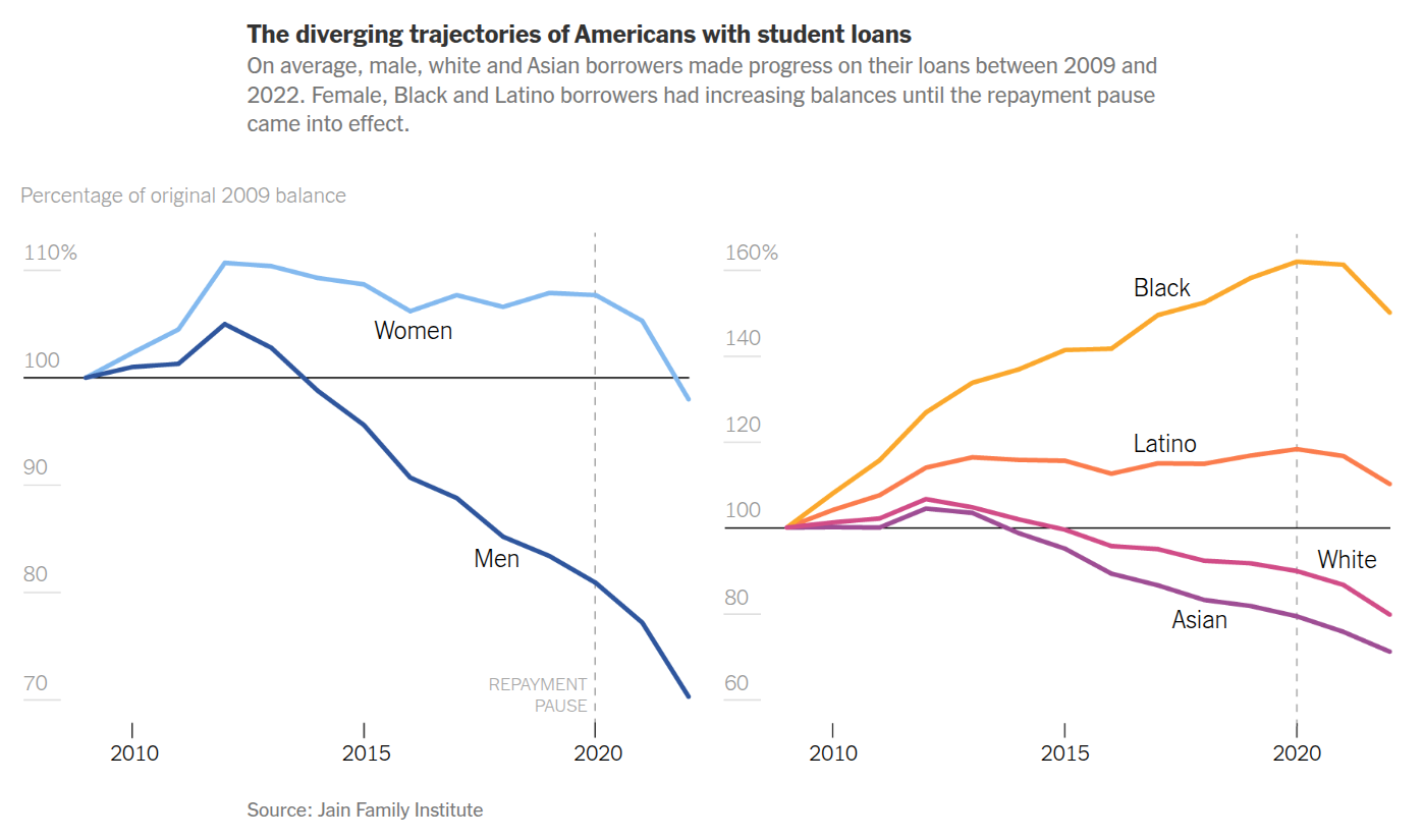
This extremist research has been popularized by the well-known far-right think tank The New York Times. One can also see that Blacks and Latinos should cut back on education spending.
The last question is a simple matter of family formation. If jobs are too scarce to support a dual income family, then let the man work, since he is likely to make more money, enjoy it more, and the women can focus on family matters. In a world of still falling sub-replacement fertility, this makes a lot of sense. Indeed, we already know that despite what Westerners say on the survey, they make the same decision when taking paid parental leave, and politicians have been forcing the men to take some of it in several countries to the detriment of the families. Anyway, the question talked about a right, which sounds like a legal right, and I am not keen on such an approach so I ended up picking “Neither”, which was still extreme by Scandinavian standards. As such, my responses are in line with the science and common sense, even if they ignore the gist of what the questions are getting at. If they had instead just asked people whether women should be banned from university education etc., then I would appear like a normal Westerner. Specific item choices can be important for results!
What about the famous 2 dimension plot that the World Values Survey people produced? Can it be recovered from a theory-neutral approach? Well, sort of. In my analysis, I let the dimensions covary, as value dimensions may do. Why does this matter? Well, when plotting the 2-dimension map of countries, it is somewhat of an implicit assumption of the plot that the dimensions sitting on X and Y are not themselves correlated. This is not really true unless we force them to be uncorrelated (orthogonal rotation as in PCA). The value data is similar to the intelligence data in that if we fit oblique rotations (potentially correlated factors), then the general traditionalism-modernism (left-right in slight disguise) dimension gets split up into its components, and the general factor will appear as a 2nd-order factor instead. We can avoid this by using an orthogonal rotation, in this case just PCA for simplicity. Doing this gives us these maps:
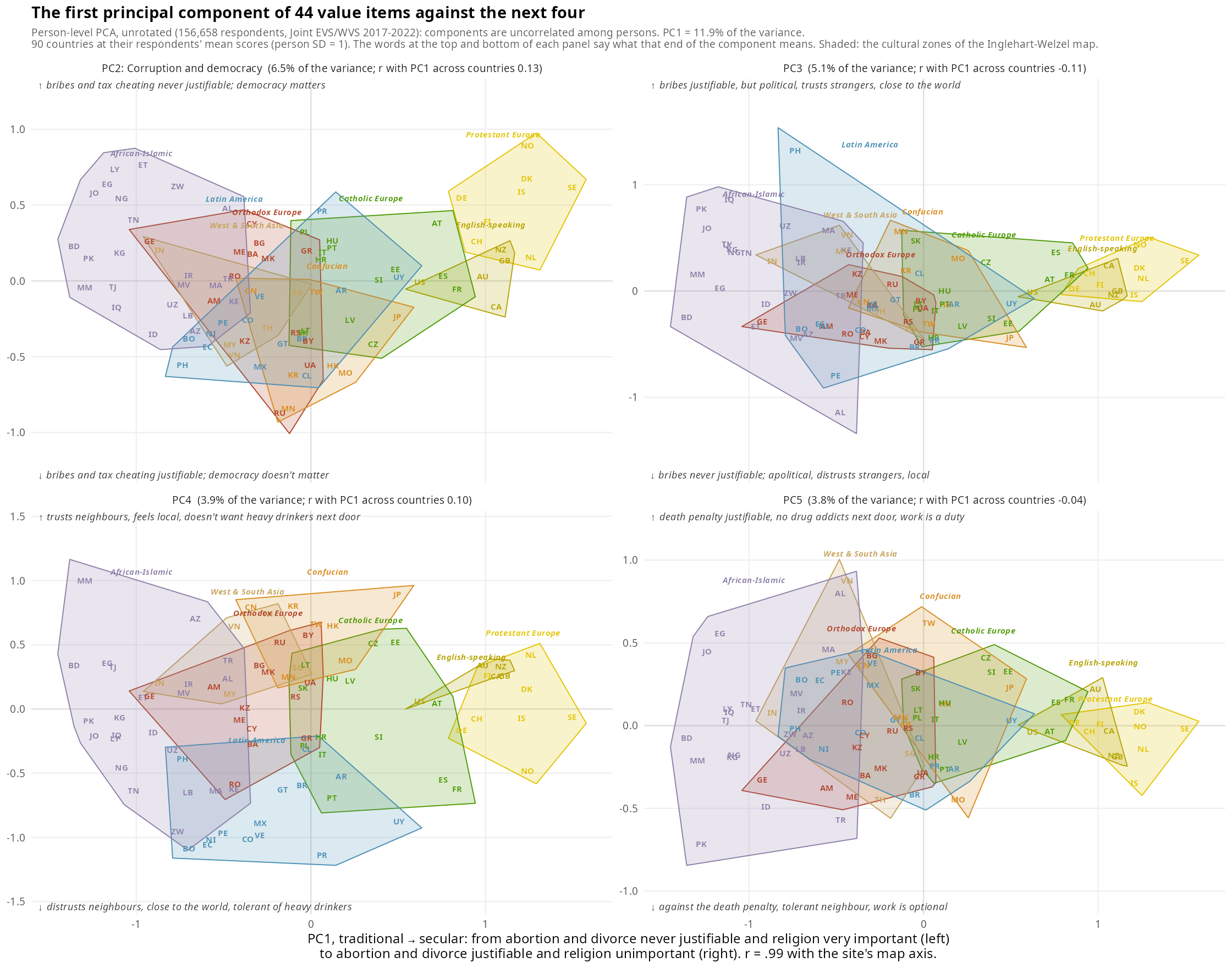
Scandinavians are at the top of the secular morality dimension with Sweden in a clear number 1, while the African-Islamic countries are on the other end. This won’t surprise you. Dimension 2 concerns corruption and democracy. Scandinavians are high again, but so are some Africans. The latter is odd given the prevalence of corruption there. Or maybe it is not so strange. After all, if corruption is prevalent, presumably a lot of citizens develop a dislike of it, even if they would also do it themselves if they could. Dog eat dog world. The other dimensions are somewhat harder to interpret without help so here’s a table:
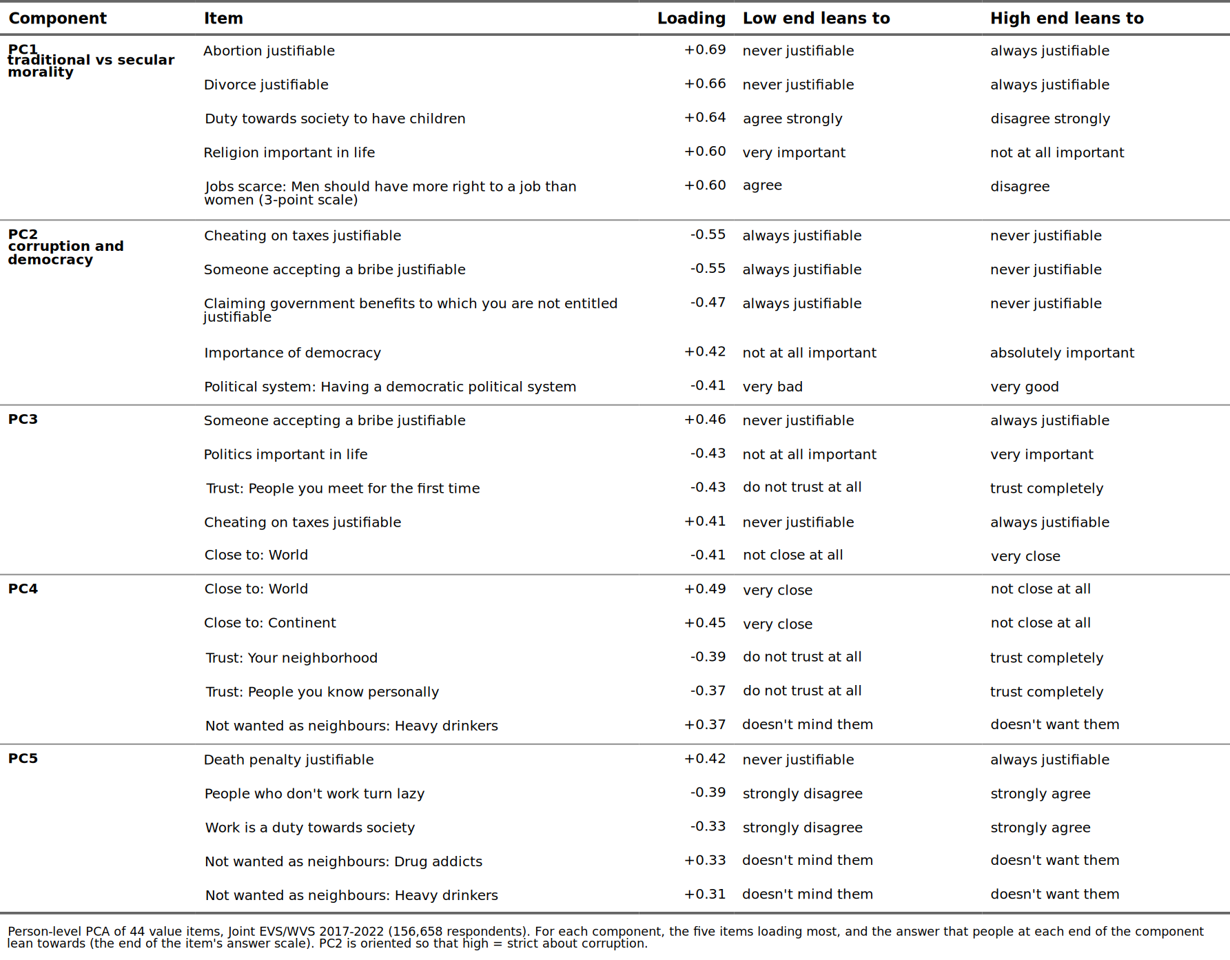
Honestly, the other dimensions don’t always make sense. PC4 is a kind of my-local-people vs. globalism dimension.
I tried a variety of other approaches, but nothing I tried could make a neat, wholly scientifically satisfactory 2-dimensional plot. So what I ended up showing on the site is the 2nd-order modern values scale (from the 3 first factors, .99 correlated with PC1 as well), and interpersonal trust on the second dimension:
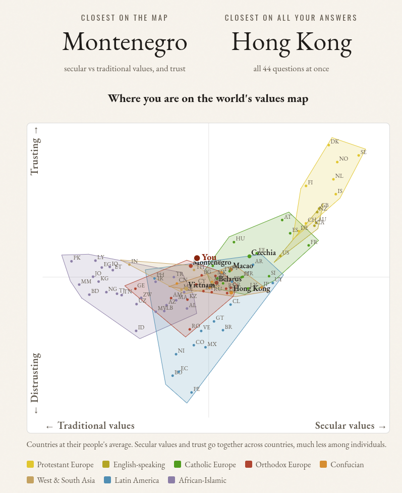
In terms of best fit for a country, the question is not really which country you sit closest to on a 2-dimensional map (whatever version of it we use), but how you place in all the 44-dimensions relative to country means. This 44-dimensional space is not something we can mentally visualize, but computing your position relative to countries is a trivial mathematical exercise. It turns out the country for me is Hong Kong:
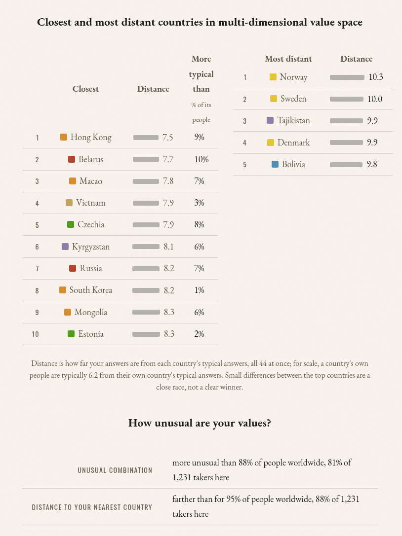
However, we can see that the distances are somewhat close. I’ve never been to HK, Macao, Belarus, Vietnam etc., so it would seem a strange match. Amusingly, Denmark is one of the most distant matches to me! Clearly, this is not true if one used more sensible measures.
Finally, at the bottom, there are 2 metrics for how unusual your responses are, taken together. The first one is how unusual your responses were relative to what the 6-factor model predicts (mean absolute residual of responses predicted from your 6 factor scores). The second one is based on how far you are from the nearest country compared with other users. These are related metrics, but the first assumes a particular structure of the dataset, the second does not. They correlate about .70 in the norm data.