It is often said that polygenic traits are based on tons of causal variants each of which has a very small effect size. What is less often discussed is the distribution of these effect sizes, although this has some implications.
The first statistical importance is that we may want to modify our hyperprior if using a Bayesian approach. I’m not sure what the equivalent solution would be using a frequentist approach. I suspect the Frequentist approach is based on assuming a normal distribution of the effects we are looking at and then testing them against the null hypothesis, i.e. looking at p values. Theoretically, the detection of SNPs may improve if we use an appropriate model.
The second implication is that to find even most of them, we need very, very large samples. The smaller effects probably can never be found because there are too few humans around to sample! Their signals are too weak in the noise. One could get around this by increasing the human population or simply collecting data over time as some humans die and new ones are born. Both have problems.
But just how does the distribution of betas look like?
However, based on the current results, just how does the distribution looks like? To find out, I downloaded the supplementary materials from Rietveld et al (2013). I used the EduYears one because college is a dichotomized version of this and dichotomization is bad. The datafile contains the SNP name (rs-number), effect allele, EAF (“frequency of the effect allele from the HapMap2-CEU sample”), beta, standard error and p value for each of the SNPs they examined, N=2.3 x 10⁶.
From these values, we calculate the absolute beta because we are interested in effect size, but not direction. Direction is irrelevant because one could just ‘reverse’ the allele.
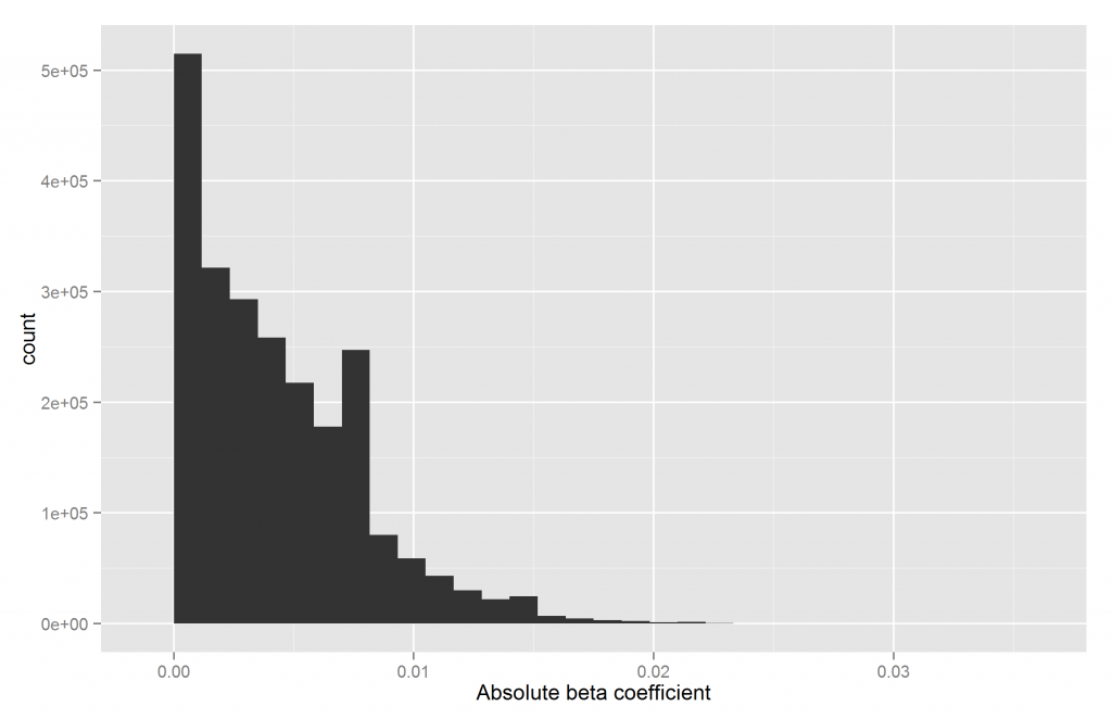
One can plot the data in various ways. Perhaps the most obvious is a histogram, shown below.
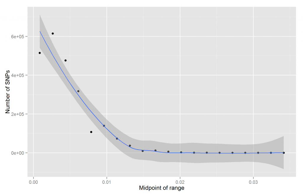
We see that most SNPs have effect sizes near zero. Another way is to cut the betas into k bins, calculate the midpoint of each bin and the number of betas in them.
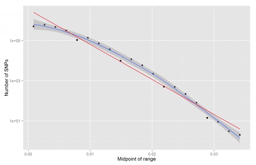
The result is fairly close to the histogram above. It is clear that this is not linear. One can’t even see the difference between the numbers for about half the bins. We can fix this by using logscale for the y-axis:
We get the expected fairly straight line. It is however not exactly straight. Should it be? Is it a fluke? How do we quantify straightness/linearity?
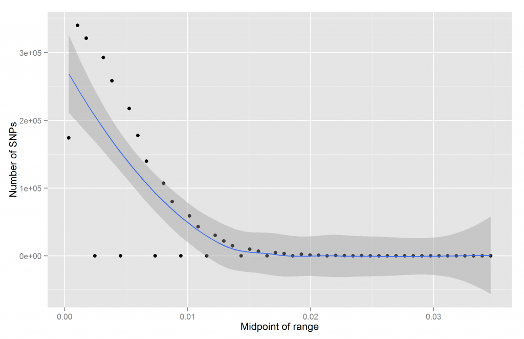
Perhaps if we increase our resolution, we would see something more. Let’s try 50 bins:
Now we get a bizarre result. Some of them are empty! Usually this means sampling, coding, or data error. I checked and could not find a problem on my end and it is not sampling error for the smaller betas. Perhaps they used some internal rounding system that prevents betas in certain regions. It is pretty weird. Here’s how the table output looks like:
> table(r$cut_50)

(-3.5e-05,0.0007]   (0.0007,0.0014]   (0.0014,0.0021]   (0.0021,0.0028]   (0.0028,0.0035]   (0.0035,0.0042]
           174315            340381            321445                 0            292916            258502
  (0.0042,0.0049]   (0.0049,0.0056]   (0.0056,0.0063]    (0.0063,0.007]    (0.007,0.0077]   (0.0077,0.0084]
                0            217534            177858            139775                 0            107282
  (0.0084,0.0091]   (0.0091,0.0098]   (0.0098,0.0105]   (0.0105,0.0112]   (0.0112,0.0119]   (0.0119,0.0126]
            80258                 0             58967             42998                 0             30249
  (0.0126,0.0133]    (0.0133,0.014]    (0.014,0.0147]   (0.0147,0.0154]   (0.0154,0.0161]   (0.0161,0.0168]
            21929             14894                 0              9733              6899                 0
  (0.0168,0.0175]   (0.0175,0.0182]   (0.0182,0.0189]   (0.0189,0.0196]   (0.0196,0.0203]    (0.0203,0.021]
             4757              3305                 0              2535              1322               912
   (0.021,0.0217]   (0.0217,0.0224]   (0.0224,0.0231]   (0.0231,0.0238]   (0.0238,0.0245]   (0.0245,0.0252]
                0               502               319                 0               174               133
  (0.0252,0.0259]   (0.0259,0.0266]   (0.0266,0.0273]    (0.0273,0.028]    (0.028,0.0287]   (0.0287,0.0294]
                0                85                47                33                 0                14
  (0.0294,0.0301]   (0.0301,0.0308]   (0.0308,0.0315]   (0.0315,0.0322]   (0.0322,0.0329]   (0.0329,0.0336]
                5                 0                 4                 2                 0                 1
  (0.0336,0.0343]    (0.0343,0.035]
                1                 1
Thus we see that some of them are inexplicably empty. Why are there no betas with values between .0021 and .0028?
We can try investigating some other number of cuts. I tried 10, 20, 30, 40 and 50. Only 40 and 50 have the problem. 30 is fine:
The pattern at the 50% higher resolution (30/20=1.5) is still somewhat curved, although probably not with a low p value.
Frequency-corrected betas?
An idea I had while writing this post. Correlations and other linear modeling is affected by base rates as well as betas. Unless they corrected for this (I don’t remember), then some of the SNPs with lower betas probably have stronger betas but they appear to be weak because their base rates are too high or too low. One could correct for this restriction of range if desired which may change conclusions somewhat. What this would do is to estimate the betas of the SNPs if they all had the same frequency.
Is there support for this idea? A simple test is to correlate frequency with absolute beta. This value should be negative. It is: r = -.006 [CI95: -.007 to -.005].
R code
# IO and libs -------------------------------------------------------------
library(pacman)
p_load(stringr, kirkegaard, psych, plyr, ggplot2)

#load data
r = read.table("SSGAC_EduYears_Rietveld2013_publicrelease.txt", sep = "\t", header = T)


# calculations ------------------------------------------------------------
#absolute values
#since we dont care about direction
r$Abs_Beta =  abs(r$Beta)

#find cut midpoints
#feature is missing
#http://www.r-bloggers.com/finding-the-midpoint-when-creating-intervals/
midpoints <- function(x, dp=2){
  lower <- as.numeric(gsub(",.*", "", gsub("\\(|\\[|\\)|\\]", "", x)))
  upper <- as.numeric(gsub(".*," , "", gsub("\\(|\\[|\\)|\\]", "", x)))
  return(round(lower+(upper-lower)/2, dp))
}

#make new dfs
cut_vec = c(10, 20, 30, 40, 50)
d_list = llply(cut_vec, function(x) {
  #add cuts to r
  tmp_var = str_c("cut_", x)
  r[tmp_var] = cut(r$Abs_Beta, breaks = x)

  #make a new df based of the table
  data.frame(N = table(r[[tmp_var]]) %>% as.numeric,
             midpoint = table(r[[tmp_var]]) %>% names %>% midpoints(., dp = 99))
}, .progress = "text")
names(d_list) = str_c("cut_", cut_vec) #add names

# plots --------------------------------------------------------------------
ggplot(r, aes(Abs_Beta)) + geom_histogram() + xlab("Absolute beta coefficient")
ggsave("beta_histogram.png")

#loop plot
for (i in seq_along(d_list)) {
  #fetch data
  tmp_d = d_list[[i]]

  #linear
  ggplot(tmp_d, aes(midpoint, N)) + geom_point() + geom_smooth() + ylab("Number of SNPs") + xlab("Midpoint of range")
  name = str_c(names(d_list)[i], "_beta_N_linear.png")
  ggsave(name)

  #log
  try({ #we try because log transformation can give an error
    ggplot(tmp_d, aes(midpoint, N)) + geom_point() + geom_smooth() + ylab("Number of SNPs") + xlab("Midpoint of range") + scale_y_log10() + geom_smooth(method = "lm", se = F, color = "red")
    name = str_c(names(d_list)[i], "_beta_N_log.png")
    ggsave(name)
  })

}


# investigate -------------------------------------------------------------
table(r$cut_50)
