Twitter user AnechoicMedia has an amusing new example of research incompetence in economics. The paper in question is:
- Cook, L. D. (2014). Violence and economic activity: evidence from African American patents, 1870–1940. Journal of Economic Growth, 19(2), 221-257.
Recent studies have examined the effect of political conflict and domestic terrorism on economic and political outcomes. This paper uses the rise in mass violence between 1870 and 1940 as an historical experiment for determining the impact of ethnic and political violence on economic activity, namely patenting. I find that violent acts account for more than 1,100 missing patents compared to 726 actual patents among African American inventors over this period. Valuable patents decline in response to major riots and segregation laws. Absence of the rule of law covaries with declines in patent productivity for white and black inventors, but this decline is significant only for African American inventors. Patenting responds positively to declines in violence. These findings imply that ethnic and political conflict may affect the level, direction, and quality of invention and economic growth over time.

The author is a Black woman, so she presumably received a very hefty dose of affirmation action (Black + Female) to get that PhD degree from Berkeley. Anyway, so let’s jump into the paper. It’s very woke as expected, and it has this figure:
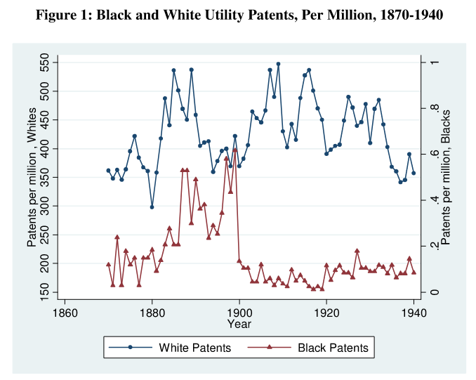
So what happened in 1900!? That should be your first question when seeing this data. Apparently, that year saw something like a 90% decline in the Black patent rate (per million), while the years 1880-1900 saw a rather large increase. And this mysterious effect didn’t do anything to the White rate. So what is happening? AnechoicMedia quotes a 2020 interview about this research:
COOK: The thing that I was deluded about was that all these data were just hanging around and available. Like, patents were not searchable. There was no Google Patents. You know, race is not recorded on a patent record.
DUFFIN: Yet the most critical information that Lisa needs – the race of inventors – that is not listed on patents. In fact, the only patent filing that does list race is one of the earliest granted to an African American. It was a man named Norbert Rillieux. He invented an evaporator that’s used in sugar production in 1843. And the reason the patent file notes his race is because someone tried to take it from him because of his race.
…
DUFFIN: The place where she finds the most data is in a survey that was commissioned by the U.S. Patent Office and W.E.B. Du Bois. They wanted to showcase African American inventions at the 1900 World Fair.
COOK: It took me a year to identify the names and then a year to match them to the data and then another year to fail at that (laughter).
CHILDS: She ends up with a list of 726 patents filed by African Americans between 1870 and 1940. Finally, she has all the data she needs to start testing her theory.
…
DUFFIN: But then, as Lisa followed the patent line further, the story her dataset was telling her took a turn.
COOK: There was a sharp decline in patenting right at 1900, around the time of Plessy v. Ferguson and thereafter.
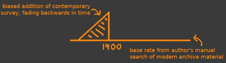
You may get the idea now. She has an actual list of patents and tries to find Black inventors from them based on Census data and the like. Then she also has a survey from 1900 where patent officers were asked how many patents they granted to blacks in the prior years. This survey this adds a massive amount of data to the years just before 1900. The paper itself mentions the surveys, plural:
The central task in data collection was to identify black patentees, since race is not recorded in patent records. A first strategy was to take advantage of little-known surveys conducted by Henry E. Baker on behalf of the U.S. Patent Office in 1900 and 1913. Surveys were sent to 9,000 of the 12,000 patent attorneys and agents in the U.S., and they were asked if they had clients who were or if they knew of any African American patentees. Data collected from these surveys constitute approximately 65 percent of the data set. The Baker data, however, are incomplete. He mistakenly identifies the first African American known to receive a patent, and the data terminate in 1914, 26 years short of the period of interest.19 Other approaches were invoked to correct and extend these data.
It is weird that the 1913 survey basically does not appear to have added any notable amount of data. AnechoicMedia illustrates the problem:
This kind of bias from a survey is called recall bias, and is well known. Here’s a 1982 paper by the Bureau of Labor Statistics noting this issue with unemployment surveys:
The question of “recall bias” has also been the subject of an inquiry by Statistics Canada in relation to its retrospective Annual Work Patterns Survey.4 During January of each year since 1978, the Canadian statistical agency has conducted this supplemental survey, in which respondents are asked labor force questions pertaining to the previous calendar year . The Canadian survey differs from the U. S. Work Experience Supplement in that persons are asked to describe their labor force activities in each of the 12 preceding months. For example, the Canadian respondent actually identifies “July” as a month in which he or she worked or, looked for work . When Canadian analysts compared the answers to these retrospective questions to their ongoing monthly labor force surveys, they found a “substantial, systematic recall bias.” In the early months of the year, unemployment is seriously understated, with the bias declining and then reversing towards the end of the year. That is, some of the unemployment in January of the previous year is “forgotten,” while recent unemployment in December is overstated.
Clearly, it would be very silly to base any statistics on this obviously incomparable data from the two sources, but that is what the paper is about!
OK, but we can go deeper. The journal has an open data policy, so I downloaded the data for a closer look. Here’s the remade Figure 1:
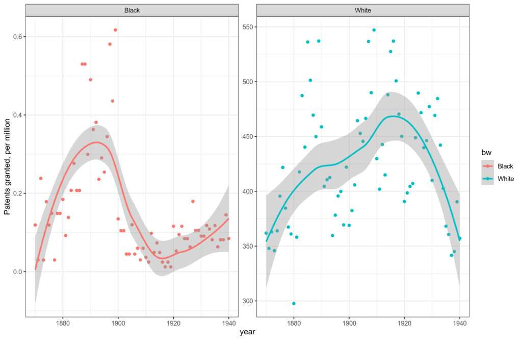
The remade plots look the same as hers (yay!). Note the two Y axes, however. Unfortunately, the detailed data are not available so I could not reconstruct the dataset without the problematic survey data:
If one wants to replicate the data construction, please see the data-construction details in the online data appendix. The code and data files for implementing the data construction as detailed in the online data appendix are available on request and require Stata to be installed. [note in supplementary data]
The interview then talks about a particularly bad year, 1921:
DUFFIN: Her data were screaming at her that something big had happened in 1921. She couldn’t scrub it out as a calculation error no matter how many times she checked.
CHILDS: She looks into it and realizes that 1921 was the year of one of the worst incidents of racial violence in American history, the Tulsa race massacre. If you’ve seen “Watchmen” on HBO, this was the attack on Black Wall Street.
Try to guess which of the points on the plot is 1921 without looking at the X axis? You can’t. That’s because 1921 does not stand out at all. Here’s a year-to-year difference plot:
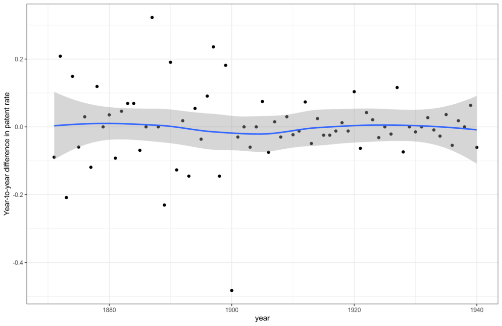
There is nothing much to see. The value for 1921 is supposedly bad, but as a matter of fact, it is not remotely the most outlying value, which is 1900, the year of the data source change! OK, if we disregard the survey data years, then 1921 is the … third most outlying value right after 1906 and 1928.
But OK, reading her paper, we can see where the 1921 number comes from:
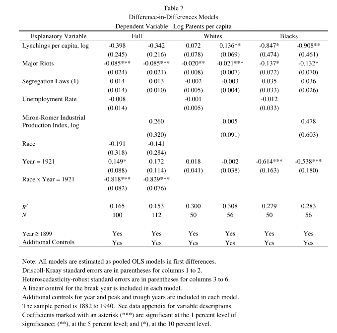
It’s the 1921 dummy line. Interestingly, looking at the dataset, we see that she coded at least 4 such dummies: 1910, 1913, 1921, and 1928. The other values are mysteriously not mentioned in the paper anywhere, so I guess they didn’t get p < .05 in the model output. So there were at least 4 tests here, a fishing expedition. We may also note that her model is just overall very complicated for a dataset that has n=50-57 per race, depending on the specification. Reading her table notes very carefully, and looking at the STATA code, I see that it says “Additional controls for year and peak and trough years are included in each model.”, and indeed her code includes the variable names (_iyear_1910 _iyear_1913 _iyear_1928), so they are included but not shown. Mysterious. I would guess that she looked at a residual output from her model, then found these 4 years were bad, and then tried dummies for them, finding only 1921 produced something of interest. But that’s just a guess. By the way, note the use of asterisks is very weak, as 3 stars (***) only indicates p < .01. Since there were so many possible model specifications here, that p value is not at all impressive. In fact, most of the p values are not impressive, only a few reach the p < .01 level.
Let’s backtrack a little. The interview goes further yet:
DUFFIN: During this period, African Americans made a lot of gains – holding office, owning property and filing more and more patents. She sees the line on her graph rise. African Americans filed patents at roughly the same rate as white inventors through about 1900.
CHILDS: Given this new freedom and new rights, African American inventors flourished. They invented all kinds of things in this period – an elevator, rotary engines, a tapered golf tee, a dough kneader, a telephone system, a fertilizer distributor and a bunch of other things.
Recall that plot with 2 Y axes? The Black rate is on the right, and the White rate is on the left. In the most extreme year, 1900, the rates are, respectively: 425/million and 0.6/million. So a relative rate of some 0,0014, or 0.14%. So the rates were not remotely even in that year. To be fair, this mistake was not hers, but she didn’t correct it either, despite it being a very gross error of some factor 700 in the best case.
It gets better. One can find Paul Romer, an economist who won a Nobel prize in economics in 2018, recommending Lisa Cook based on this study! A Nobel Prize winner who apparently cannot spot even an obvious error like this. Makes you think!
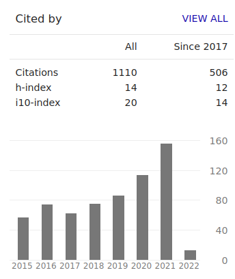
The best part of this story is that this person is proposed for a role at a government body (the Federal Reserve Bank; I think inflation fanatics call this the Fed). So let’s check out her CV, it must surely be impressive right? Google Scholar:
Uh, what about ResearchGate then?
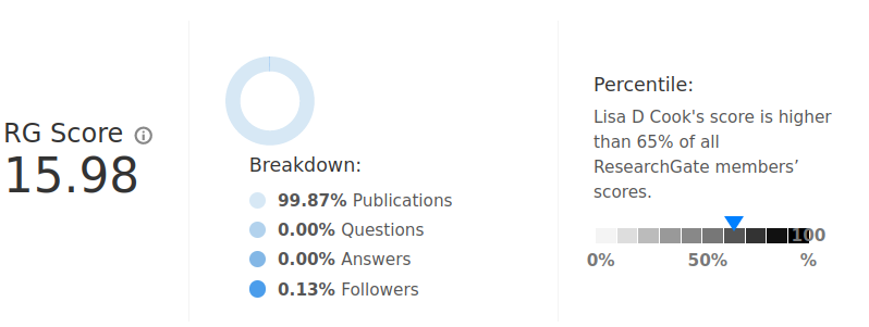
With 26 articles listed, she is somewhat above average (65%) of researchers on this site, which includes a lot of younger researchers. Sadly, the site does not report age-adjusted values.
Barely anyone reads her works, though, with only 2,721 reads in total. Not surprisingly, she has a nice Wikipedia page, many media interviews, even testifying to Congress. Thus, she attains a very high Kardashian index score. It will be exciting to see what amazing economic progress she can achieve at the Fed.
After writing up this post, I found that others are also on this, even a long time ago!
- Michael Wiebe has a very nice Twitter thread from 4th Feb, which builds on his analytical review of this paper from 2021
- Steve Sailer is on the spot too: Did Biden’s Fed Nominee Lisa Cook Mess Up Her Most Famous Paper?
- Andrew Gelman too, who also notes “My guess is that the big dropoff in Cook’s data in 1900 are a combination of an actual decline and some data issue involving the census.”