Saw this anti-communism meme today:
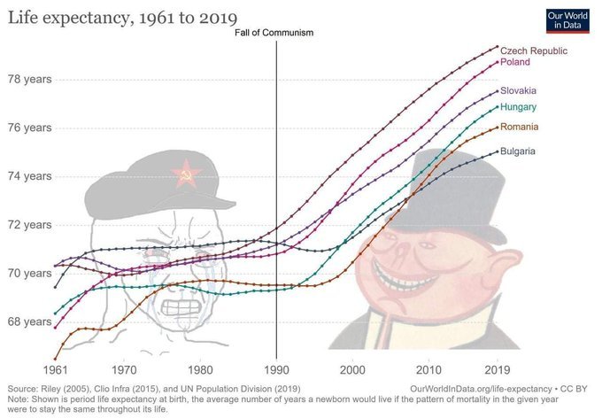
(I couldn’t find a higher res version.) Looks true enough, but perhaps cherry-picked. There were more than 6 countries in the ex-USSR. So I downloaded the data from OWID:
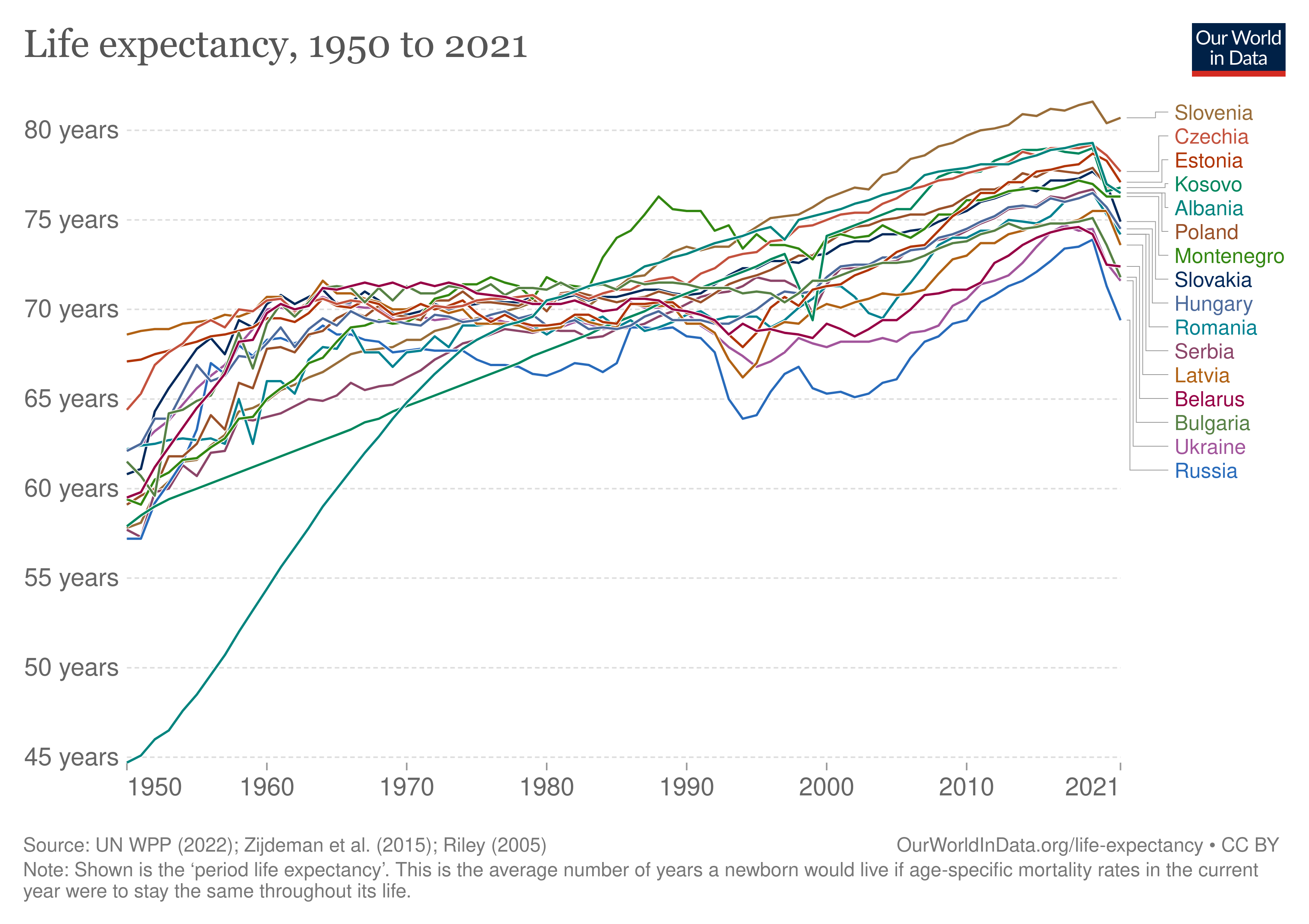
It holds up with the full set, only Kosovo is weird, presumably because these are fake imputed data. Next up, let’s see if we can get a real statistical result. First, a linear fit:
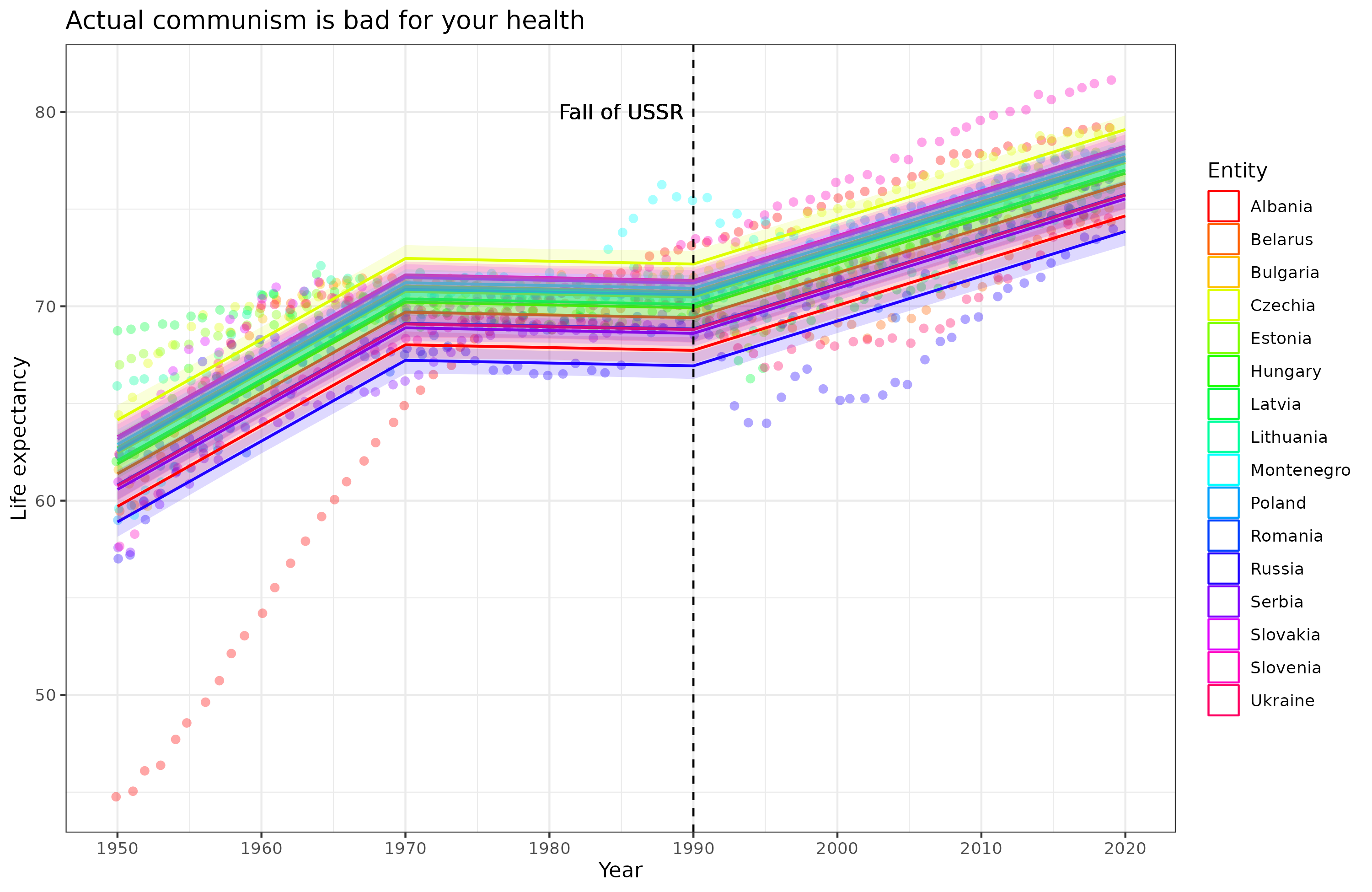
The fit isn’t terrible (R²=.63), but we can improve it with a linear spline:
Much better fit (R²=.69). I had to manually specify the knots (locations where the slope changes) and these looked like about 1970 and 1990. Still, this is somewhat arbitrary. Here’s a natural spline:
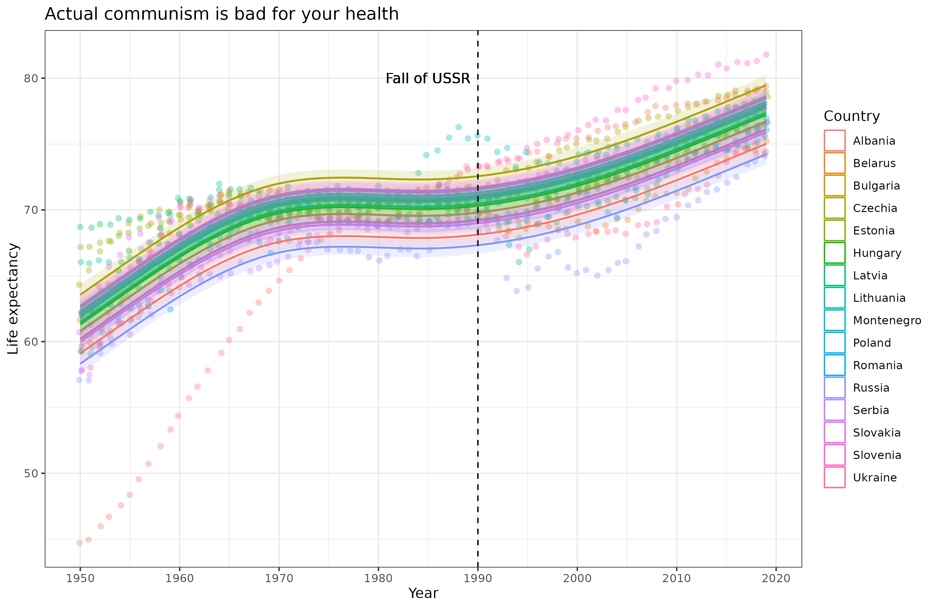
The fit is about the same (R² = .70). Sure enough, we get about the same result: improvement from 1950 to about 1970, then stagnation until the fall in 1990 and a bit later (capitalism takes some time to work). We can also allow each country its own spline, which will essentially give us what OWID did:
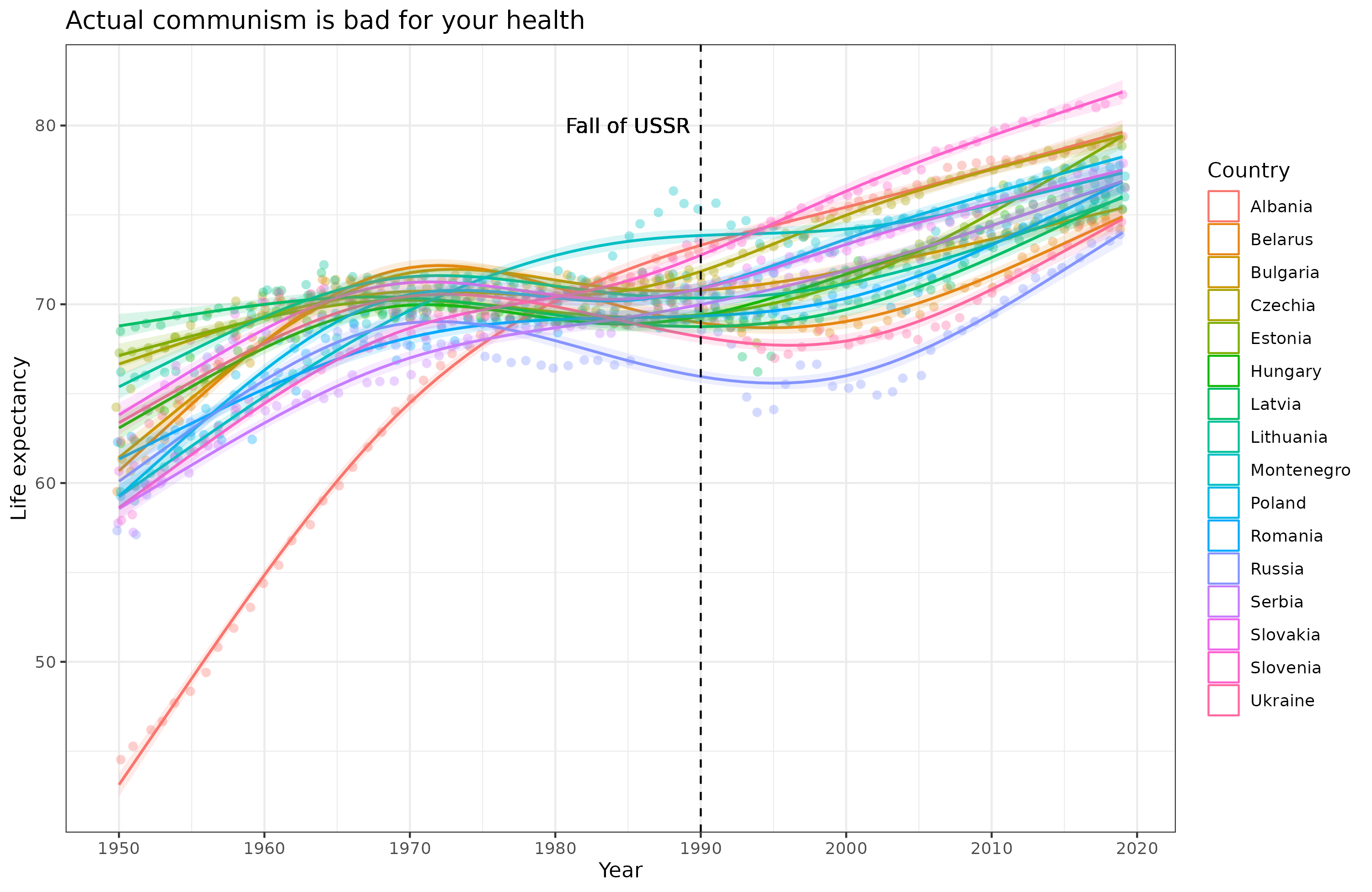
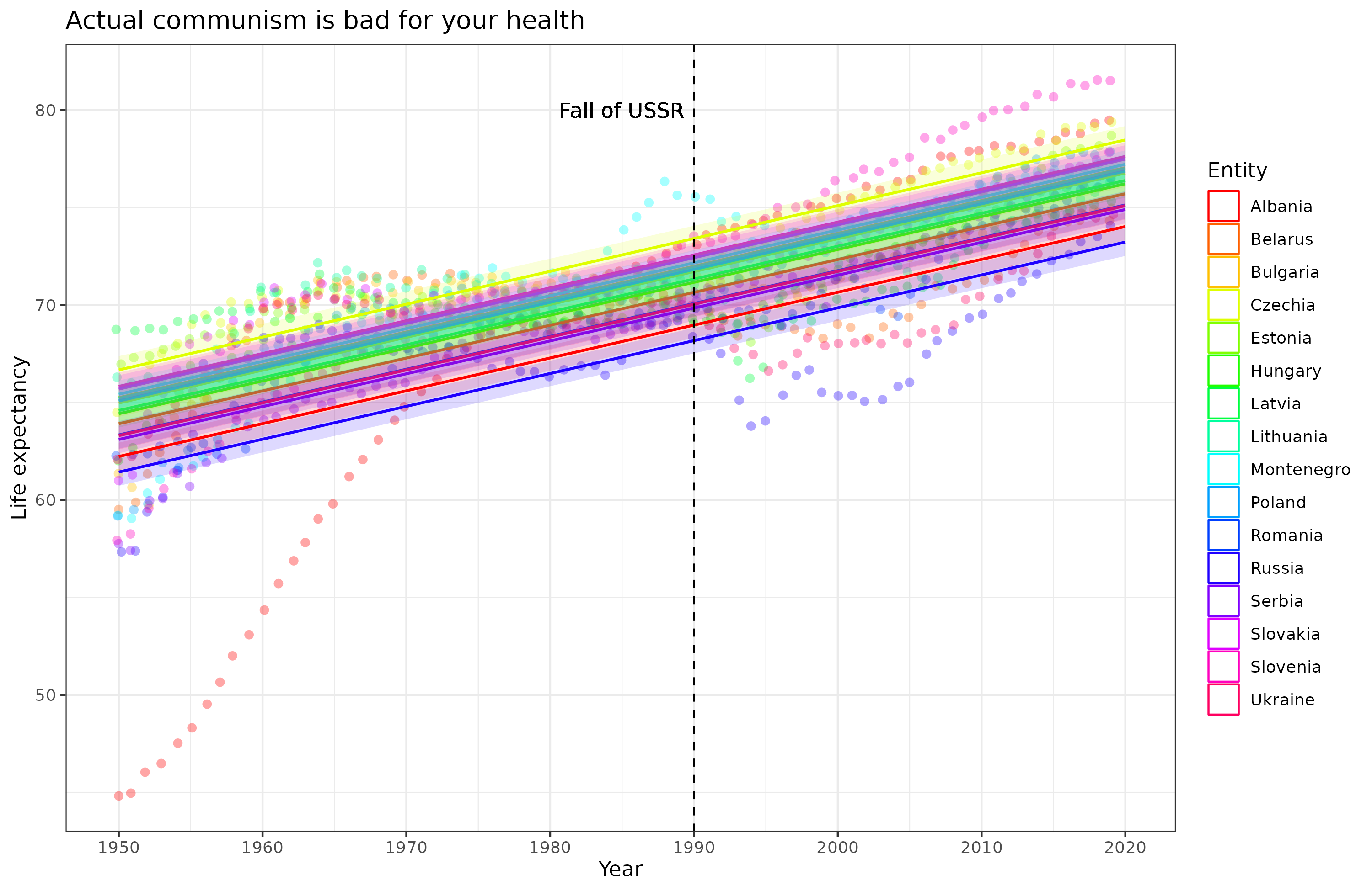
Of course the fit is now near perfect (R²=.97), but it also doesn’t as clearly show the effect of communism since every country has some other factors affecting their life expectancy.