I saw this on Twitter earlier today:
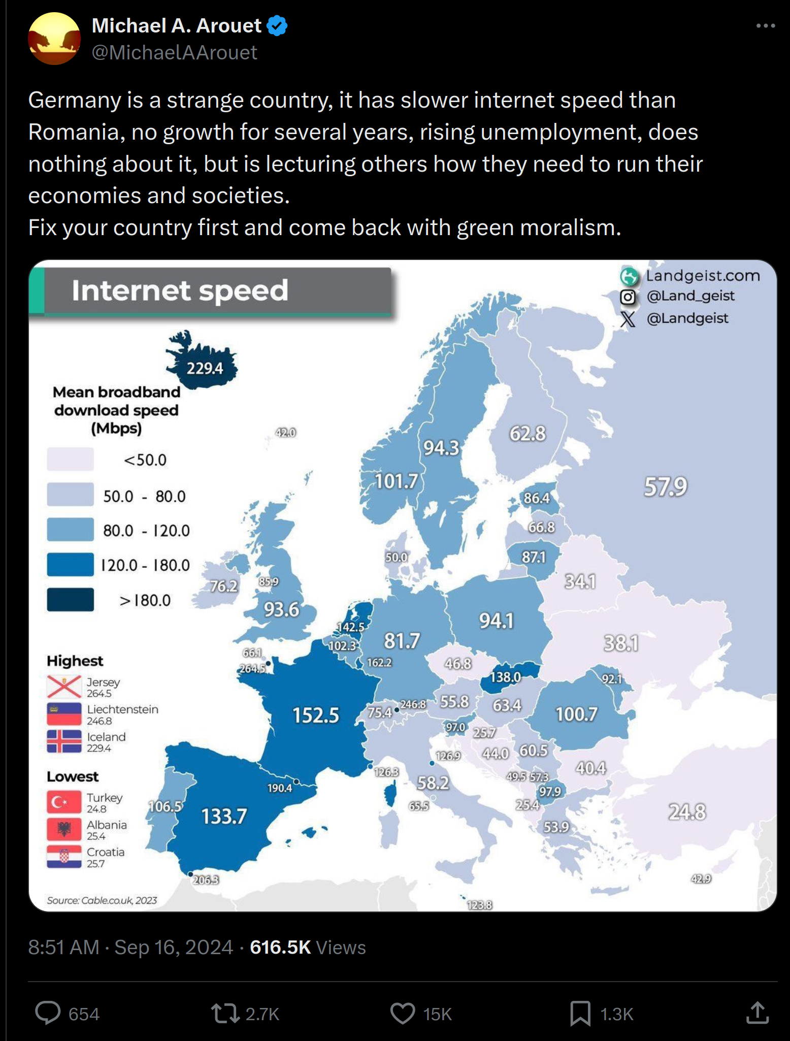
The narrative seemed right, so at first I retweeted. But then I looked closer at the map and realized it couldn’t be right. Denmark 50 Mbps? Checking Wikipedia, we find this dual table:
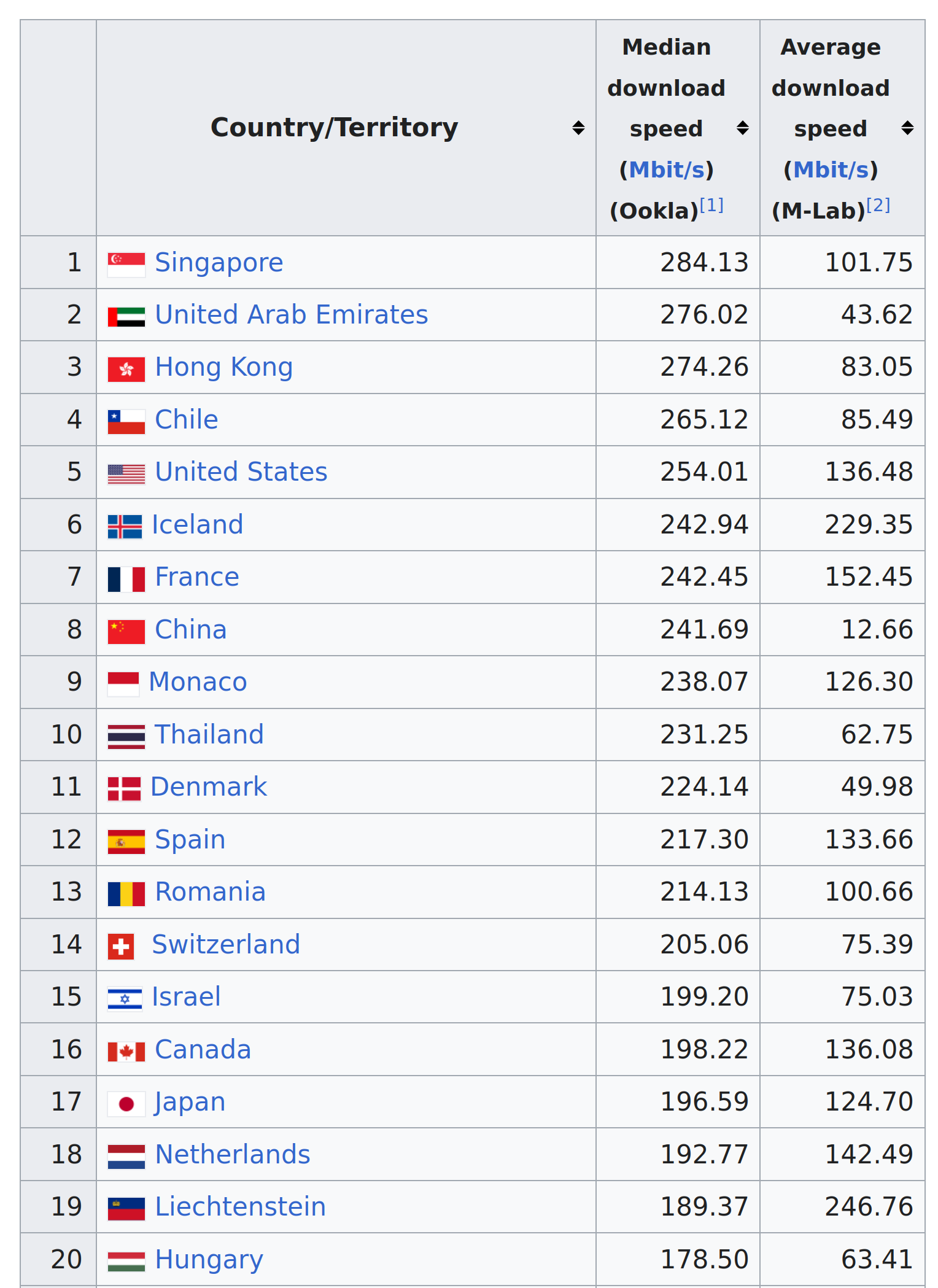
Sure enough, Denmark is listed at 50 Mbps. But it can’t be right, so I checked the source, which shows this top list:
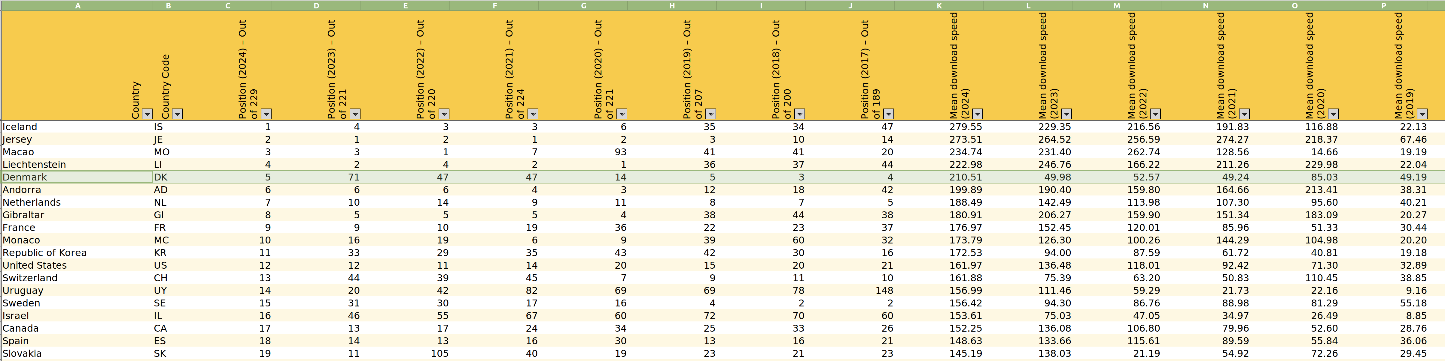
Notice the abrupt changes for Denmark. Are we to believe that in 2018 Denmark had the 3rd fastest internet worldwide, then dropped to world rank 71 in 2023, and then in 2024 magically went back to world rank 5? It doesn’t make sense. If anything, it looks like a COVID-related anomaly.
But this got me interested in what does actually explain global variation in internet speed. So I downloaded another dataset for comparison from speedtest.net (the one in the Wikipedia table above). Plotting them together, we find they agree pretty well:
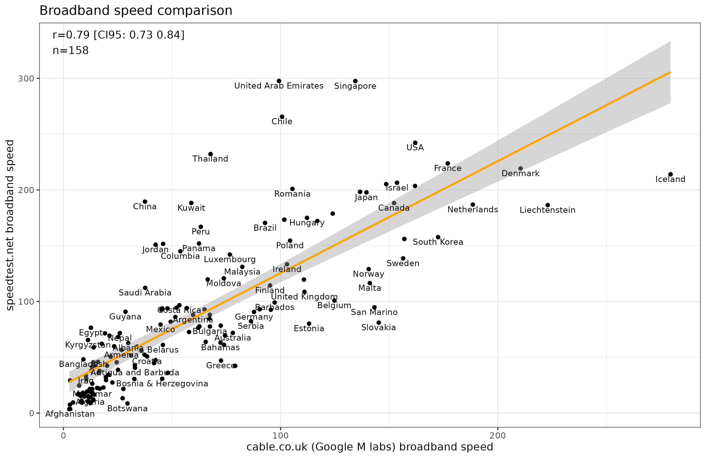
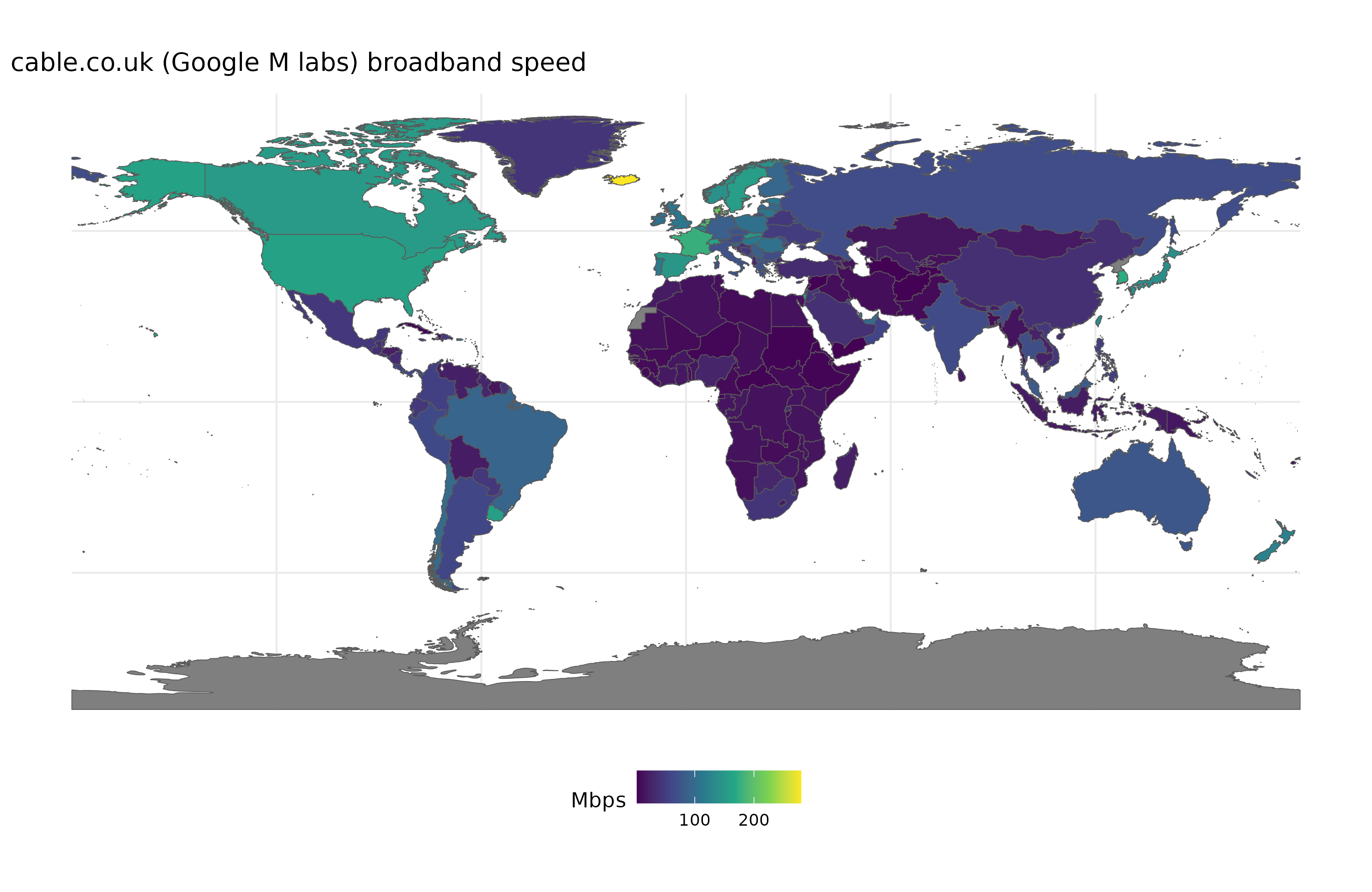
Google’s M labs data is more comprehensive, covering 229 units versus 161 for speedtest’s data. I checked the methodology and it seems sound enough, even for small units (small countries with potentially small sample sizes). Here’s the full map of Google’s data:
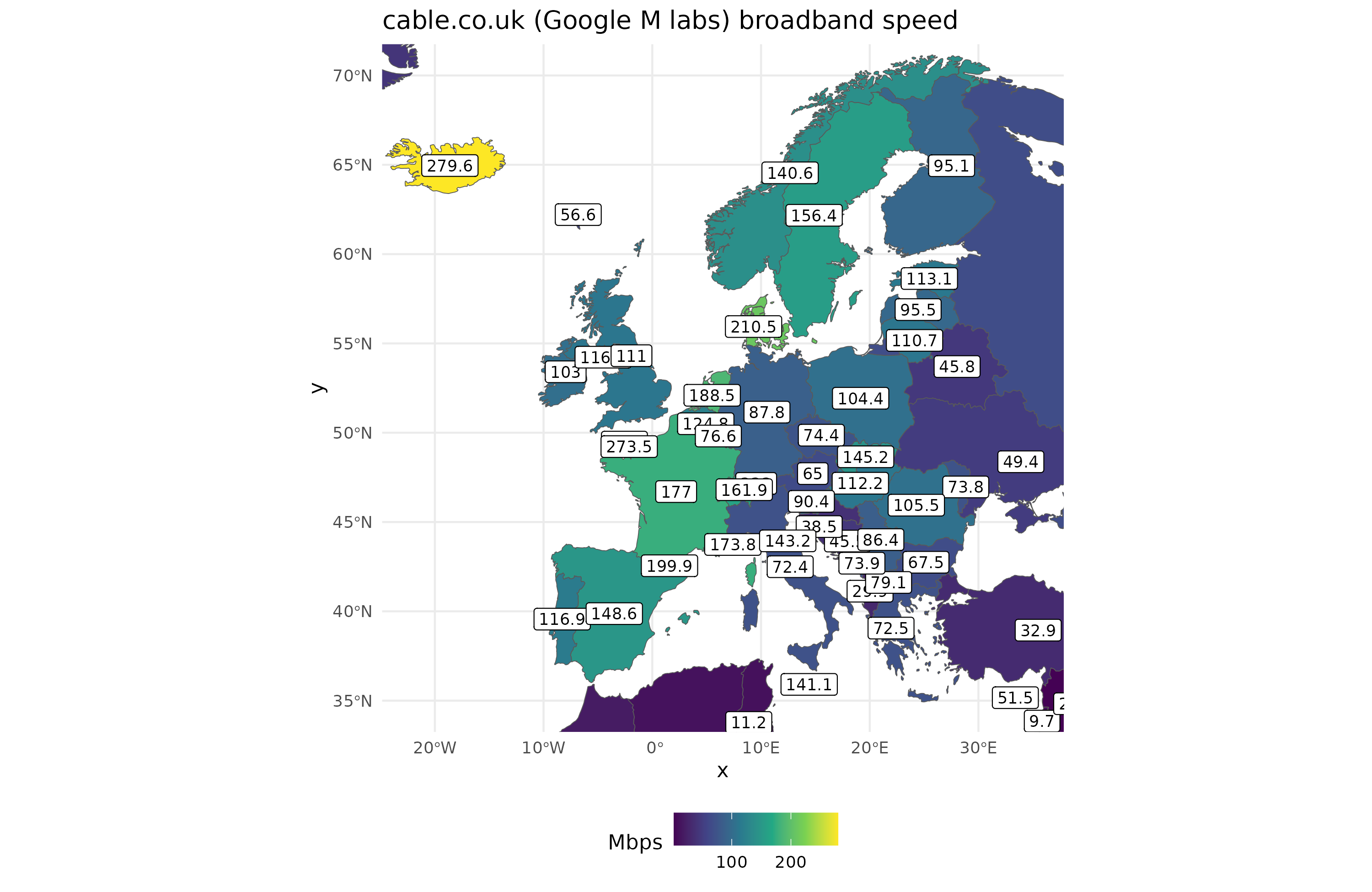
And here’s a zoom on Europe:
What explains the variation? We can note a few things. First, and most obvious, good countries have better internet speed, whether we consider wealth or average intelligence as our measure. Second, densely populated countries have better internet, as UAE, Singapore, and Iceland above. So let’s try some ideas based on population density. Though I discussed this issue in my prior post on population density and fertility rates, there are severe issues with using the ordinary population / land area metric. We can plot the map to see this:
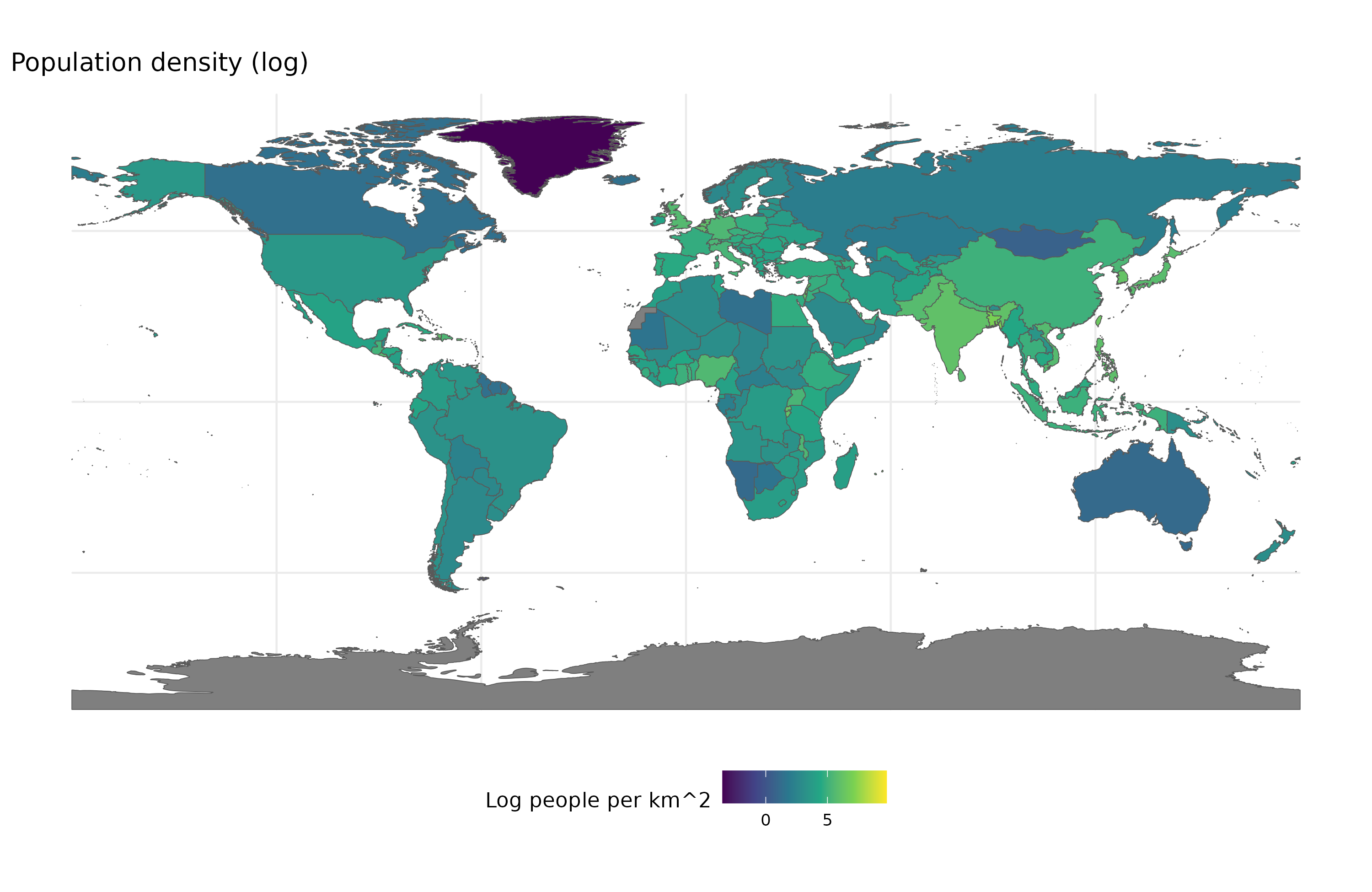
Can you see anything? Neither can anyone else. That’s because the variable has an absurd distribution with a few tiny city states having extreme density (Monaco has 21000, median is 97). The usual economist trick of taking the log value helps:
But perhaps an easier way is to group countries into classes:
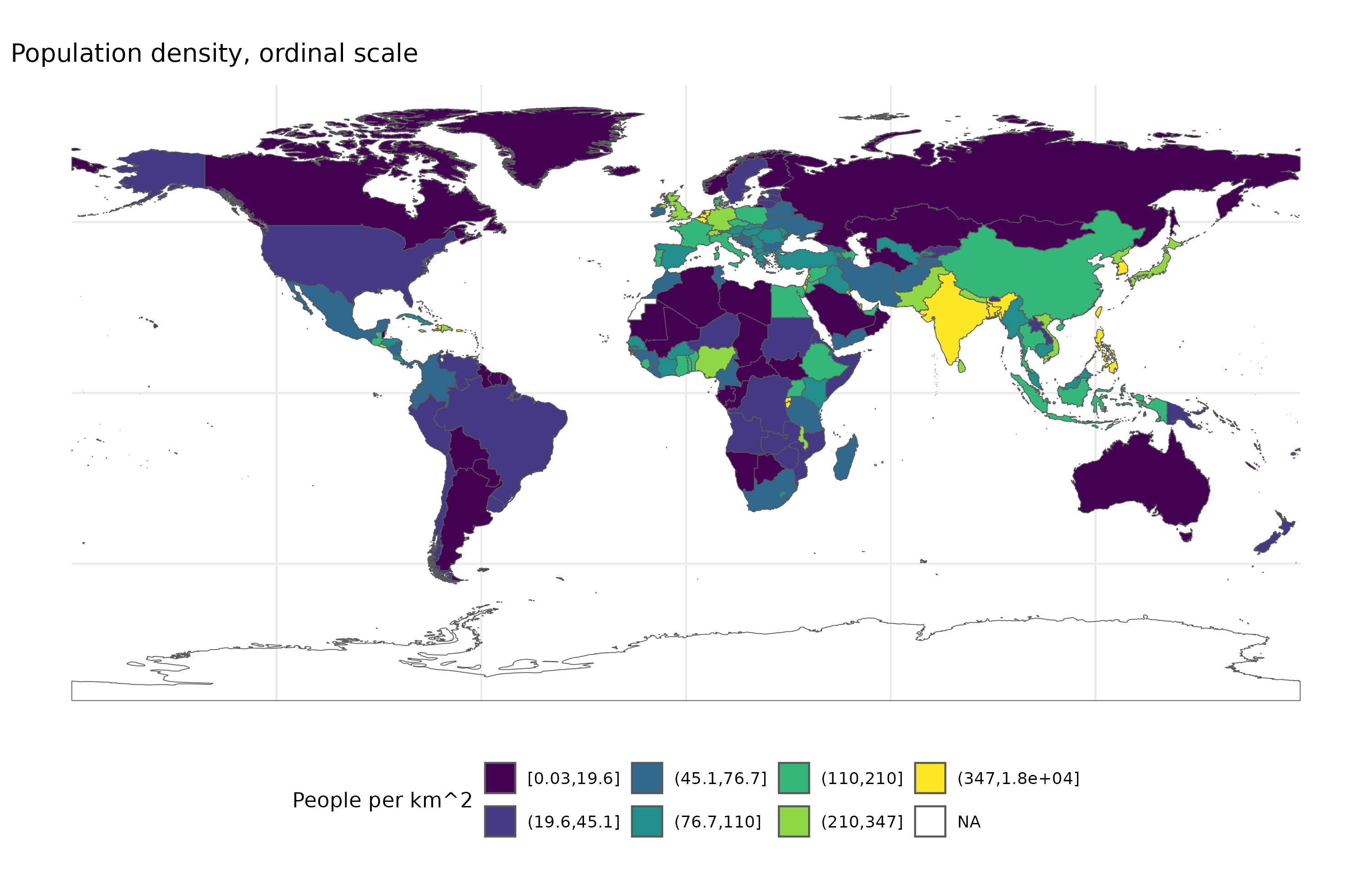
Here the yellow group are the 32 countries (1/7 of countries) with the highest density. We can now finally get some clarity. However, we also know this metric doesn’t make too much sense. USA and Canada have very low density, but not because people live far apart in general, but because they have large areas of land that are largely uninhabited:
“90% of Canadians live within 100 miles (160 km) of the U.S. border.” is a factoid often repeated for a reason.
There are various other alternative metrics of population density, but I couldn’t find a nice dataset. Instead, I will use another proxy, urbanization %, the percentage of people living in cities:
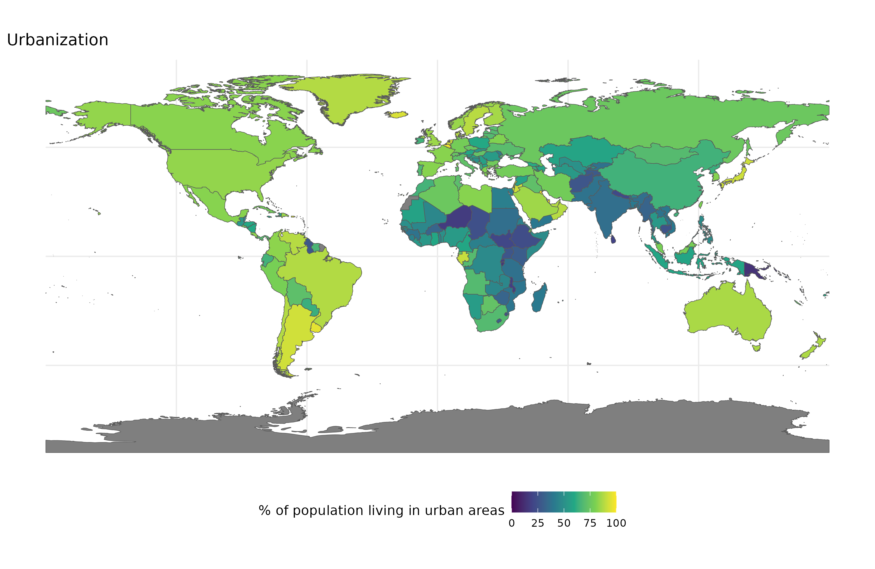
Now north America is no longer an outlier due to their empty land, as most people don’t live there anyway. For good measure, how’s how they correlate:
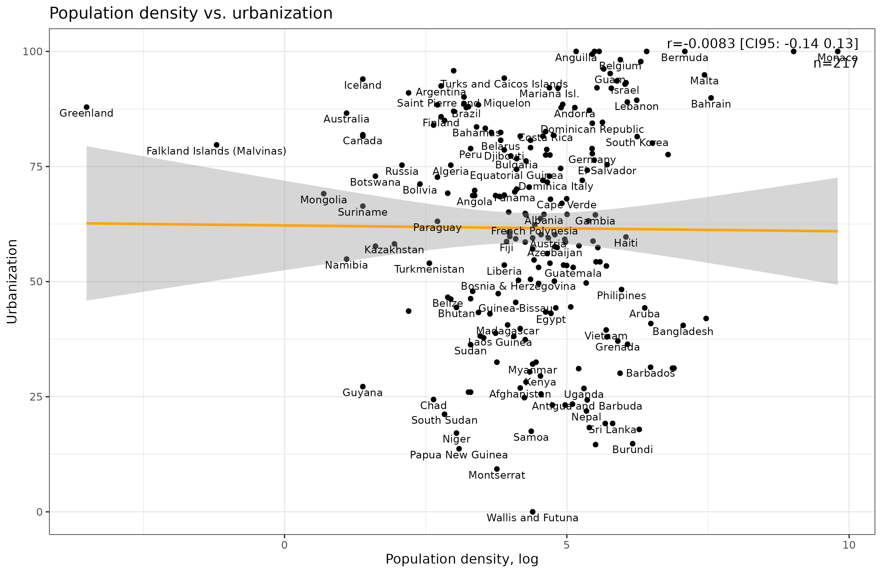
Surprisingly, these two metrics don’t even correlate when we use the log value of density, and correlate a measly 0.15 before due to extreme outliers.
So what better predicts internet speeds? Let’s compare all our variables first. I’ve added wealth and a spatial lag (average of 3 nearest neighboring countries) as well:
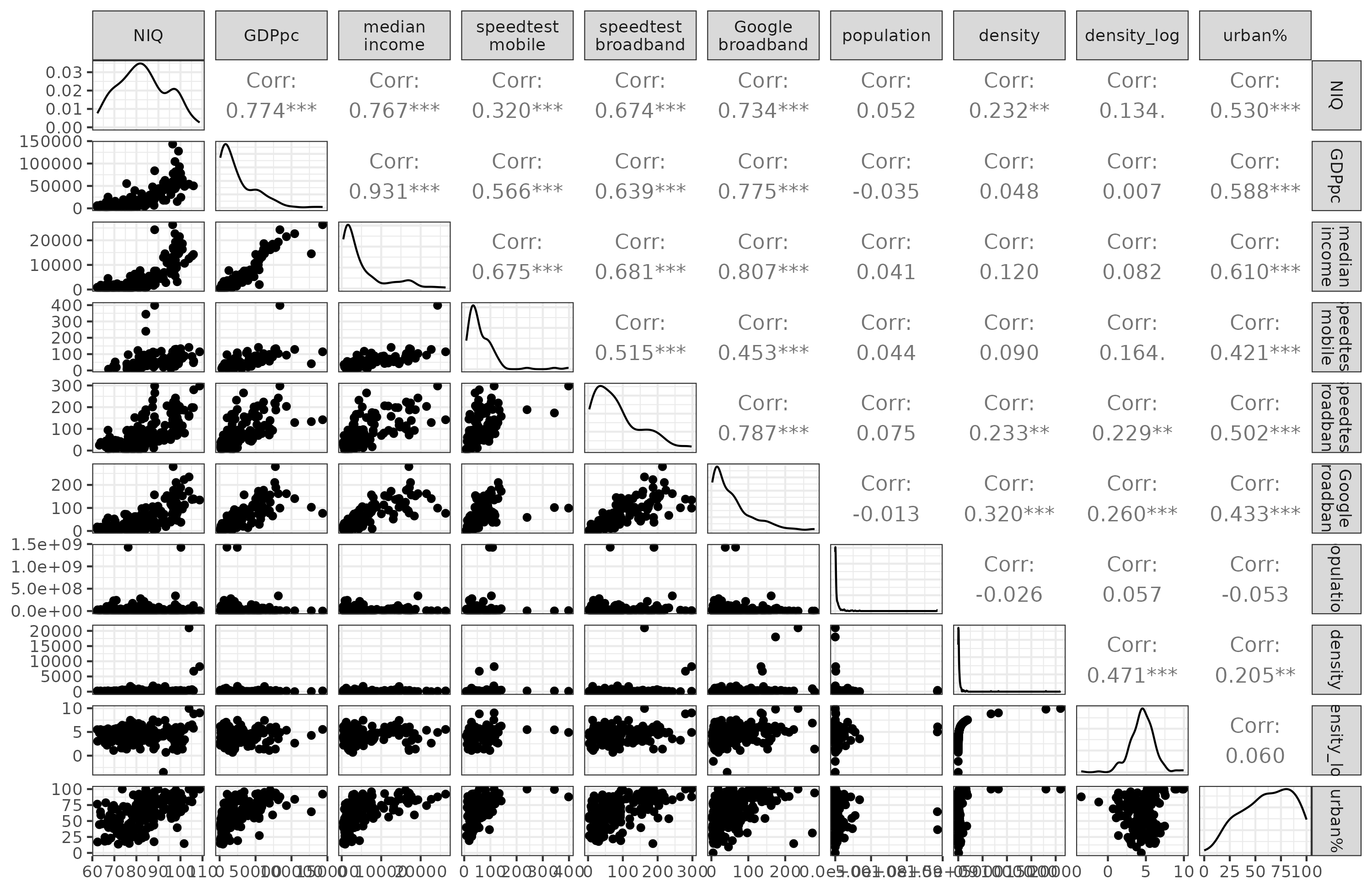
We see that Google’s internet speed metric correlates the strongest with the explanatory variables, perhaps because it covers a broader set of countries and thus suffers less restriction of range bias. Notice also that urban % is a much better predictor of internet speeds than the ordinary population density metrics. The reason here is simple enough: it’s a lot easier to upgrade the internet speed when everybody lives close to each other in cities rather than 10 km apart in the country side. Starlink will probably change this pattern as we move to wireless internet in the future, but for now it is true.
Here’s some models comparing the 4 main predictors:
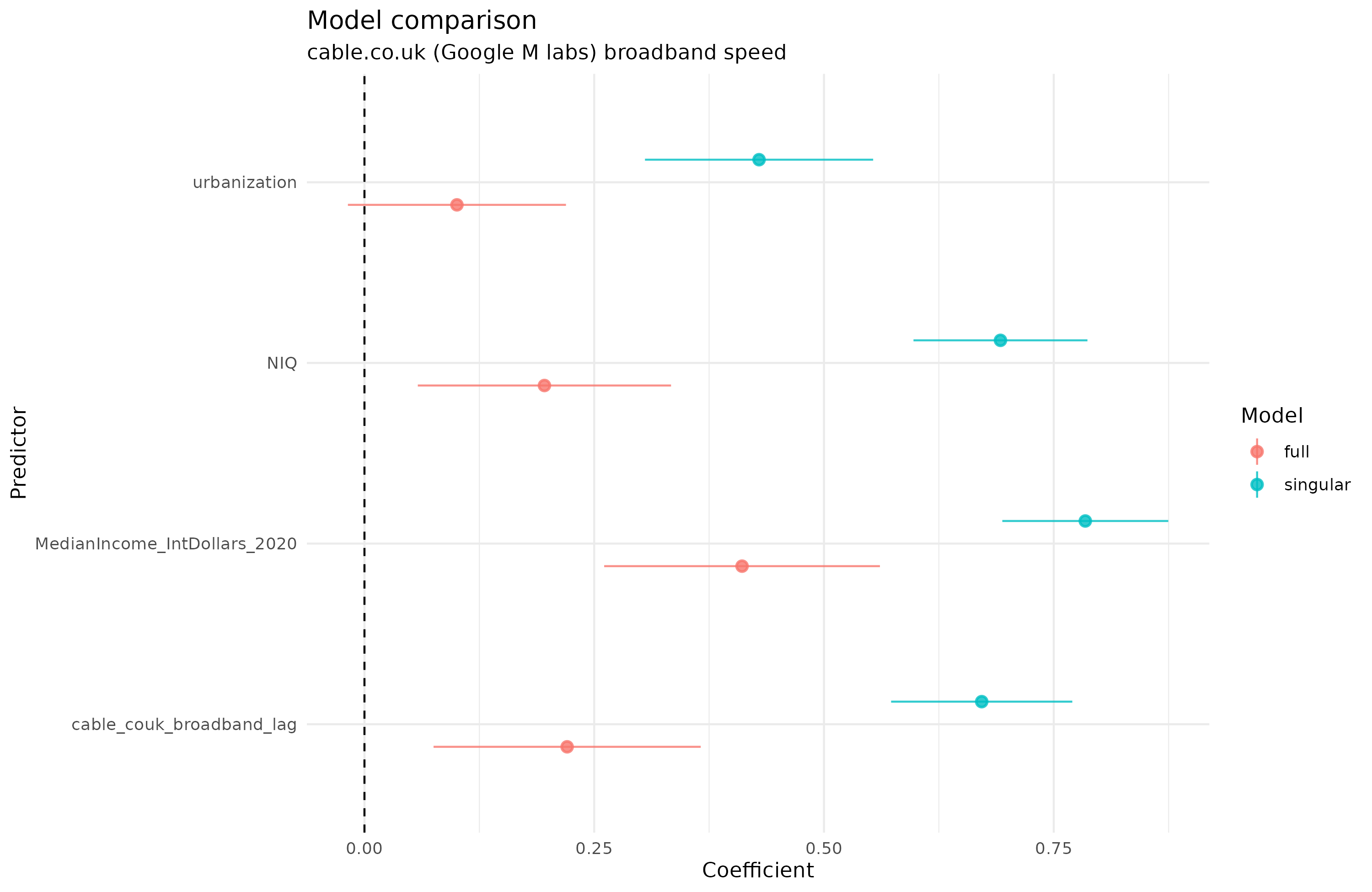
The blue lines and dots show the models with just a single variable (same as the correlation), and the red ones show the joint model. We see that each variable can predict internet speed by itself, but urbanization does not actually predict above chance levels when they are combined. Note that national IQ and median income continue to predict internet speed even when we account for spatial autocorrelation in the data using the spatial lag of the outcome variable. From a causal perspective, it is interesting that intelligence still predicts internet speed even when the most obvious causal mechanisms are controlled for (intelligence causes urbanization and income).
For good measure, here’s the same models using speedtest’s broadband data instead:
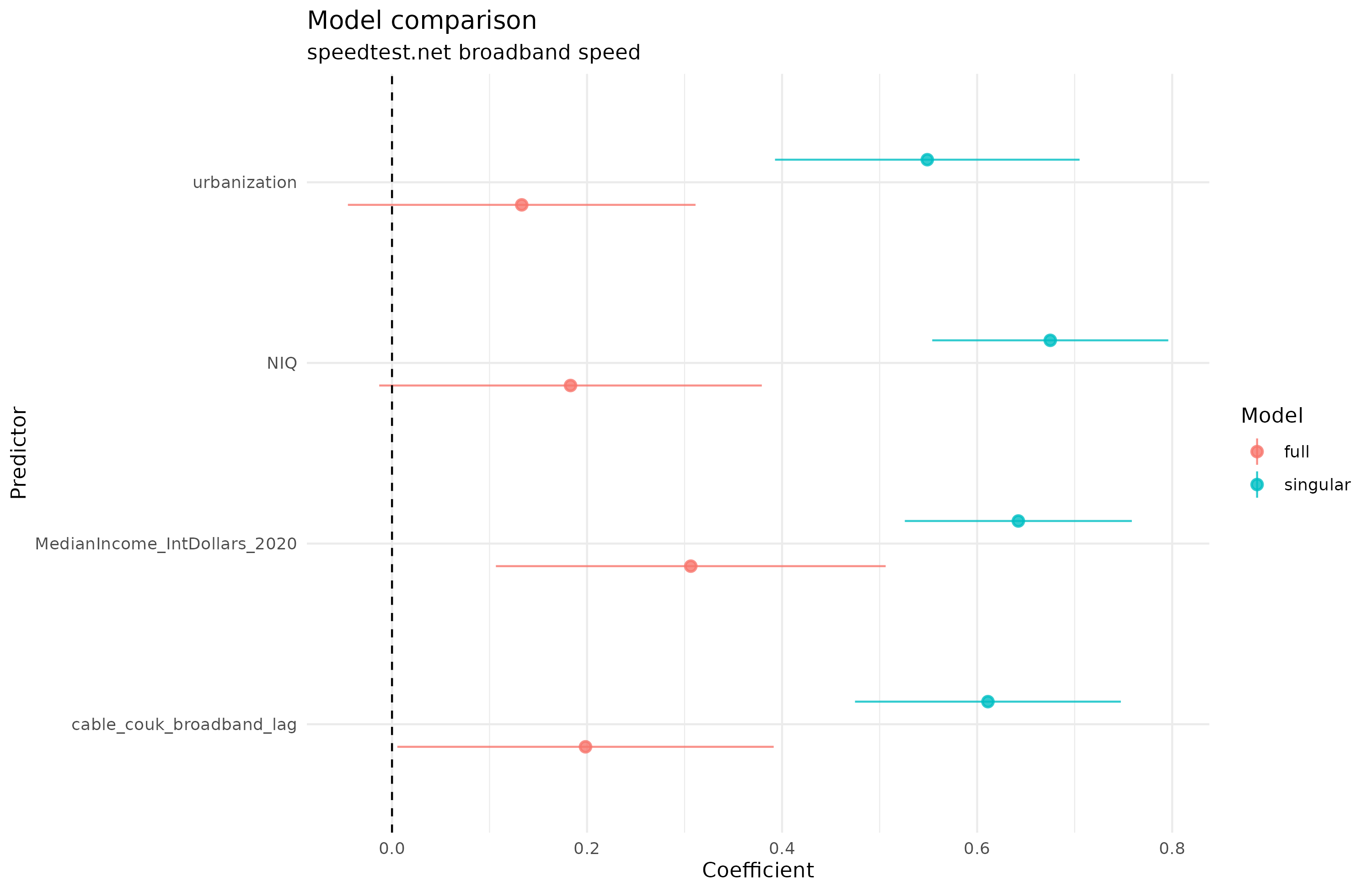
The results are materially the same in terms of relative size of coefficients, but NIQ is no longer beyond chance, probably due to the decreased sample size (from 157 to 137).
It would appear then that though urbanization has an obvious causal mechanism for explaining average internet speed, it doesn’t actually work in practice when we control for the most obvious other causes.
Also let this post serve as a reminder not to put too much faith in seemingly credible maps seen on Twitter. In this case, the data were correctly reproduced from the source, but the source had faulty data for the year of data Wikipedia happens to list. Who knows how many other misleading plots of this nature exist out there.