I tweeted this funny (?) rebuke at Richard Hanania earlier:
However, Twitter demanded that I explain my words:

Alas, the fact is that:

But to be more serious. The fact of the matter is that a lot of plots floating around on the internet are based on OECD data. Why does that matter? Here’s OECD:
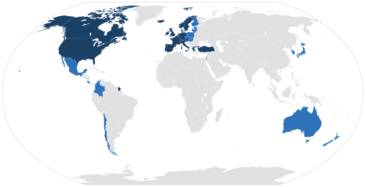
So OECD is a really narrow part of the global population. It’s in the name really, The Organization for Economic Cooperation and Development, made by Western countries to talk about stuff and manage monetary policies. Originally it was a group of European countries only who managed to manage post-WW2 Europe.
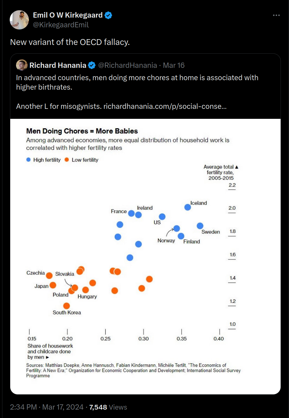
When you use OECD’s admittedly awesome statistics databases to do studies, you are ignoring the rest of the world. As such, patterns can appear in your data that aren’t real if you had looked at the rest of the world. In Richard Hanania’s example with household chores and fertility, inside the 25 OECD countries out of 38 shown in the plot, we see a positive relationship. But really, what we see is just that Northwest Europe has higher fertility than Northeast Asia and East/South Europe and they are more sex egalitarian in general. We already knew that, so what did we learn? Not too much. It seems no one bothers to do surveys of household chore split by sex across all the countries of the world, so we don’t know what the split is in Gambia, Tunisia or Papua New Guinea. I imagine it would be women doing the vast majority of it, and these countries also have higher fertility than the OECD countries. So the world-wide pattern would be the opposite of what this plot is suggesting, and what numerous thinktanks and media are claiming based on it. Since we lack proper data for the household chore split by sex, however, I picked a real example of this same issue that we can use for illustration purposes — wealth and fertility. Split by World-wide vs. OECD it looks like this:
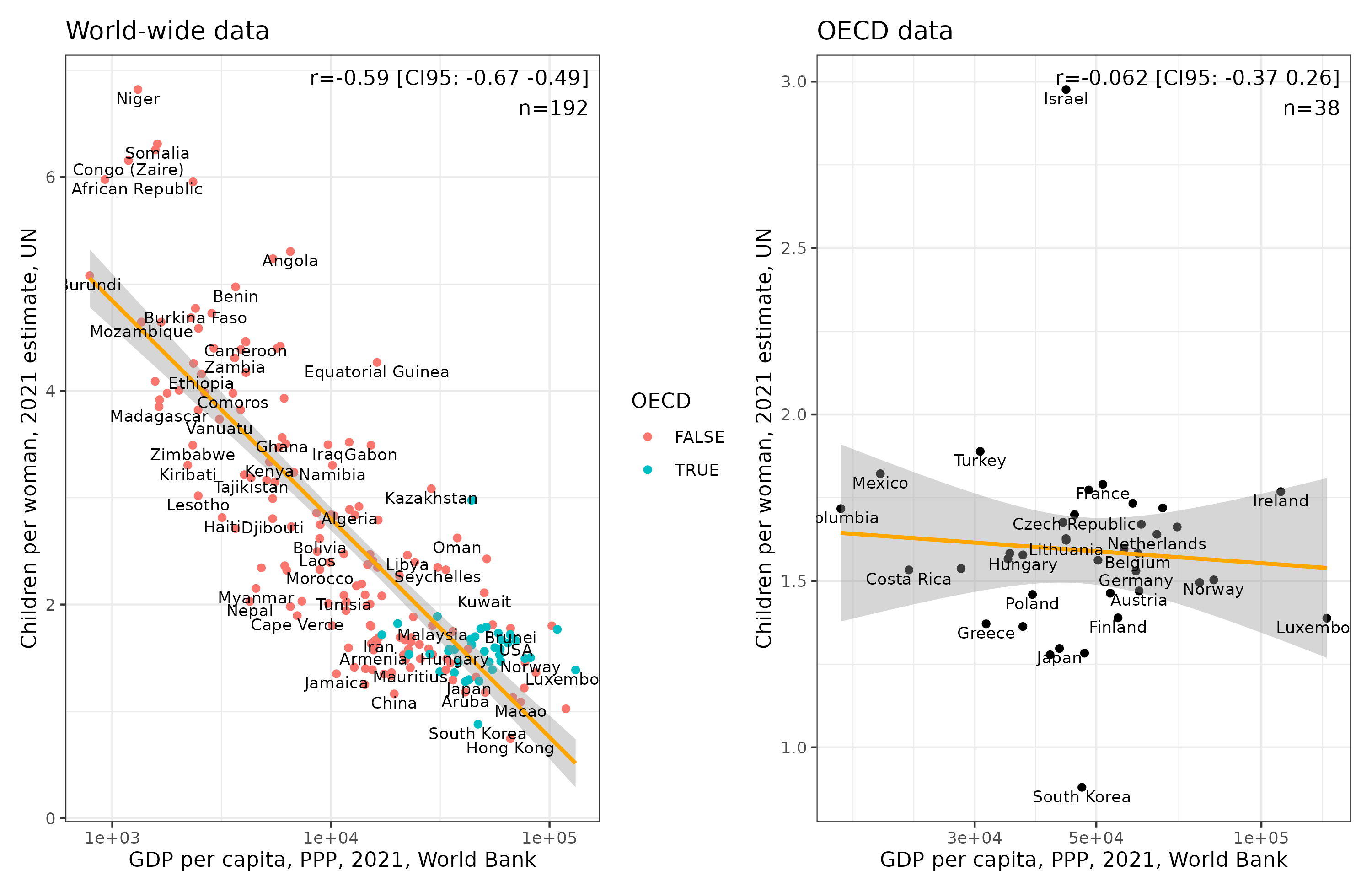
So, if we had used one of the OECD or not-even-OECD data sources, like the one Hanania used above, we would find the surprising result that wealth (GDPpc anyway) is unrelated to fertility rates (r = -0.06). But if we had used a proper world-wide dataset, we would find the expected strong negative correlation (r = -0.59). We could hack our way further. Suppose we wanted to show a positive relationship:
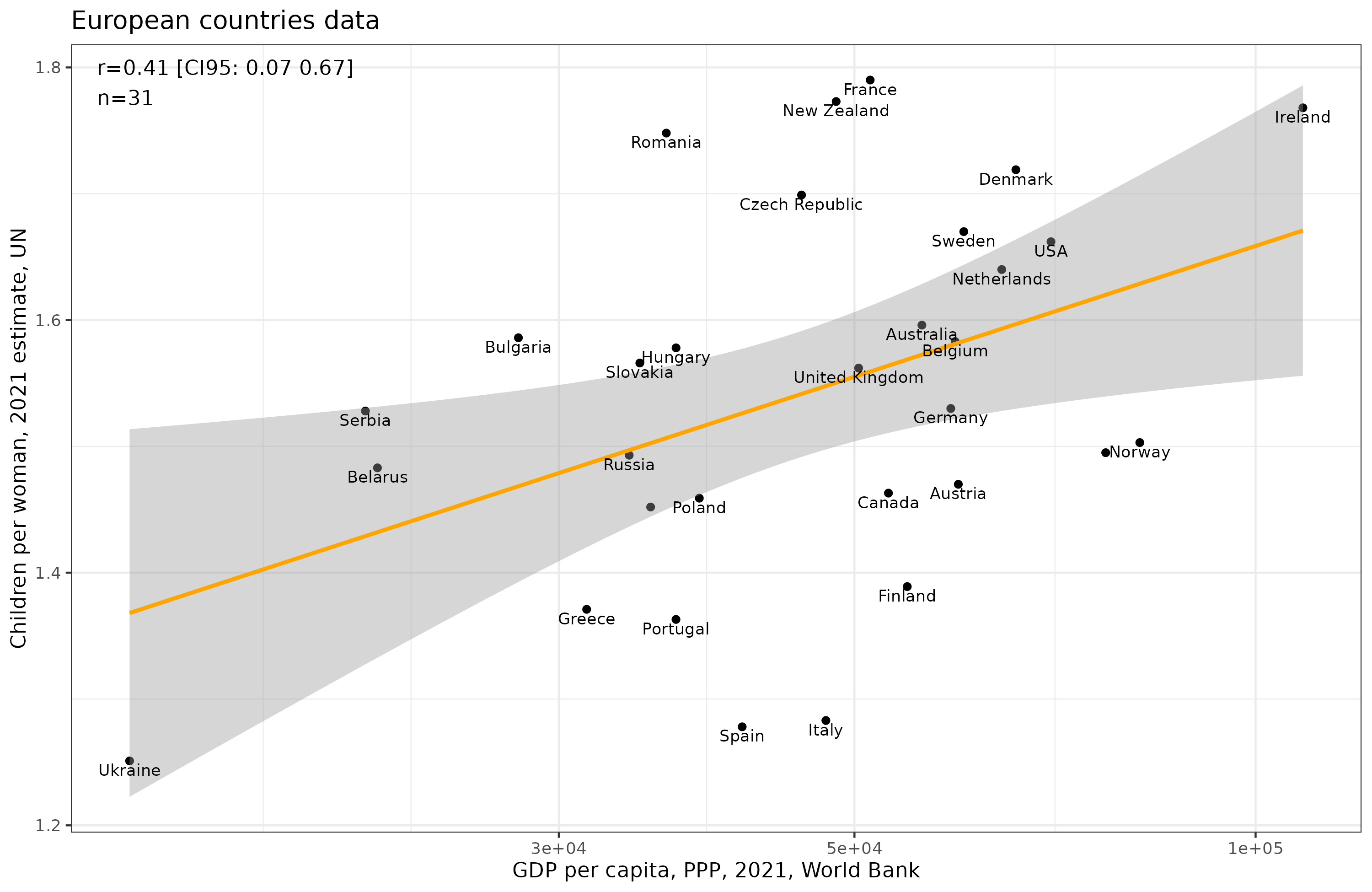
A magic correlation of r = .41 appears (p <.05). How? I subset to the 42 European countries, and p-hacked my way by filtering for population size to 4+ million, since this removed Moldova which was a big outlier for the desired pattern, ending up with 31 countries. I’m sure readers can come up with more creative ways to achieve the same result.
Going back to the household chores meme posting. We can note that this kind of plot has a further problem, namely, that it invites the reader to assume causality at the individual level based on aggregate data, called the ecological fallacy. It is a silly example because we already know that households with more traditional distributions of household chores have higher fertility, i.e., religious conservatives where women don’t work outside the home have more children (currently, and in the past where this was the norm). This is obvious enough. Naturally, this does not prevent the spurious finding based on OECD data to be plastered all over the internet (for those conspiratorially minded, I see WEF has it too). We can also obtain the same kind of spurious pattern by looking at religiousness and fertility within Europe, because Northwest Europe’s fertility is higher but they are less religious than South and East Europe. At the individual level, of course, religious people have more children. The country-level results are due to sampling bias of not including a representative set of countries.

If we look inside Europe, we see that less religious northwest Europeans have higher fertility than Greece, Spain, Poland etc. The reason for the OECD fallacy name, then, is just that the OECD datasets are so commonly used that this sampling bias problem with countries arises frequently.
Finally, it is amusing to see Hanania post these takes because he himself has been complaining about people not controlling for spatial autocorrelation (i.e., regional clustering in data, which is what inflated this problem):

For the record, I will say that I’ve been posting about spatial autocorrelation for almost a decade.