Reporting the proportion of variance explained by some statistical model is ubiquitous. However, just like p-values, it is a misleading metric. I’ll try explain why it is used, and why you should intuitively take the square root of it.
Effect sizes are statistical metrics for how large some effect or association is. There are two variants: unitless/standardized and natural units. The latter are strongly favored by economists, who will often report things like “Results at mean values for males indicate that being 10 cm taller is associated with a 14–47% increase in obesity, an 8–13% reduction in cholesterol prevalence, and a $1874–2306 income premium.”. Getting results in natural units is very nice for interpretation. The trade-off is that comparisons across time and place are difficult. Suppose you read a study like the above, but it was done in Yugoslavia in 1960, using their currency. Suppose they report that 10 cm height income predicts an income increase of 200 Yugoslav dinar. Is the associations between height and income stronger in Yugoslavia in 1960 or America in 1984–2005? We can’t tell because we would first have to look up the income distributions and adjust for inflation to try to figure out if the association was stronger or not, and even this is just about the slope, but there can be more or less noise too. A different approach here would be to report the correlation between the variables (say, .20), or the model’s R2 value (4%). These metrics are comparable across time and space, but are not so intuitive. Ideally, then, studies would always report both, but it makes the tables of results cumbersome, which makes reviewers complain. And as we know, science is a game that consists of appeasing reviewers.
Supposing that you want to stick with the standardized effect sizes, there is a common practice of reporting r² values, that is, squared correlations, which is the same as the proportion of variance ‘explained’ (associated with) in the outcome by the predictors. When it’s a correlation, you can simply square it. However, thinking in terms of variances is highly misleading when making comparisons between predictors. Consider this great example of coin flipping:
As bad as these decontextualized criteria are, the other widely used way to evaluate effect size is arguably even worse. This method is to take the reported r and square it. For example, an r of .30, squared, yields the number .09 as the “proportion of variance explained,” and this conversion, when reported, often includes the word “only,” as in “the .30 correlation explained only 9% of the variance.”
We suggest that this calculation has become widespread for three reasons. First, it is easy arithmetic that gives the illusion of adding information to a statistic. Second, the common terminology of “variance explained” makes the number sound as if it does precisely what one would want to it do, the word “explained” evoking a particularly virtuous response. Third, the context in which this calculation is often deployed allows writers to disparage certain findings that they find incompatible with their own theoretical predilections. One prominent example is found in Mischel’s (1968) classic critique of personality psychology, in which he complained that the “personality coefficient” of .30, described by him as the highest correlation empirically found between trait measurements and behavior, 3 “accounts for less than 10 percent of the relevant variance” (p. 38). As Abelson (1985) observed, “it is usually an effective criticism when one can highlight the explanatory weakness of an investigator’s pet variables in percentage terms” (p. 129).
The computation of variance involves squaring the deviations of a variable from its mean. However, squared deviations produce squared units that are less interpretable than raw units (e.g., squared conscientiousness units). As a consequence, r2 is also less interpretable than r because it reflects the proportion of variance in one variable accounted for by another. One can search statistics textbook after textbook without finding any attempt to explain why (as opposed to assert that) r2 is an appropriate effect-size measure. Although r2 has some utility as a measure for model fit and model comparison, the original, unsquared r is the equivalent of a regression slope when both variables are standardized, and this slope is like a z score, in standard-deviation units instead of squared units.
Consider the difference in value between nickels and dimes. An example introduced by Darlington (1990) shows how this difference can be distorted by traditional analyses. Imagine a coin-tossing game in which one flips a nickel and then a dime, and receives a 5¢ or 10¢ payoff (respectively) if the coin comes up heads.
From the payoff matrix in Table 1, correlations can be calculated between the nickel column and the payoff column (r = .4472) and between the dime column and the payoff column (r = .8944). If one squares these correlations to calculate the traditional percentage of variance explained, the result is that nickels explain exactly 20% of the variance in payoff, and dimes explain 80%. And indeed, these two numbers do sum neatly to 100%, which helps to explain the attractiveness of this method in certain analytic contexts. But if they lead to the conclusion that dimes matter 4 times as much as nickels, these numbers have obviously been misleading. The two rs afford a more informative comparison, as .8944 is exactly twice as much as .4472. Similarly, a correlation of .4 reveals an effect twice as large as a correlation of .2; moreover, half of a perfect association is .5, not .707 (Ozer, 1985, 2007). Squaring the r is not merely uninformative; for purposes of evaluating effect size, the practice is actively misleading.
The reader can easily verify this by simulation using R.
A particular relevant case of this misleading practice when people discuss polygenic scores. The researchers themselves usually express their results in terms of variance explained (because they derive the value from model comparisons with and without polygenic scores added). For instance, here’s the dyslexia GWAS that I tweeted yesterday:
Reading and writing are crucial life skills but roughly one in ten children are affected by dyslexia, which can persist into adulthood. Family studies of dyslexia suggest heritability up to 70%, yet few convincing genetic markers have been found. Here we performed a genome-wide association study of 51,800 adults self-reporting a dyslexia diagnosis and 1,087,070 controls and identified 42 independent genome-wide significant loci: 15 in genes linked to cognitive ability/educational attainment, and 27 new and potentially more specific to dyslexia. We validated 23 loci (13 new) in independent cohorts of Chinese and European ancestry. Genetic etiology of dyslexia was similar between sexes, and genetic covariance with many traits was found, including ambidexterity, but not neuroanatomical measures of language-related circuitry. Dyslexia polygenic scores explained up to 6% of variance in reading traits, and might in future contribute to earlier identification and remediation of dyslexia.
But how much use is 6% variance? Is 12% variance twice as useful? Really, what they found are squared correlations of .036, .037, .055. We can square root these to get the correlations back, which are: .19, .19, .23. The correlations express the utility of the scores in real life. As Sacket et al 2008 explained:
Prototypically, admissions tests correlate about .35 with first-year grade point average (GPA), and employment tests correlate about .35 with job training performance and about .25 with performance on the job. One reaction to these findings is to square these correlations to obtain the variance accounted for by the test (.25 accounts for 6.25%; .35 accounts for 12.25%) and to question the appropriateness of giving tests substantial weight in selection or admissions decisions given these small values (e.g., Sternberg, Wagner, Williams, & Horvath, 1995; Vasquez & Jones, 2006).
One response to this reaction is to note that even if the values above were accurate (and we make the case below that they are, in fact, substantial underestimates), correlations of such magnitude are of more value than critics recognize. As long ago as 1928, Hull criticized the small percentage of variance accounted for by commonly used tests. In response, a number of scholars developed alternate metrics designed to be more readily interpretable than “percentage of variance accounted for” (Lawshe, Bolda, & Auclair, 1958; Taylor & Russell, 1939). Lawshe et al. (1958) tabled the percentage of test takers in each test score quintile (e.g., top 20%, next 20%, etc.) who met a set standard of success (e.g., being an above-average performer on the job or in school). A test correlating .30 with performance can be expected to result in 67% of those in the top test quintile being above-average performers (i.e., 2 to 1 odds of success) and 33% of those in the bottom quintile being above-average performers (i.e., 1 to 2 odds of success). Converting correlations to differences in odds of success results both in a readily interpretable metric and in a positive picture of the value of a test that “only” accounts for 9% of the variance in performance. Subsequent researchers have developed more elaborate models of test utility (e.g., Boudreau & Rynes, 1985; Brogden, 1946, 1949; Cronbach & Gleser, 1965; Murphy, 1986) that make similar points about the substantial value of tests with validities of the magnitude commonly observed. In short, there is a long history of expressing the value of a test in a metric more readily interpretable than percentage of variance accounted for.
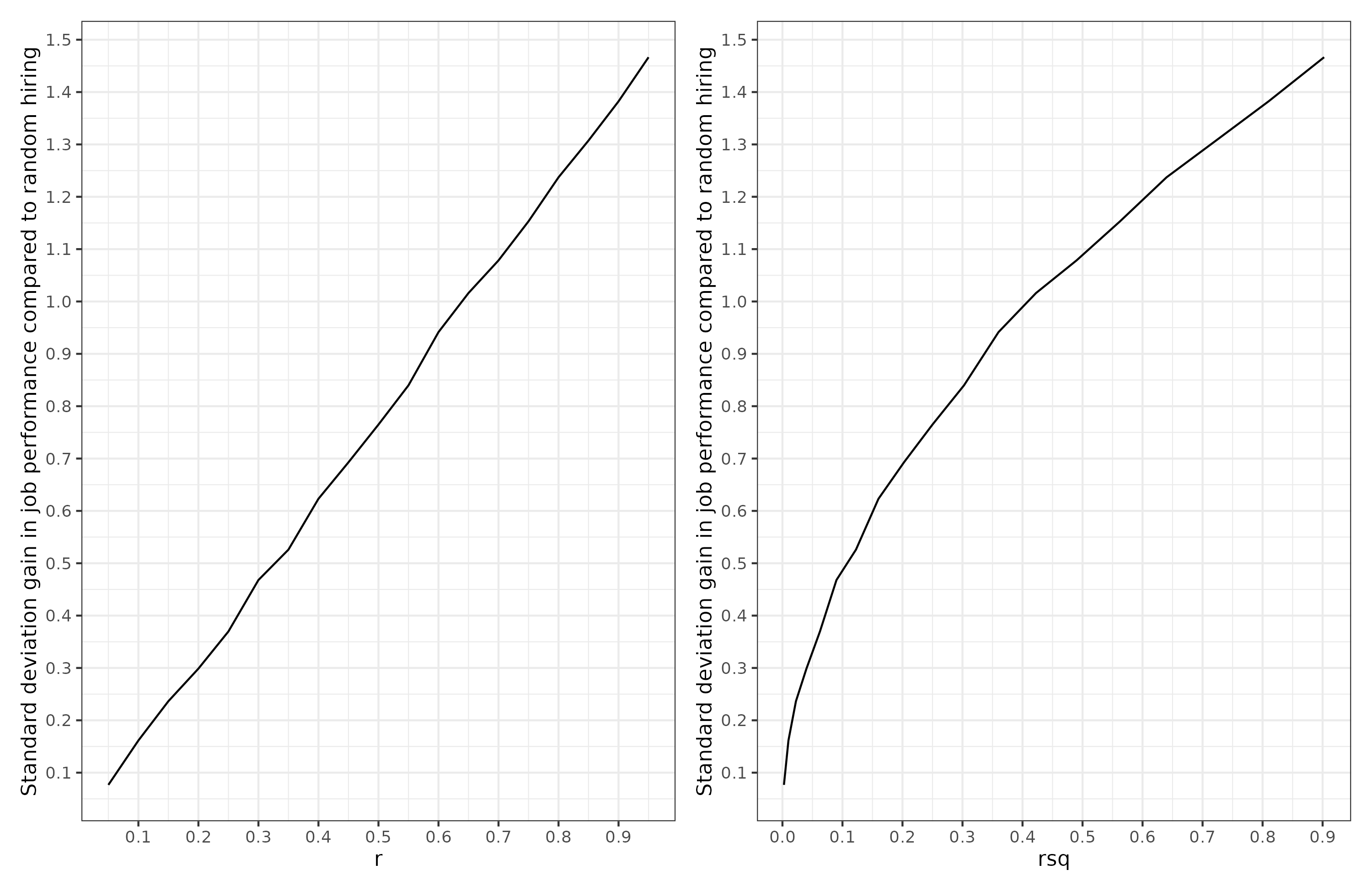
A common scenario is top-down selection. Suppose you have a company. You need to hire some new people. Top down selection is where one hires the best X persons out of some set of applicants. In the simplest case, we want to hire just the top person, or pick the top embryo. Suppose we want to select job applicants based on a test of job knowledge we made, and what we want is job performance. We’ve done a big study of our company and we know that our job knowledge test correlates at X with job performance. How will the size of the correlation or it’s squared value relate to how much better recruits we get? Here’s the results of selecting the best applicant out of 10, varying across values of X (how good the test is):

We see that utility of selection is a linear function of correlation, not of the squared correlation. The r squared function is concave (bulges upward), which means that small increases from 0% to 10% produce larger than linear utility gains, and vice versa when the value gets close to 100%. So a model that ‘explains’ 70% of the variance is not much better than one that explains 60% in terms of practical utility. These represent correlations of .77 vs. .84, for an improvement of .06, not .10.
Going back to the GWAS results. If someone used this dyslexia predictor to select embryos for less (risk of) dyslexia, then based on picking the best out of 10 embryos, we expect an improvement of about .30 d (standard deviations) on these verbal tests compared to selecting at random. That’s a nontrivial gain when you consider that most other things that people try in social science struggle to even prove it can deliver a gain of 0.20 d. A polygenic score that ‘explains’ 16% of the variance would be a correlation of .40, and gives an expected gain of 0.60 d in the trait of interest. If that’s IQ, this is about 9 IQ, a huge increase, about equivalent to the White-Hispanic gap in the USA.
So going forward, whenever you see variance explained, try to remember to square root this in your brain to get the effect size on a proper scale.
PS. If you want to dive deeper in the matters, Marco Del Giudice has a paper out in OpenPsych with the apt title: Are we comparing apples or squared apples? The proportion of explained variance exaggerates differences between effects


