Some days ago I posted some cumulative growth charts for OECD countries, like this one:
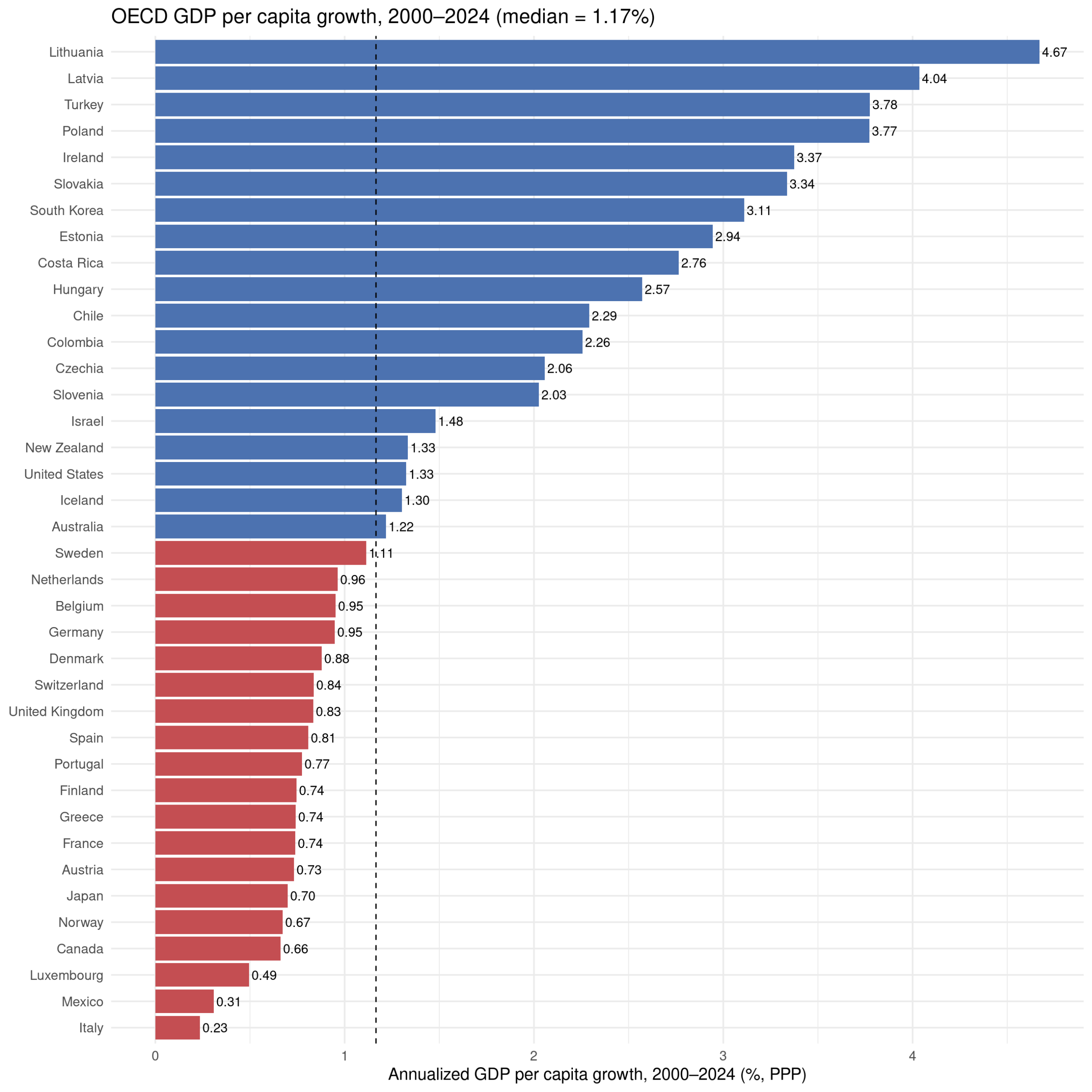
These results are somewhat affected by the usual GDP issues relating to tax haven (Ireland etc.). There are various ways to avoid this, but a simple one is using household consumption data:
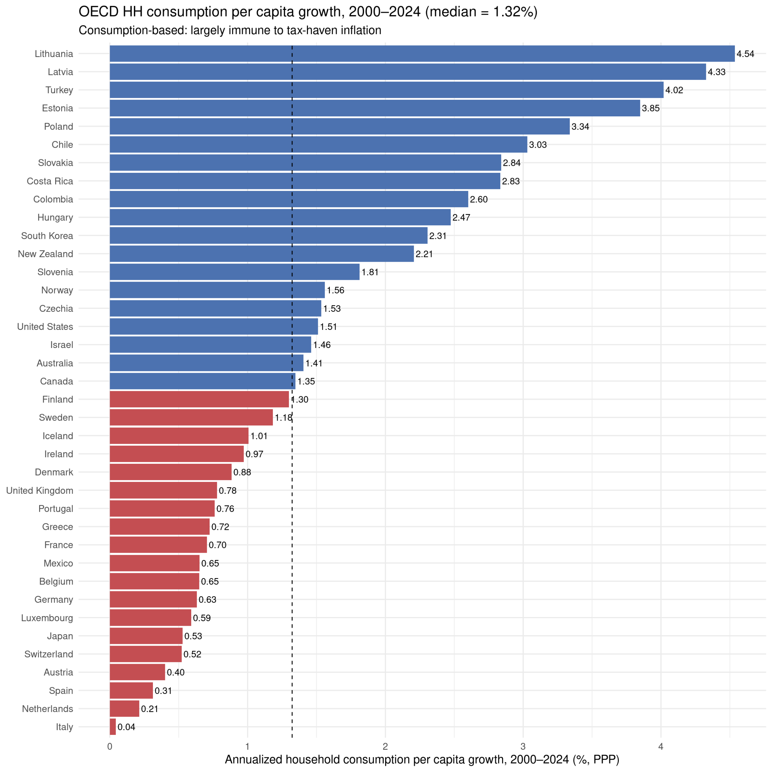
The main change is that Ireland moves down to the other west block countries. Overall, though, it doesn’t matter so much, r = 0.89. From the plot, you can also probably spot that the effect is mainly the poorer countries on the list growing faster:
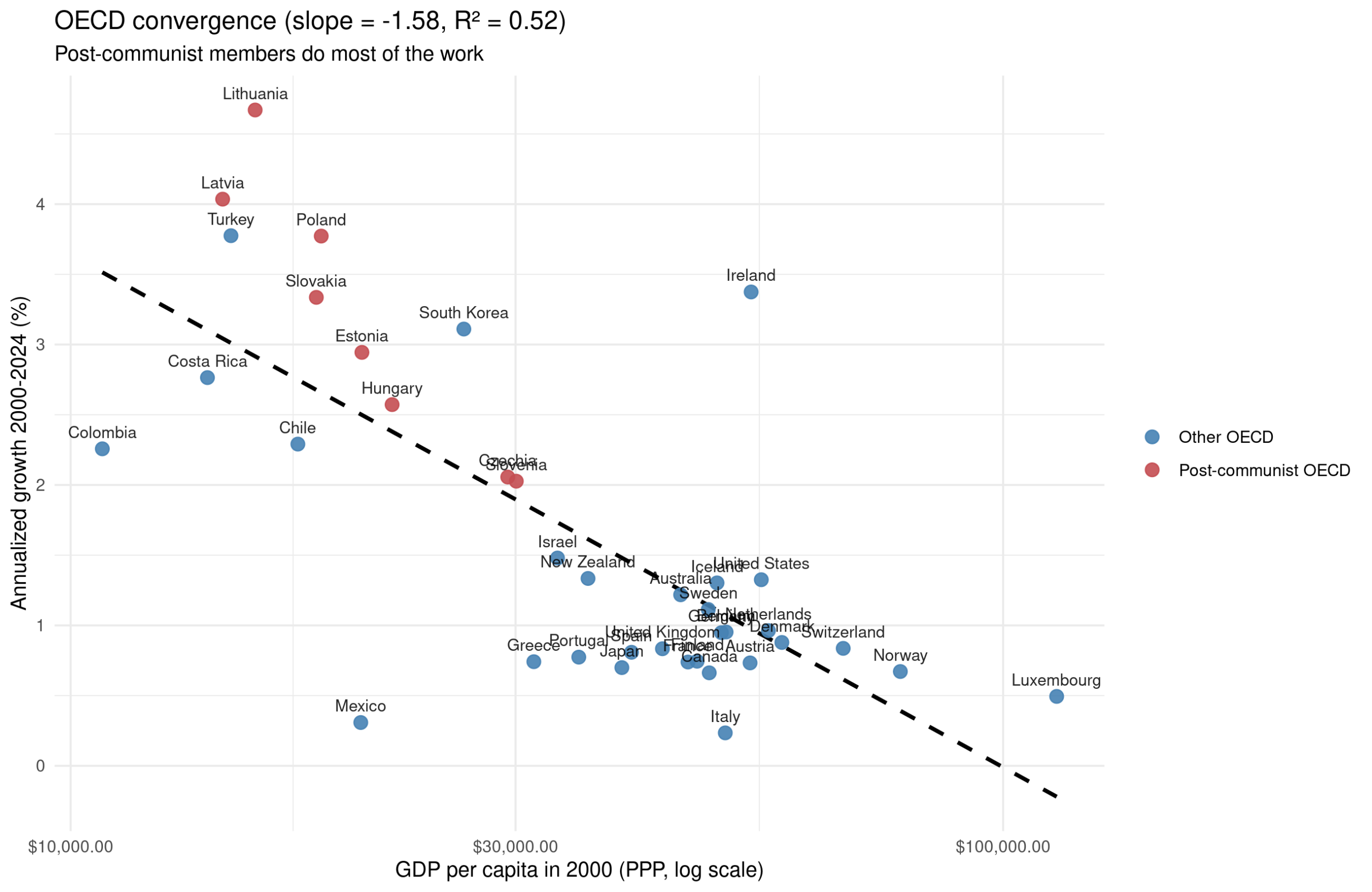
This kind of pattern is usually called the advantage of backwardness. The idea is that if your country is current poor, it is easier to copy working technology and policies from more successful countries, and since copying is easier than inventing, your growth will be faster than theirs, all else equal. We see this clearly in the OECD countries. Many of the countries are dealing with the legacy of communism which retarded their economic growth, so they are catching up to where ‘they should be’ (would otherwise have been).
This story is nice, but it is a gross simplification for the world at large:
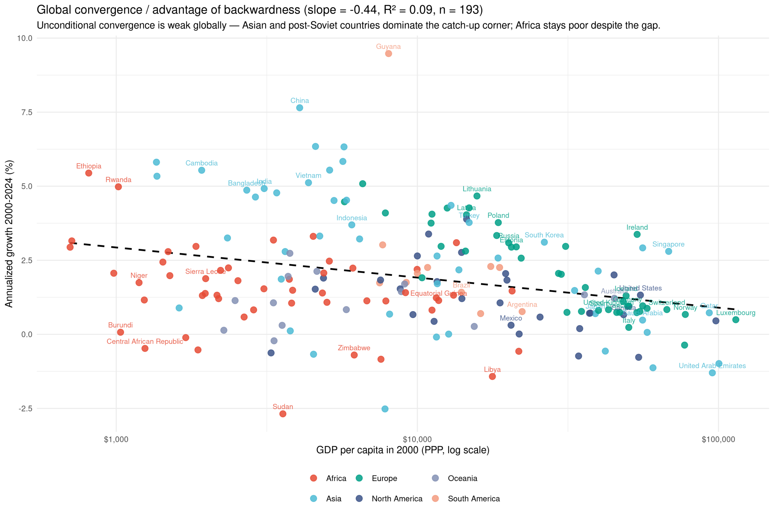
The relationship exists also for the world at large, but the effect is much weaker: r² went from 52% to 9%. This illustrates what I called the OECD fallacy: you can get wildly misleading results by analyzing only data for these largely western, relatively rich countries. By looking at the colors, you can also figure out a plausible story of how this works. Here’s the growth split by national IQ groups:
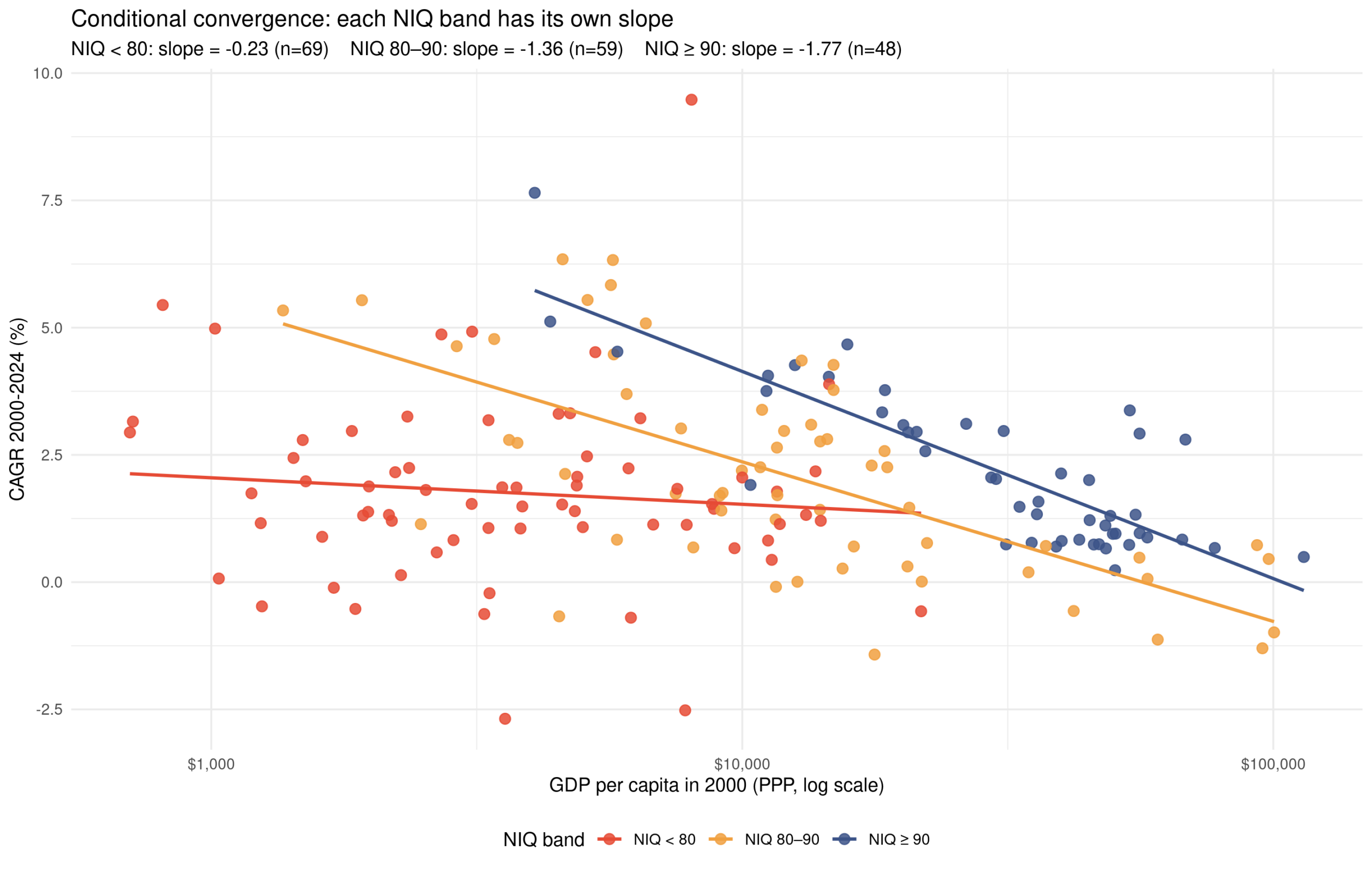
So the countries with low IQs (<80) aren’t actually catching up much at all, but the ones with higher IQs are. The difference in the slopes shows there is an interaction effect between national intelligence and backwardness. We can formally model this:
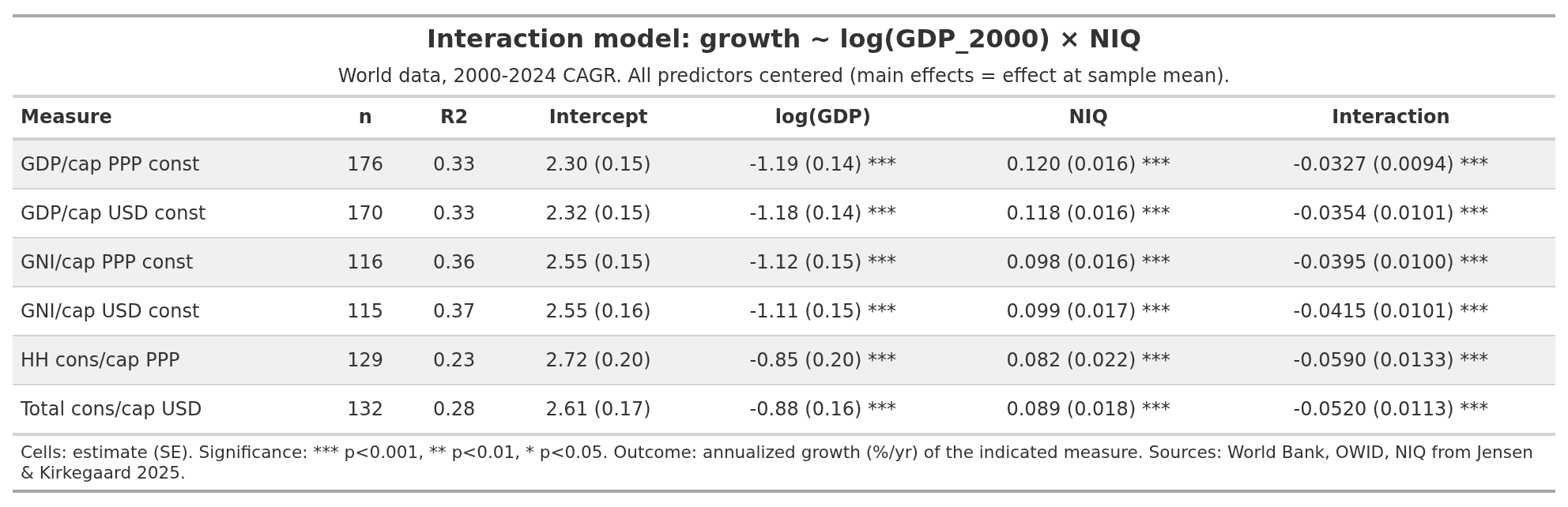
I’ve used a variety of economic growth metrics for those who have issues with GDP, nominal vs. ppp and so on. The more sophisticated metrics have less coverage (look at n column), so we are trading statistical precision for better measures, a typical trade-off. Fortunately, it doesn’t matter so much, all the models show the same interaction at p < 0.1%.
Next, someone will object that maybe there is some other regional confounding, or other spatially autocorrelated confounders. A wise objection, so I ran the same models with regional dummies (6 groups) or spatial errors (3 closest neighbors):
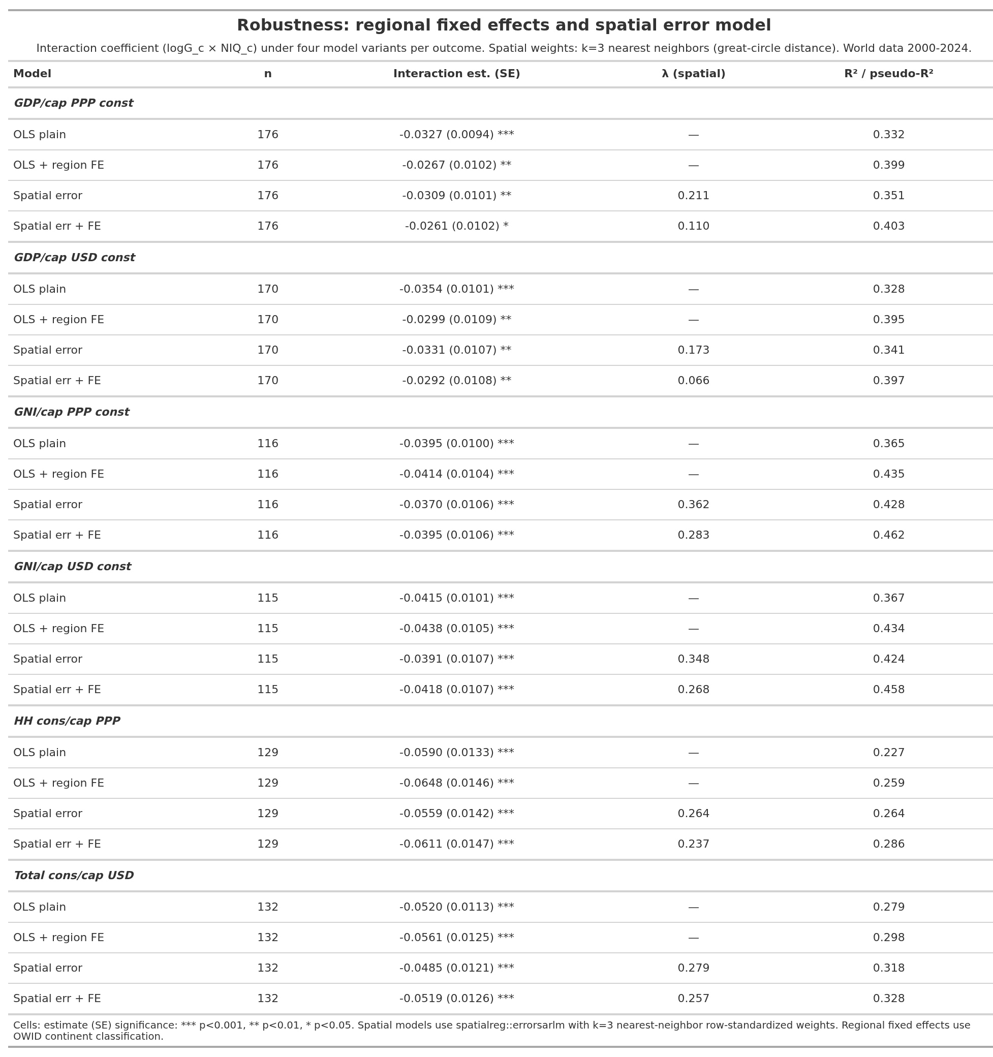
All 24 models attained p < 5%, most far below. The result is not just due to some spatially autocorrelated unmeasured confounder.
Now, one can go further if one wants to. Some differences are due to degree of market freedom (taxes, or full socialism), some are due to population aging, some are due to natural resources, some are due to third world immigration expenses, some are due to specific incompetent autocrats, and so on. One could dig into each of these if one wanted to. The main story, however, is what we see above.