France is the 4th most populous country in Europe these days (it used to be number 1 before it had early secularization). It is also quite insular when it comes to data owing to their poor English and strong native language (about the same number of speakers as Arab, rank 5-6). This insularity is somewhat ironic given that English derives something like 50% of its words from French. Anyway, the point of the introduction here is just that we don’t know much about France from an HBD perspective, so I’ve tried to do something about it using public datasets for aggregate units. The normal issue with exploring the data from some foreign country is that I don’t speak the language and to some extent am not familiar with the kind of data that exist. However, AI solves the first issue and also makes it exceedingly easy to quickly build a massive database for analyses as well as implement the key models. So that’s what I’ve done.
First, we have to understand the structure of France from an administrative perspective since the available datasets will reflect this structure. France has 13 regions (level 1, US state equivalent), 101 departments (level 2, US county equivalent) and X communes (level 5):
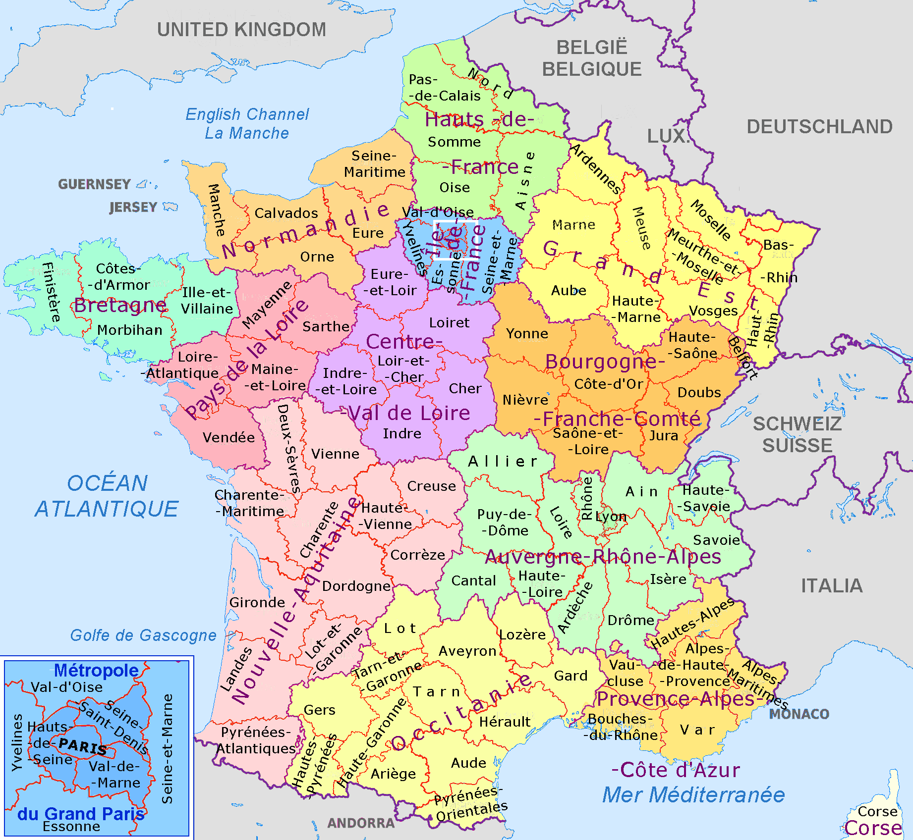
The communes are too numerous to usefully show but this map shows the regions of mainland France and their departments. Paris itself is split into 4 or 8 departments depending on how inclusive you are, which is good for us.
The next peculiar thing about France is that it has a law that makes it broadly illegal to collect ethnic/race and political/philosophical data. I know this sounds insane, and it is. It also sounds like a modern Woke invention but it is not, and also prevents them from complaining about inequality directly since they themselves cannot collect such data. Of course, when regulation is introduced, the market interprets this as cost of doing business and routes around it, and this is also true for the scientific market. Thus, a number of different approaches exist to counting the ongoing population replacement:
- Foreign born % (also broken down by country or region of birth)
- Foreign citizenship % (including categorization)
- Sickle cell anemia testing of newborns
- First name counting and classification
- Counting mosques and Muslim businesses on the map
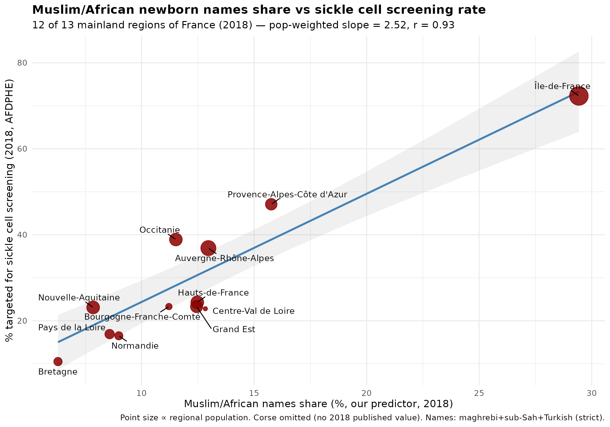
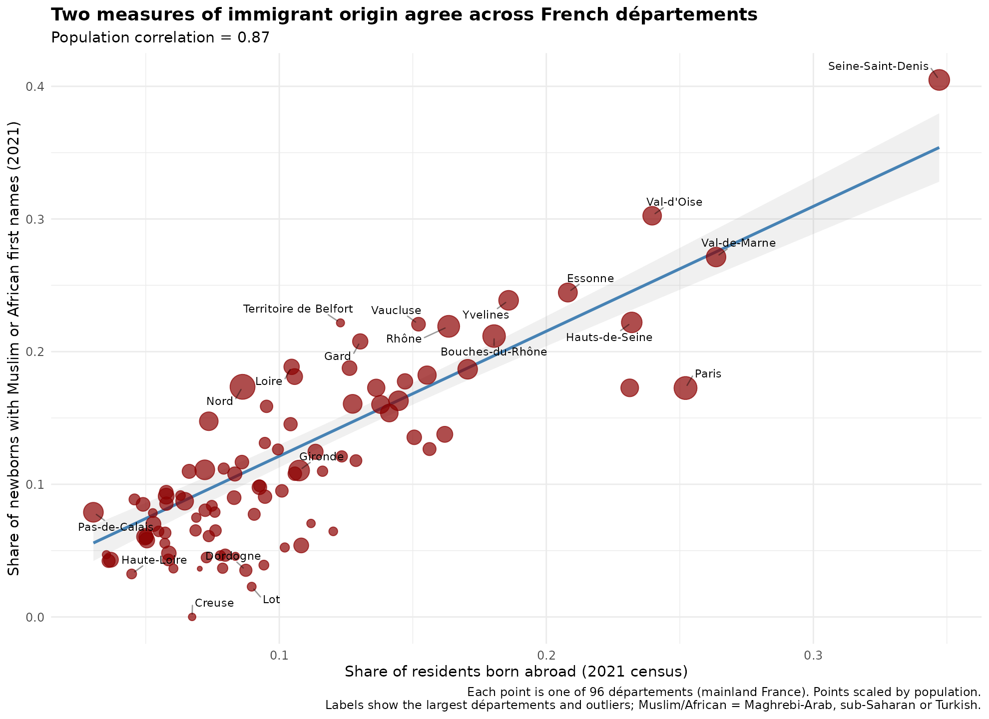
The government publishes data for 1-2 at various levels of granularity depending on the administrative level, that is, most fine-grained for the national situation and less precise for the lower levels. Sickle cell anemia is a clever workaround because the law stipulated that newborns should be offered genetic testing if at least one parent is from an at-risk ethnic background, and thus indirectly this tells us about which fraction of babies are born to such people (apparently not violating the law against ethnic data). More or less every culture has distinctive names, and while this is more true for last names, first names are also alright. Muslims really like Mohammed and very frequently give that name to their sons. Muslim names are much more clustered around a few popular names than other cultures which makes counting Muslims using first names easier. Finally, using various open map data or company listings, one can count the density of Muslim related organizations. The combination of these various methods thus give us a quite good idea about what is going on in France despite the direct ban on the data collection. The names% approach is how people post stuff like this on Reddit:
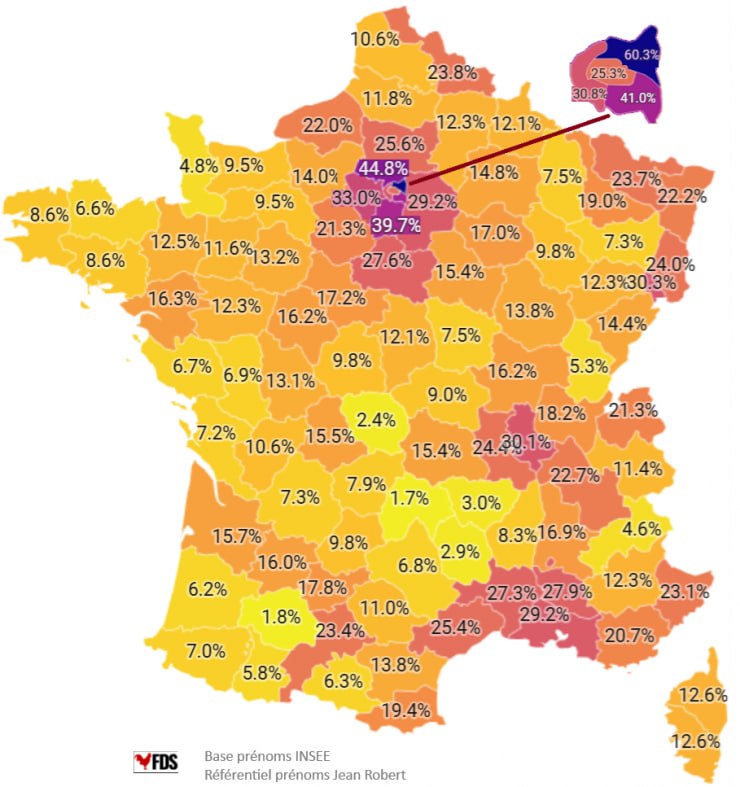
Here’s my replication of this map:
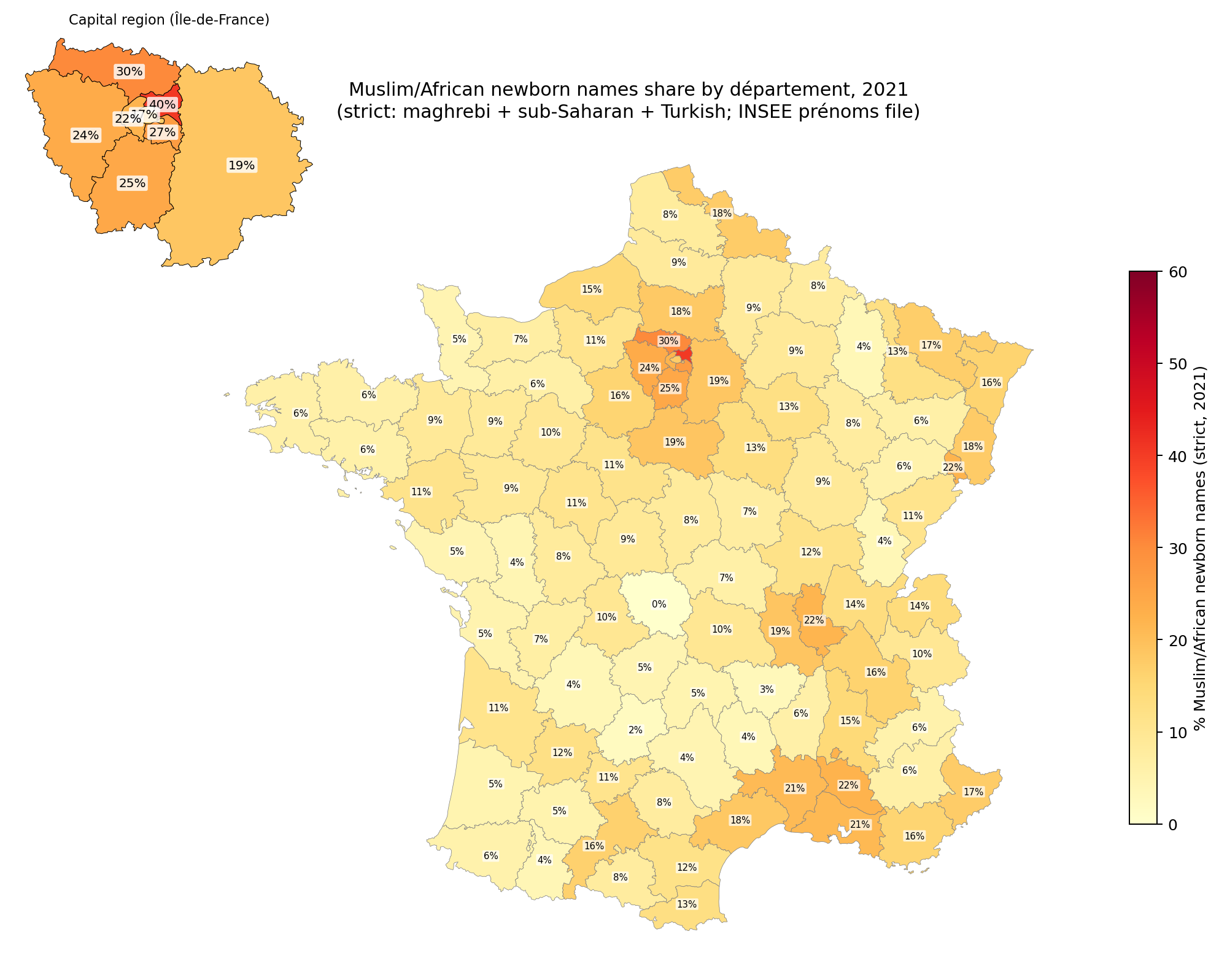
The correlation is about 0.88, but I wasn’t able to resolve the causes of the discrepancy. Notice that Muslims are heavily represented in the north and east of Paris. This is very helpful because population density or urbanization confounds many social metrics that we can look at, so having a city split into different parts with roughly equal urbanization/population density means we can control for this factor effectively. There are some names that are common among Muslims but also common among Europeans, like Sara(h) and Adam. One could include these, and thus count some Europeans, or not include them, and miss some Muslims. Either way gives some errors and it’s not clear which is more accurate. The stricter standard underestimates the Muslim/African% (MA) of newborns, but hopefully is not too biased. It is worth noting that newborns is a flow metric — the new people entering the population at age 0 — rather than a stock metric, of the existing population. Stock metrics are what we want since these are most relevant to the current socioeconomic performance of the people in some location, but we will have to use the flow metric as a proxy. The two metrics will eventually align with each other given infinite time without further changes, but at any given time may not, and does not in the west because Europeans are older on average and have lower fertility (usually). Thus the newborn names will both over- and underestimate the MA% of the total population. It seems pretty accurate, though, because this is the correlation with the sickle cell anemia data for the regions:
The first names of babies has been published for 100+ years, so we can make a nice time series:
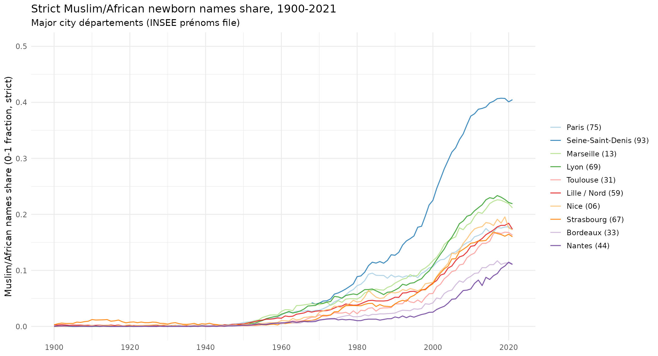
These only concern the larger urban departments, since otherwise the plot would be cluttered in the extreme.
The other measures of foreigners are worse, however. Foreign born % only covers first generation migrants. According to the French stats agency, ~11% are foreign born, and ~11% are second generation, so using foreign born misses at least 50% of the foreigners. To be fair, a lot of the older generations of foreigners are other Europeans who aren’t of much interest (there’s little social consequence of someone having 1/8 ancestors come from e.g. French speaking Belgium).
The foreign born and foreign citizen data are available for every level, but has severe issues. Here’s the map of foreign born % by commune:
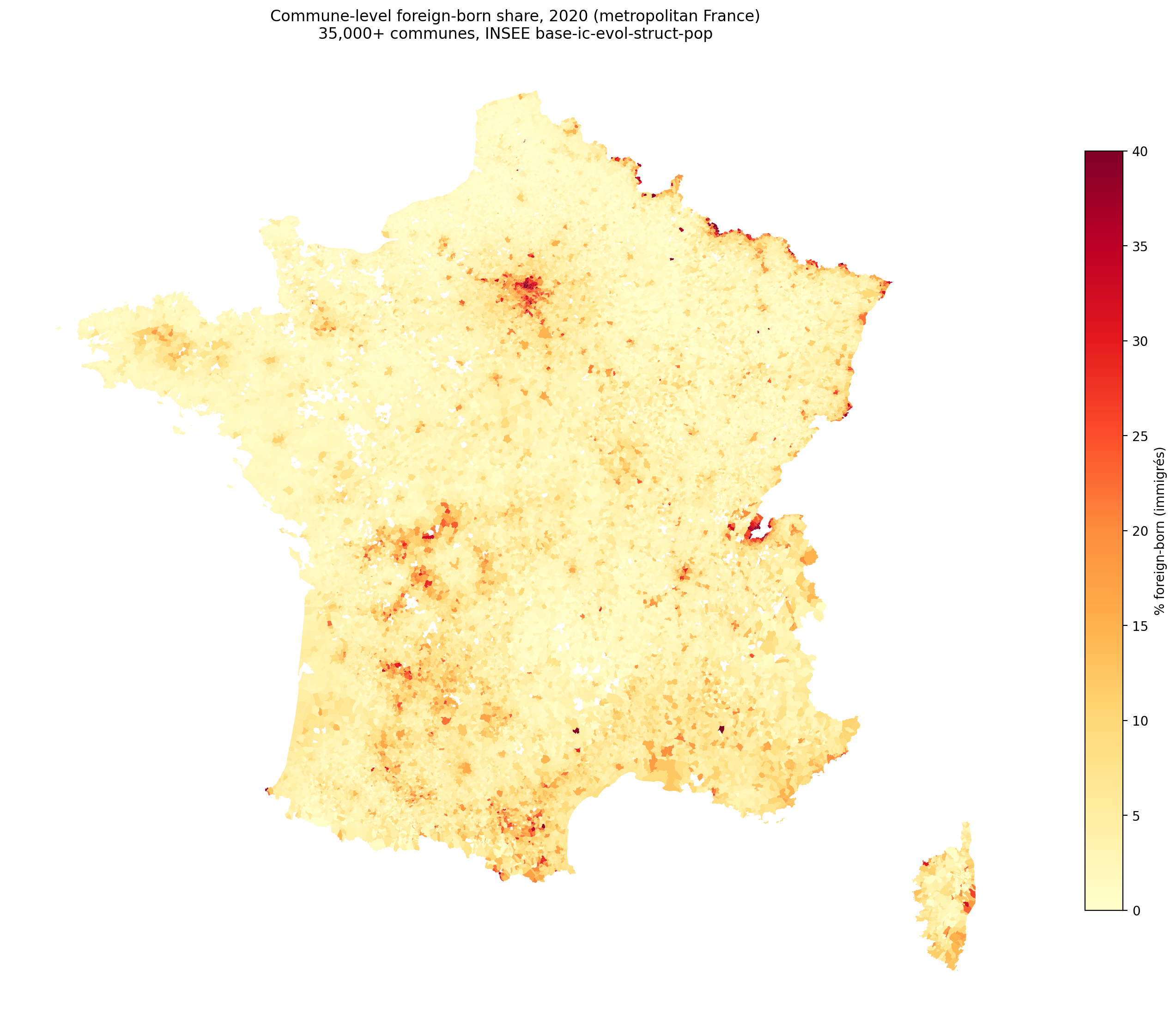
Foreign born % is high in the MA areas, but also very high around the borders to the north and east (Belgium, Luxembourg, Germany, Switzerland). This is problematic because these foreign born people are mainly Europeans working in another country. Using foreign born% as a predictor thus mixes 3rd worlders with foreign Europeans, which will not give a sensible result. Though at the department level they tend to be in the same places when it comes to departments:
Concerning the social outcomes, we are limited to what exists. Crime data does not appear to be sensibly available, but we have:
- Median income, 2006-2020
- Education level, 1968-2022
- Poverty rate, 2013-2020
- Unemployment rate, 1982-2025
- Crime rate, 2020-2024
Using these, we can make some simple plots to get an idea of the relationship:
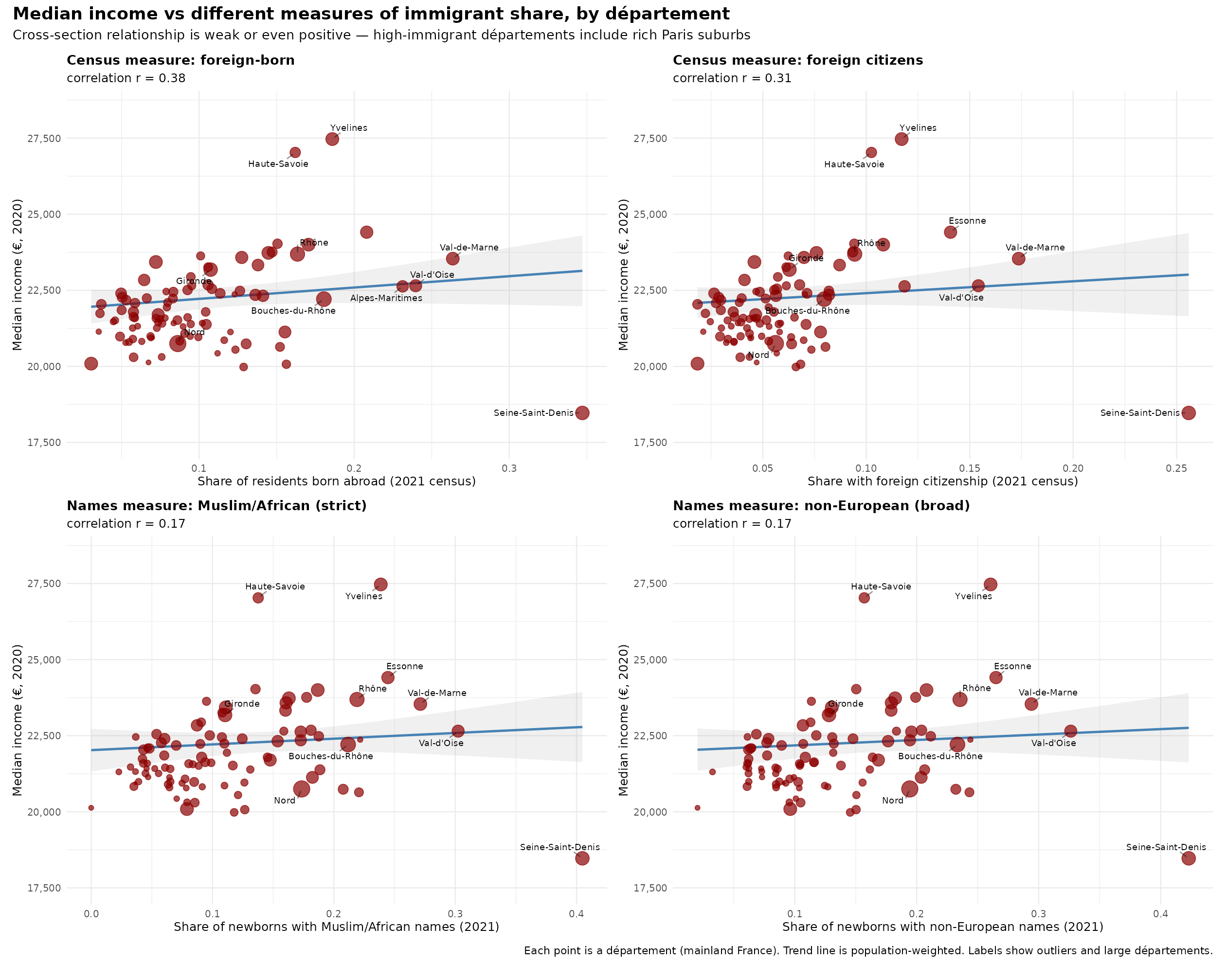
Perhaps surprisingly, the relationship to median income is positive overall, somewhat inverse U-shaped. How is that possible given that MAs have lower incomes? Because they live in cities. Here’s the same plots but with the effect of population density removed:
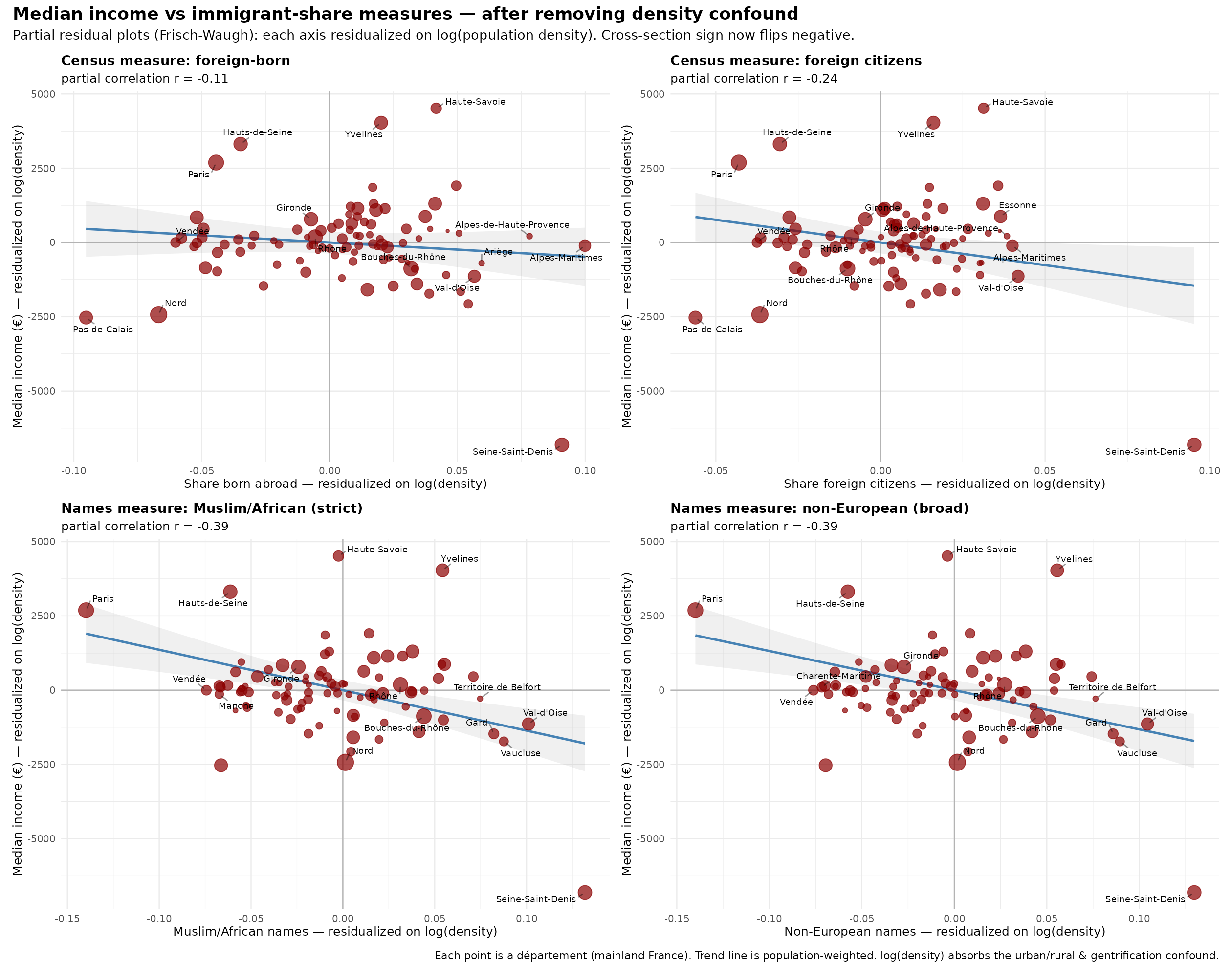
The relationships aren’t great, but we can tell the issue has to do with the clustering of both high end Europeans and MAs in the same areas. The department data is too coarse. Here’s the commune data:
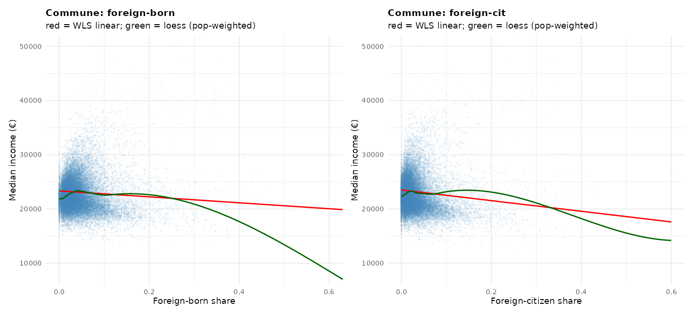
The nonlinearity on the left end concern the poor rural areas which also have low median incomes, also because of course the cost of living is much lower there. We can get around this by focusing on only the Paris area:
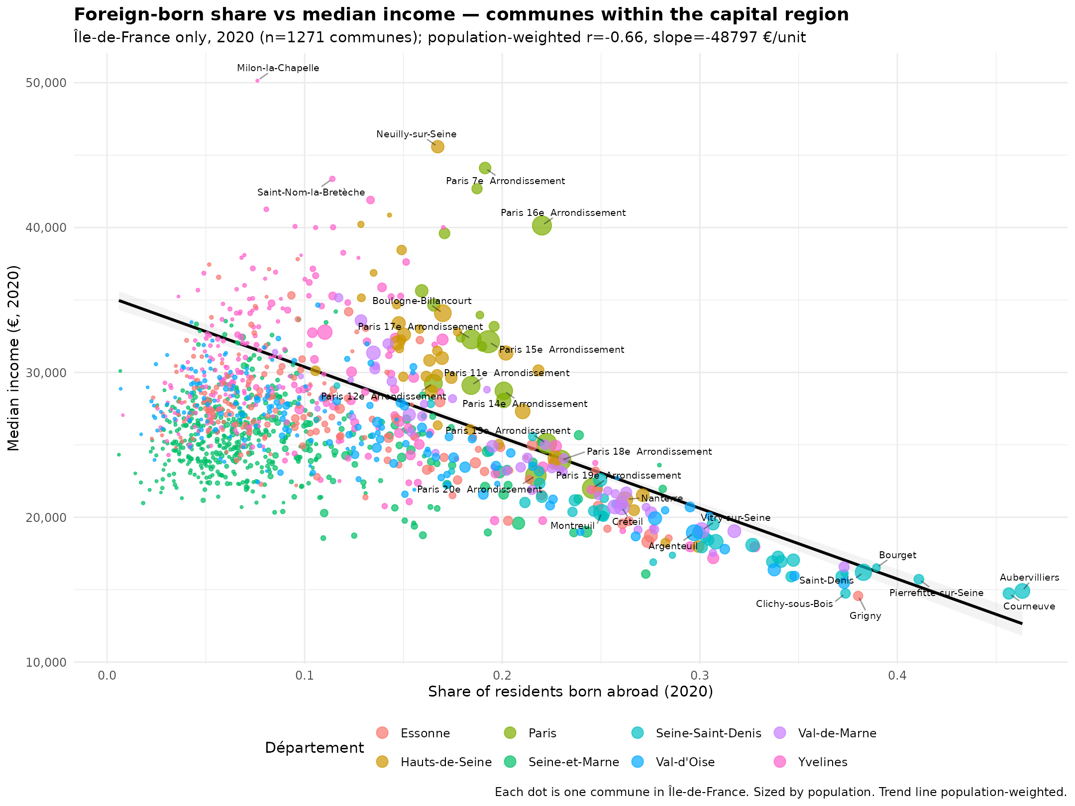
Now the pattern is very clear to see. But let’s not get ahead of ourselves. The department data can be salvaged using covariates and time series data:
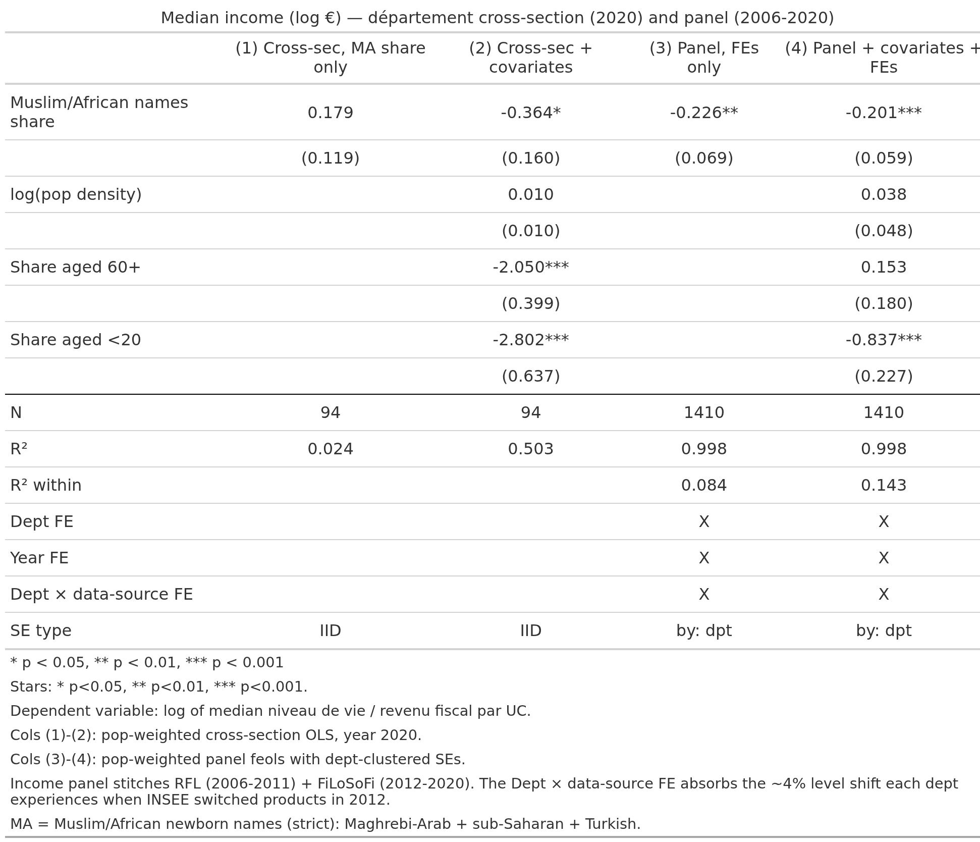
Thus the panel data using only changes in department MA% also shows up. If one is less strict with the covariates in model 2, then the p values for MA are also better, but no matter. The effect sizes are in log units, so the final model suggests that changing the entire population from not MA to 100% MA means a -20% median income reduction.
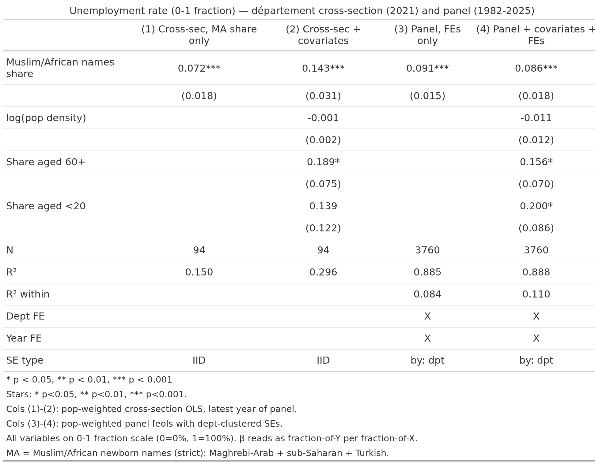
We can do the same thing for the other outcomes. Some of them give sensible results, like unemployment rate:
Less so the poverty rate:
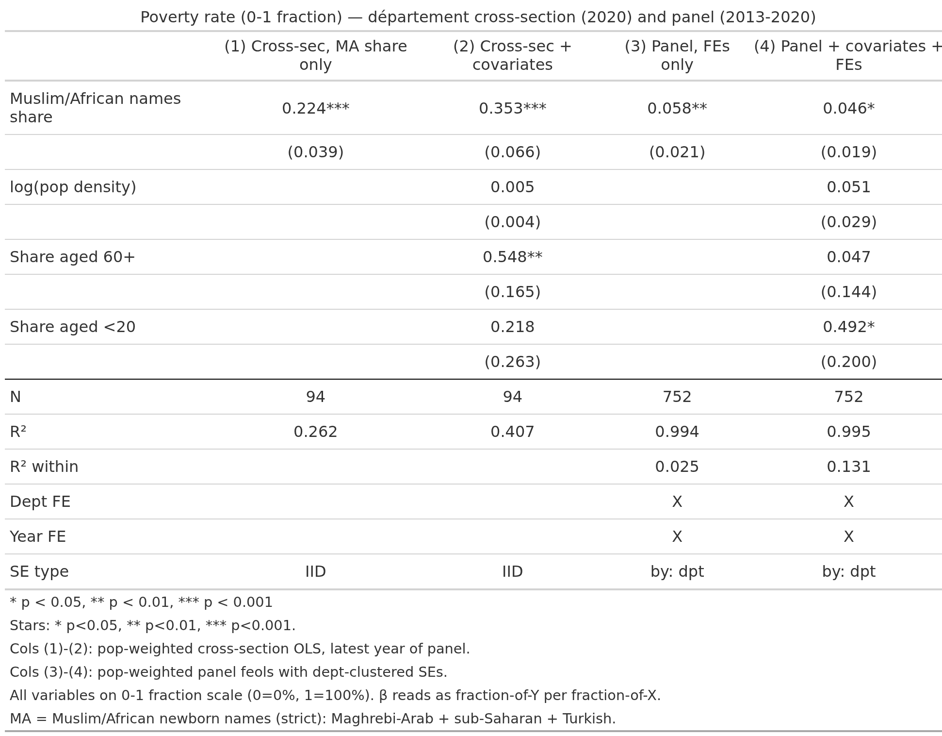
Note the panel data effect size is much smaller. Worst is education:
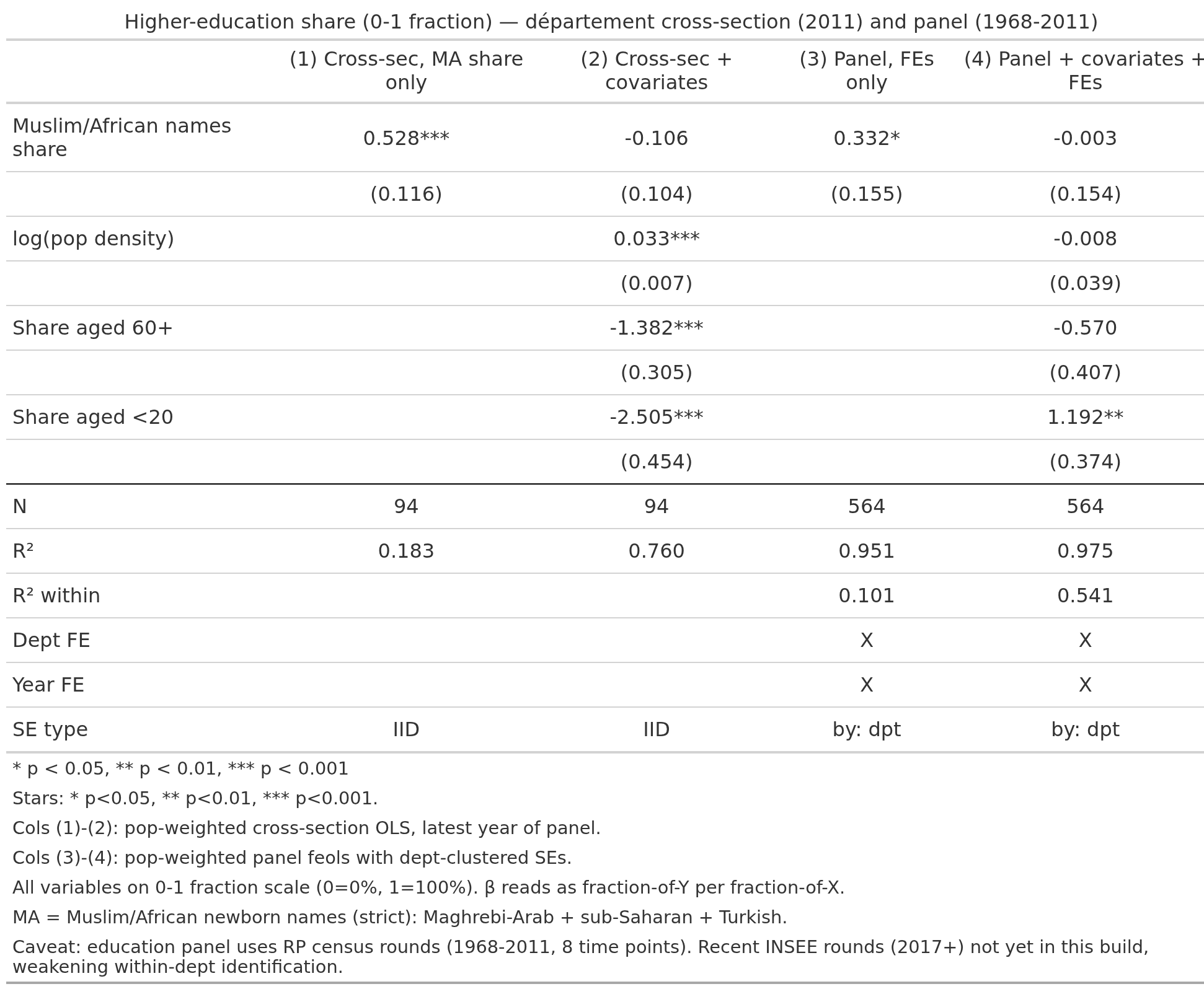
Suggesting that despite these covariates and use of time series data, we can’t properly pull things apart. We can see the issue if we look at the Paris area communes for education (% highly educated):
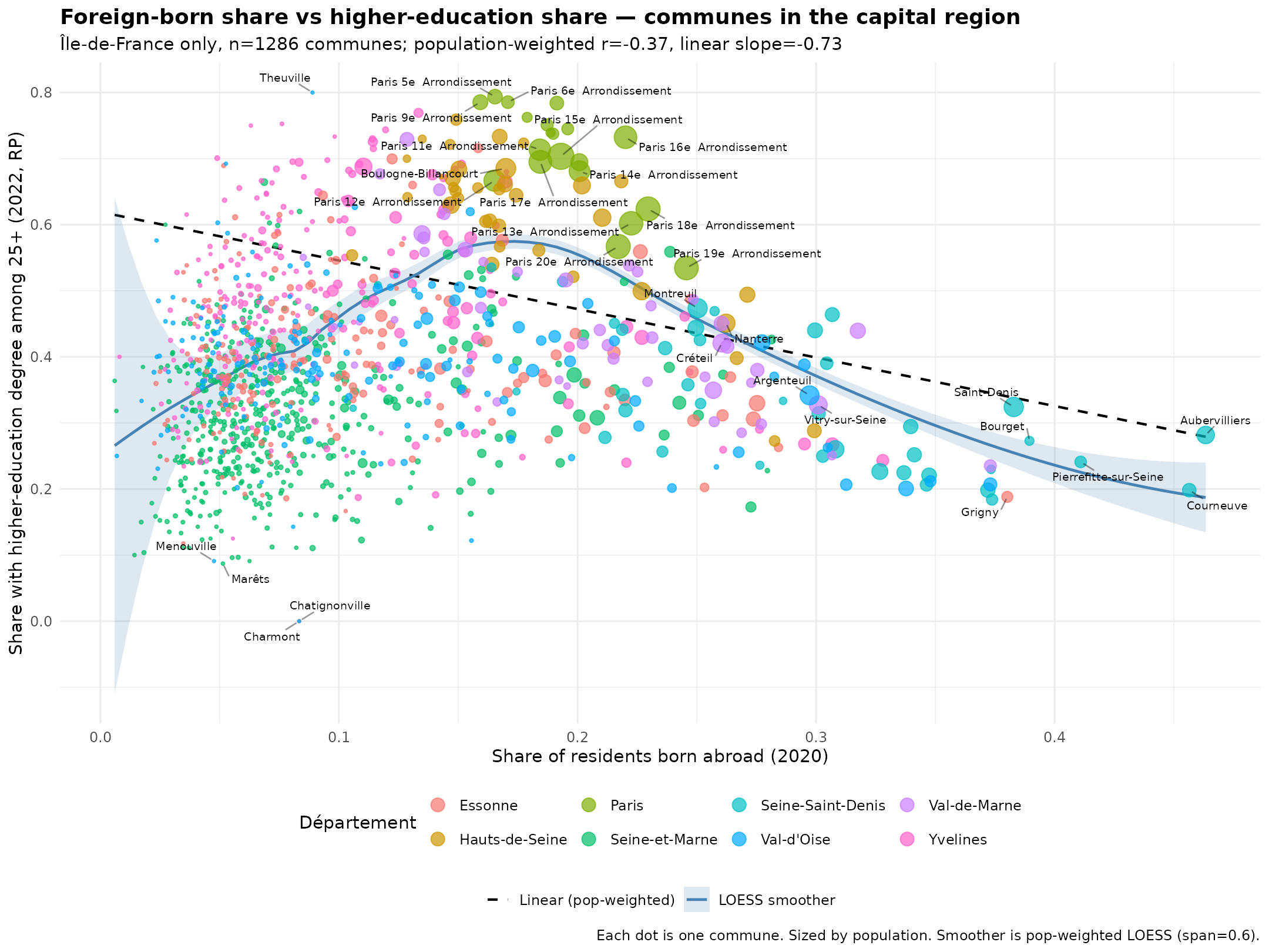
The sweet spot is about 15-20% foreign born. Recall at the commune level we can’t distinguish between foreigners, so we don’t know if those areas have lots of other Europeans.
Here are the commune level regressions, compact view:
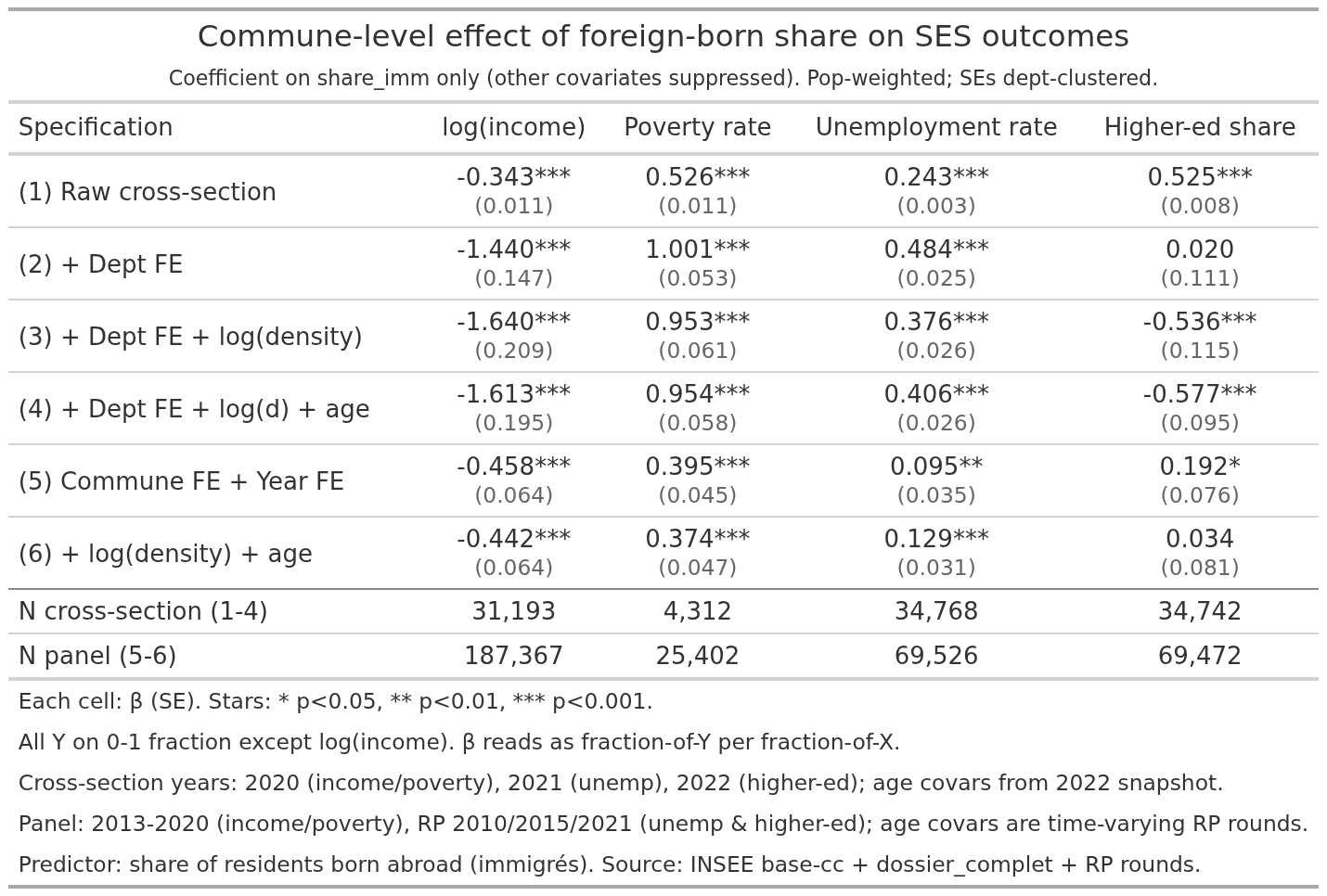
Most models produced results in the expected direction (more MA -> worse). Education is anomalous. Not only is it positive without controls using the cross sectional data but it then flips 180 when the covariates are added. Using panel data without controls, it is likewise positive, and become null when controls are present.
For the record, we have national breakdowns by origin groups, first and second generation:
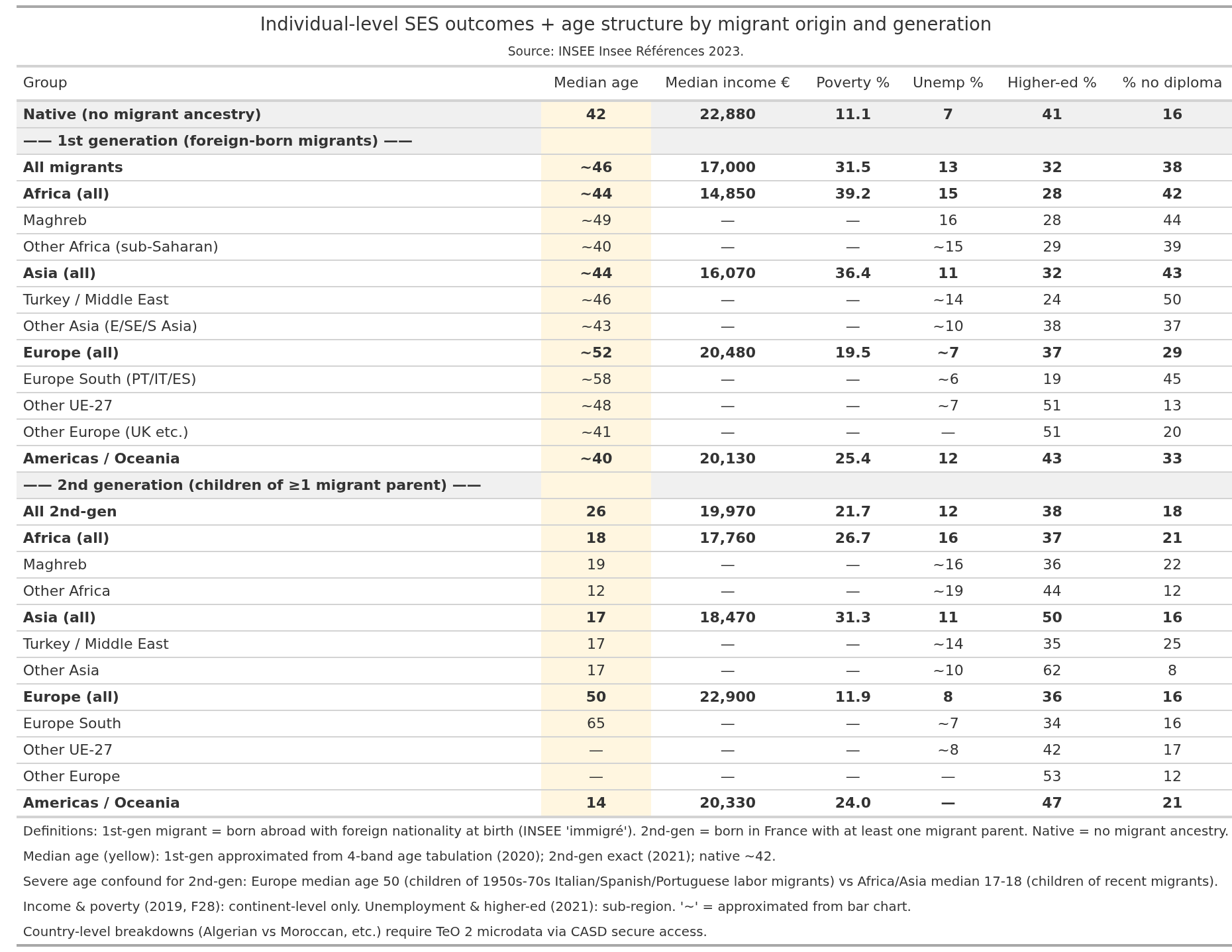
Assuming assumptions, the various aggregate (ecological) results should approximate these results given correct modeling. Our Muslim+African names correspond to Africa+Asia for the department level analyses. The foreign born corresponds to the mean of all 1st generation migrants. For departments, Africa+Asia is approximately -8k EUR median income compared to the natives, whereas the 3 models estimate -4.6k, -4.2k, and -7.0k, so they are on the low side. For the commune level, the foreign born national result is about -5.9k EUR, and the models estimate -8.4k and -8.2k, a bit on high. One can go through the same for the other outcomes. For instance, for the commune foreign born panel data, we estimate about +40%points poverty rate, but the national data show +20%, so close to 2x too high.
To note, for the ecological models to accurately recover the individual level results, we need to assume that 1) no internal sorting: people are distributed around the country without regard to SES, 2) no spillover: people don’t affect each other. Both assumptions are quite false, so the fact that we nevertheless got reasonably accurate results is showing that ecological models can often work well (as they do for polygenic score means). To be noted is that the 2nd generation non-Europeans have very low median ages. This confounds the results for the MA names, but not the foreign born (communes). Without individual level data, we can’t do much about this aside from what we already did.
Now crime rates, we have department level data. The cross-sectional models give us these results:
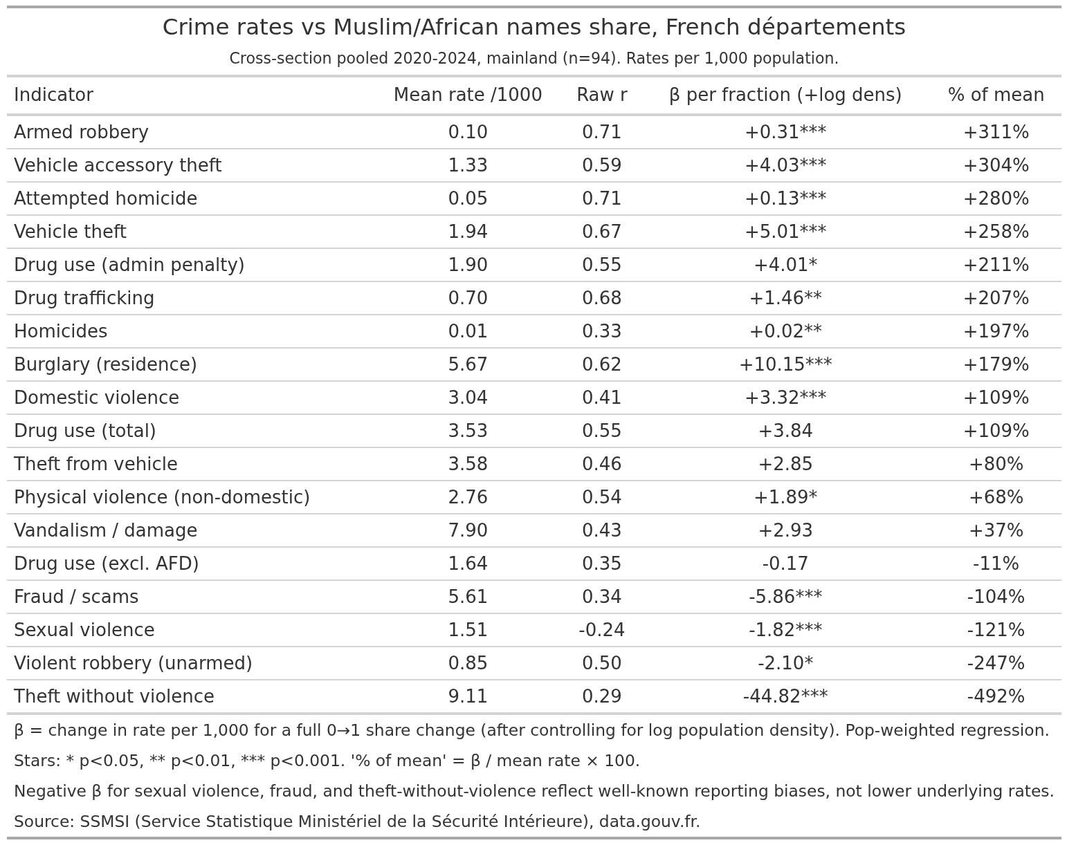
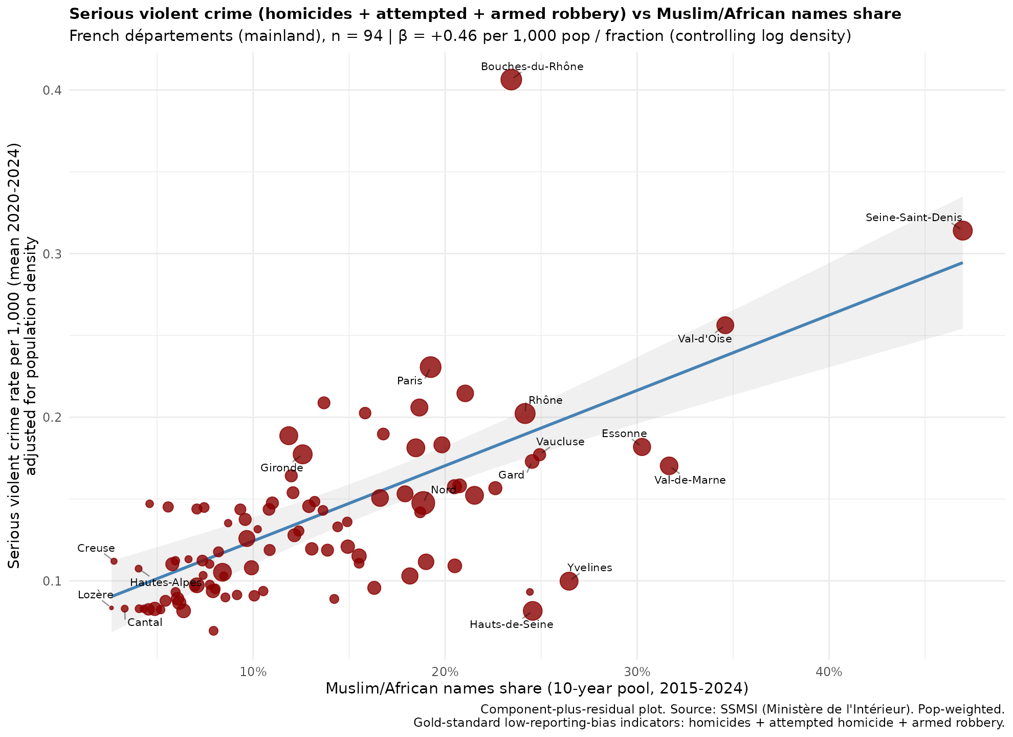
Most of the ones in the top make sense. Armed robbery would hypothetically increase about 300% going from 0 to 100% MA. However, apparently, “theft without violence”, which I guess is shoplifting or breakins-like crime, would decrease. Maybe this is some kind of “criminals commit crime elsewhere” issue. Visually it looks like this for the total serious violent crime:
Regarding intelligence, France has some public test results under various names except for “intelligence”. The first thing is the mandatory age 11 tests (tests d’évaluation de 6e). They are only available at the department level unfortunately, but if we combine with the MA% and population density as a control (population density does not cause intelligence differences, but it adjusts for the self-selection of elites into cities), we get this result:
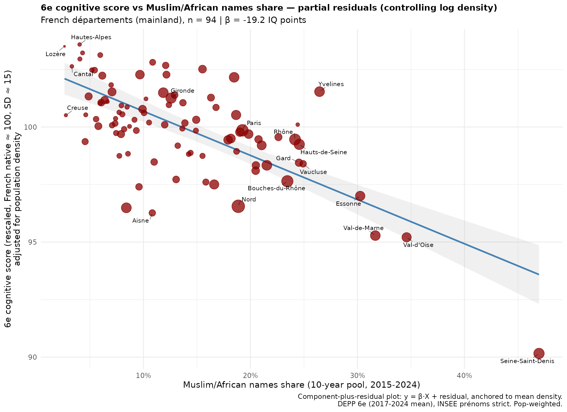
The slope estimate is about -20 IQ, which is about what one would expect based on the national IQs of origin countries. This looks clean, but it is sensitive to exact model:
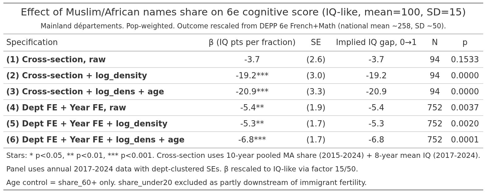
The raw results fail because of the much higher IQ than expected of Paris region, this is the sorting effect, French elites move to Paris. Controlling for density largely removes this issue. The time series models produce smaller estimates, just like they did for the SES metrics above. The departments are too large to capture the changes.
These cognitive scores are also available for the communes, and gives us this result:
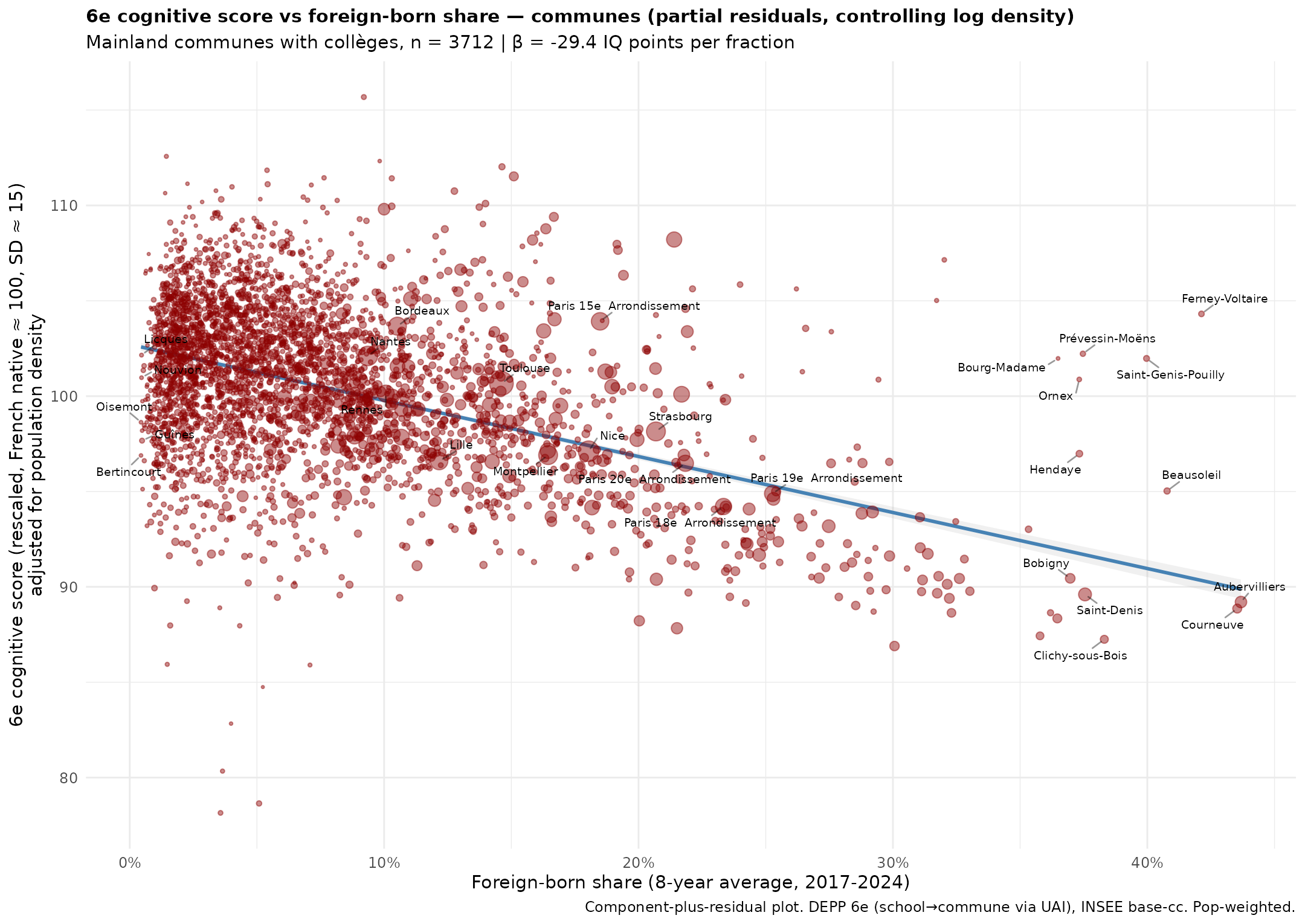
Population density is controlled just as before. The commune fixed effects did not produce anything of note though.
I think this covers just about everything one can do with the aggregate data for France. The results for educational attainment were anomalous, and some of the fixed effect models gave strange results. Overall, however, the French situation looks just about the same as everywhere else in west Europe.